Featured

Price and Provenance 0

An Index to the Price and Provenance Posts

Here is an Index with a brief description for the Price and Provenance posts.

Featured

Price and Provenance 1

An Approach to the Investigation of Books

Introduction

This is the starting point for a series of posts about how to find out information about any particular copy and any particular edition and printing of an old book. As a book collector, these have been topics of great interest to me, so I thought that it might be useful to share and document some of my approaches, methods and findings. I call this series “Price and Provenance” as it is often quite difficult to find out how much an older book initially cost and also who has owned it previously. Both are issues of some interest to a serious book collector. I am taking different editions of the novels of Jane Austen as my starting point for this series of posts, partly as it reflects one of my main collecting interests, and partly as I have quite a few interesting editions to discus.

New books

Let’s start with the situation of new books. It is obviously so much easier to document the price, nature and provenance of a new book. You go to your local bookshop, or if you must, look at online vendors. Whichever way you choose, you browse around the available stock, choose your book, pay your money and take your purchase home so it can join the family of your previous purchases.

Virtually all new books today carry excellent documentation of what they are. Externally, books generally will have a removable price sticker that humans can read and also often a machine readable price bar-code. For most of the 20th century, the price was recorded on the front inner, lower corner of the dust jacket, often below a diagonal line which invited the discerning gift giver to remove the price with a pair of scissors. Dust jackets that have been mutilated in this way are generally referred to as “price-clipped”.

Books will have a title page, which will tell you the book title, author and publisher, generally in that order as you read down the page. It used to be that, through most the past 500 years, the date of publication appeared at the foot of the title page. Today, more often than not, the title page will not have the date of publication printed at the bottom. You will now have to turn the page to find it.

Now for some nomenclature which I will try to introduce gradually through these posts. We call the front of a leaf in a book or right hand page as we view an opened book the “recto” and the rear of that page, normally appearing on the left hand side of an opened book, the “verso.” So, if you look on the other side, the verso, of the title page of a new modern book, you will see a whole lot of detail which gives you a full description of the book. There will be a dated copyright statement, the date of publication, and the full name and address of the publisher, often with addresses of that publisher in multiple countries. Books published in the USA will have a statement about registration with the Library of Congress. In the UK, the equivalent is a statement about a CIP catalogue number registered with the British Library, and in Australia, where I live, there will be an equivalent statement with regard to the National Library of Australia. Towards the bottom of the page the details and address of the printer are usually given.

The details of the edition of the book also generally appear on the verso of the title page. Some times the statement will be simply “First Edition” ; other times it might say “Third impression” or it might read something like “First published in 1963, reprinted 1964 (twice), 1965, 1966”. More recently, this has been codified into a line of numbers. It generally looks like this:

1 3 5 7 9 10 8 6 4 2

or this: 1 3 5 7 9 8 6 4 2

But is may also look like this: 9 8 7 6 5 4 3 2 1

All of these tell you that the book is the first impression (printing) of the first edition. If however the line of numbers should look like this:

9 8 7 6 5 4 3 2

you are dealing with the second impression of the first edition, and you will find with each new impression, a further digit is removed. For some blockbusters, the publishers just print a number by itself to indicate the impression.

International Standard Book Number (ISBN)

In modern books, you will also find the ISBN number. ISBN stands for International Standard Book Number. These started in 1965 as a nine-digit Standard Book Number which in 1967 became the International Standard Book Number. The format was officially established as an international standard in 1970 when a ten-digit ISBN was adopted; the earlier nine-digit numbers were updated by the addition of a leading zero. New books displayed the ten-digit ISBN, as a printed number or as a bar-code from 1970 until 2007 when the ISBN standard was redefined as a 13 digit number. While most countries adopted the ten-digit ISBN in 1970, the UK persisted with the nine-digit format until 1974. Most book readers will be familiar with the appearance of the 13 digit ISBN bar-code format shown below:

200px-EAN-13-ISBN-13.svg

Without going into the full complexities of the ISBN system, the principle is that each book should be uniquely identified, just as a URL uniquely identifies a Web page. The structure of the ISBN is built from several elements: a three-digit prefix, currently 978 or 979 known as the EAN (European Article Number), the language and or country of publication, publisher and book details. The final single digit is a technical check-sum. The elements are separated by blank spaces or by hyphens. Different formats of books (hardback, paperback, e-book) each get their own individual ISBN.

Identification and provenance of older books

For any book published before 1970, there is no ISBN, so as collectors, we have traditionally concentrated on the identification of the precise edition, printing or binding of any given book, either from inspection of the book itself, or by recourse to catalogues and bibliographies. Much less effort has been expended on understanding provenance, with the exception of the identification and collection of desirable “Association” copies of books. By Association copy, we mean a book which has been previously owned or inscribed by someone of importance, either to the book itself, or its subject matter or sometimes just by the personal fame of the associated person.

In her recent excellent book “The Lost Novels of Jane Austen”, (Johns Hopkins University Press, Baltimore, 2019, ISBN 978-1-4214-3159-8)  Professor Janine Barchas explores the topic of the provenance of hitherto unregarded, cheaper editions of the novels of Jane Austen as valuable evidence in the understanding of how the popularity of this major author was spread by the publication of editions that were accessible to the broad general reading public. Many of the books that she examined had escaped inclusion in the standard bibliographies.

Professor Barchas also uses the information of prior ownership, in combination with family history research techniques, to rediscover some of the countless unrecognised readers of Jane Austen from the past. This approach has been a facet of my book collecting practice for the past decade or so. In a series of follow-up posts, I will share some of the findings of my exploration of provenance and the previous history of the books in my collection. My first examples, like Janine Barchas’ work, will involve Jane Austen. Here are three copies of Mansfield Park which I will be exploring first.

Read the next posting to learn more about these three books.


Beginners Guide to Collecting Books

Featured

What makes a book collectible?

I am often asked by non-book collecting friends what makes a book collectible and how can you tell if a book is valuable. Here are some thoughts on these matters.

Firstly, for a book to be collectible, there needs to be someone out there in the world who desires to own it! That may seem obvious, but really is the sine qua non of any collecting. Similarly, one may ask what is a particular book worth, and one rather obvious answer is “Whatever someone in the marketplace for books is prepared to pay for it!”
For instance, a book dealer may have a rare volume displayed in his or her shop with a price tag of say $500 on it, but if the book has been unsold in the shop at that price for 5 years, then who is to say that it is worth the price on the tag?

If we dig a little deeper into these issues, the four major determinants of “worth”, which may not be the same thing as “value” or “price” are form, content, rarity and condition. Lets consider these four issues in turn.

Form

By form, I mean the physical presentation of the book. Is it a hardback or paperback? Is it a first edition or a reprint? Is it printed or published by a desirable firm? Is it in an attractive or elegant binding? Is it illustrated? Is it signed by anyone special, such as the author, illustrator or a significant previous owner? Does it have an interesting, well designed or famous bookplate? Some of these issues is worthy of some consideration.

Hardback or Paperback

Generally speaking, hardback, or more properly, ‘cased’ books are more collectible than paperbacks. There are many reasons for this. Most books are first published in a fully bound and cased format, at a relatively higher price, before they are then reprinted as a less expensive paperback in card covers, often with the gatherings of the pages glued to a back-strip, in what is misleadingly called ‘perfect bound’. Most paperbacks that one sees are perfect bound. In recent years, in an attempt to contain costs, large format first edition ‘trade paperbacks’ have been published at the same time as an equivalent fully cased hardback first edition. Here in Australia, for instance, in the 21st century, most first edition novels are only available as trade paperbacks, when in the UK and USA they are often published as both hardbacks and trade paperbacks. Often it is then only the trade paperback that is exported from the UK to Australia for retail sale.
Cased books for the last almost 200 years have been bound within board covers that are covered with a substance that can be labelled or decorated. The coverings were traditionally types of animal skins, leathers of various types, or vellum. In the early 19th century, book cloth was popularised as a cheaper and durable alternative to animal products.

Since the later part of the 19th century, cased books have also been covered by paper wrappers called a dust wrapper or dust jacket. These were initially disposable, plain paper covers to protect the printed pages before they were cased by a book binder, or to protect them on the journey between the publisher and the retail bookseller. As the years went by, the dust jackets were seen as a useful, if perhaps ephemeral part of the book, which could also be decorated and so be useful in the marketing of books. For the collector of Modern First Editions (however defined), the dust jacket is a highly desirable if not essential component of the book for it to be deemed complete and collectible.
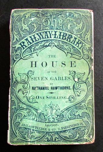
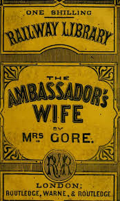
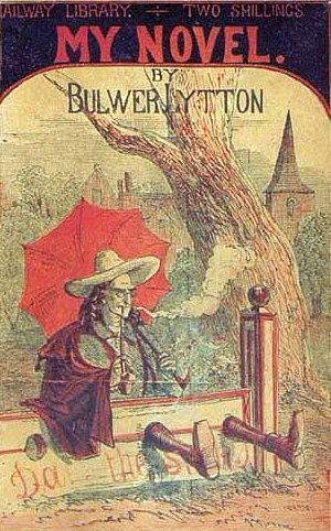
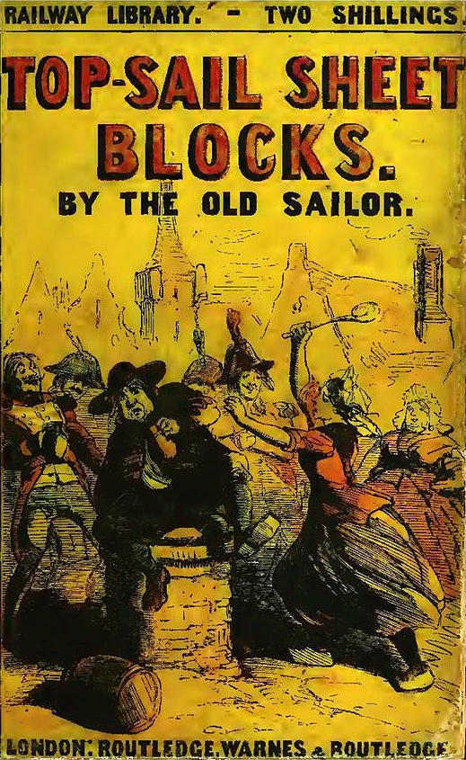
Some paperbacks are highly prized and collectible, particularly certain books which were only published in paperback format, or books from certain paperback publishers, such as Penguin, Albatross, Tauchnitz and Pan.
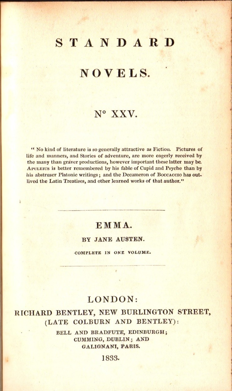
First editions

Everyone knows that first editions are very collectible and are often highly desired. But if you give this a little thought, it does require some explanation. One thing that you can be sure of is that every book that has ever been published has existed as a first edition. Indeed, the vast majority of books, once published in their first edition, have probably failed to sell sufficiently well, and so have never been  reprinted or re-issued! So why the importance of first editions?  Collectors will generally say that the first edition is the first appearance of the book and as the initial form of the book that the world ever sees, it has a particular power and importance beyond the raw text. They will also say that the first edition also represents the author’s freshest and new ideas and inventions. However, the first appearance of a book, which is strictly the first state of the first impression of the first edition ( I will explore these terms more in a following blog) in the original publisher’s binding and dust jacket will often contain errors (known in the book collecting world as points) that are most commonly introduced by the printer, but sometimes by the editor or the binder. Thus the earliest form of the book may not represent the author’s true intentions, and it may be later states that correctly reflect the text as presented in the author’s manuscript.

Bindings

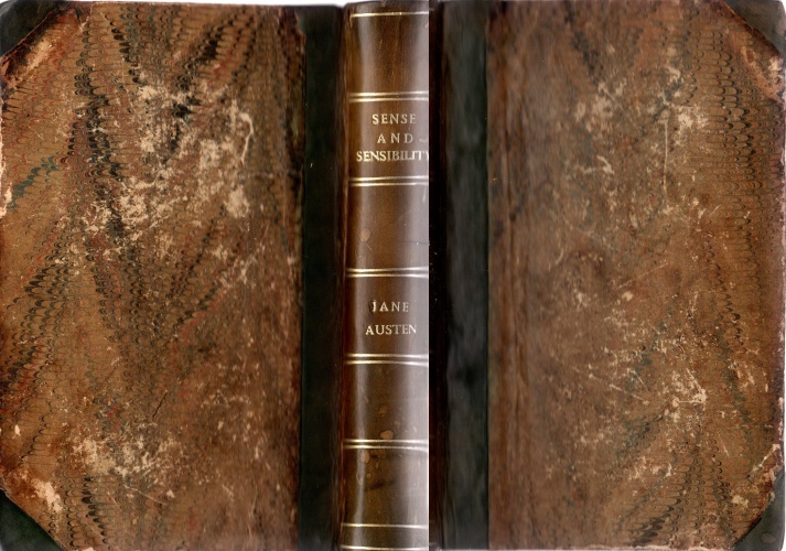
Generally, the original publisher’s binding of  a book is the most desired form. However, from the earliest times, it has been quite common for books to be given different bindings after their purchase, that are often more ornate and attractive than the publisher’s binding. Sometimes, particular book buyers or collectors had a preferred or personalised form of binding that they always applied to their books. Some private, public and school libraries also adopted this practice. From  early Victorian times, it was quite common to replace the publisher’s cloth binding with a half or quarter bound casing that used different leathers and boards, often with marbled end papers. On occasions, the publishers themselves produce a limited number of copies of a book that are bound in higher quality, more expensive bindings. 


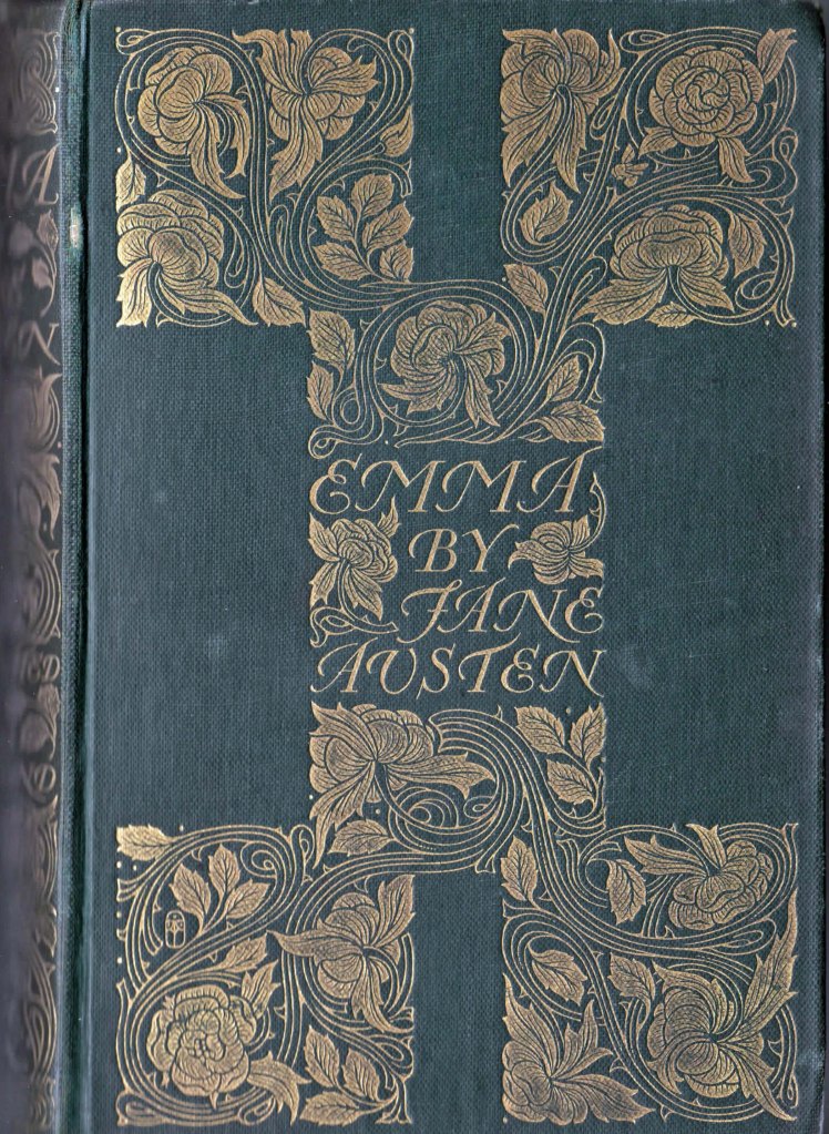
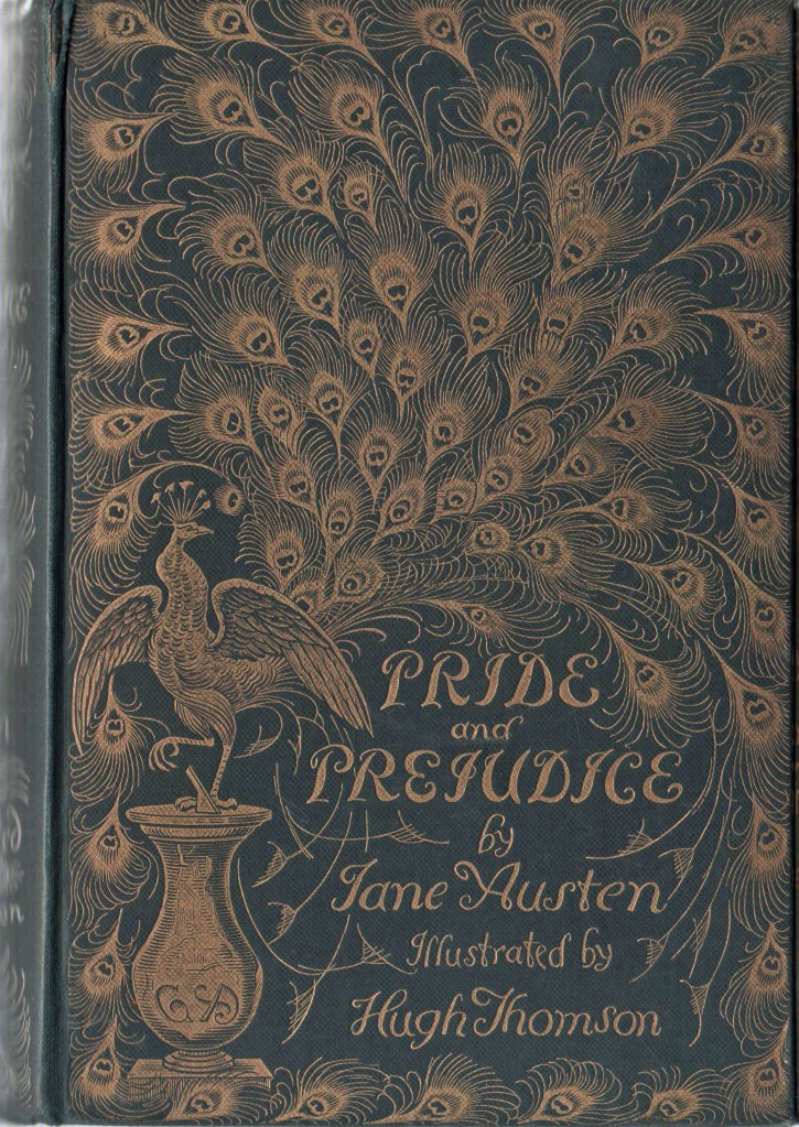
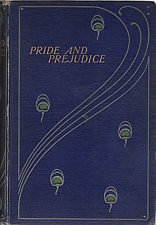
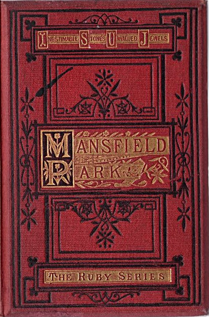
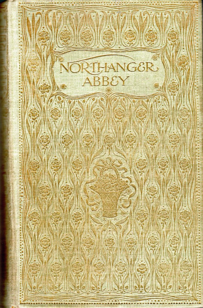
In mid to late Victorian times, many publishers adopted more highly decorated cloth styles, with the use of impressed or embossed gilt designs or coloured cloth decorations, sometimes on beveled or more elaborately incised boards. All of these superior Victorian cloth bindings are very collectible in their own right. In addition the cheap ‘yellowback’ bindings of crime and sensational novels of the late Victorian and Edwardian age are also now highly collected.

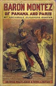
From the early years of the twentieth century, books were mostly bound in cloth which had become very plain and undecorated, particularly after World War One. As the cloth became plainer, so the dust jackets gradually became more highly decorated. In the Art Deco period, from the early-1920s until the end of the thirties, an expectation of elegantly decorated dust jackets began to become the norm for high quality books. For some crime fiction and thrillers, some of the dust jacket decorations became quite lurid and sensational. There are collectors out there for all of these. A few authors even designed their own dust jackets, Evelyn Waugh with ‘Vile Bodies‘ and Ian Fleming with ‘Moonraker‘ are two famous examples, and Len Deighton designed a few decorated Penguin covers in the 1960s.

Signed books

Names or signatures in books can add to their desirability. However, it does matter whose name and signature it is. ” To little Freddy  from Auntie Nell, Xmas 1984, XXX “, scrawled across the title page of any book with purple broad tip Texta pen will almost certain detract from the books desirability. 

However, a copy of the James Bond book ‘Dr No‘, neatly signed “Ian Fleming” on the end-paper would be desirable. If it were inscribed “Peter, here is my latest book; your brother Ian” it would probably be more desirable. If it were to be signed “to Sean Connery from Ian Fleming, loved your performance”, it would be very highly desirable. I’m sure that you get the idea.  Certainly a plain signature, probably written en masse for a bookstore appearance, is probably less desirable that a dedication to an unknown person, and certainly less desirable than a dedication to a famous person or a person who has some significant relationship to the book. 
Ownership signatures from famous, previous owners of the book, neatly written on an end-paper are also highly desirable. In this regard, a copy of Hitler’s “Mein Kampf”, with Sir Winston Churchill’s ownership signature would be desired by all collectors of war books or Churchilliana.

Bookplates

Bookplates are the often decorative labels pasted onto the end-papers of books to assert ownership. Many people had personalised bookplates designed for them and the presence of a discreet and tasteful book plate does not generally lessen the desirability of a book; if the bookplate is particularly well designed, or sufficiently grotesque  and unusual, or if it belonged to a famous or significant person, then it probably adds to the desirability of the book.

Content

Content is a fairly straight forward matter to consider in book collecting. By content, I mean the text and the illustrations (if any). 

Text

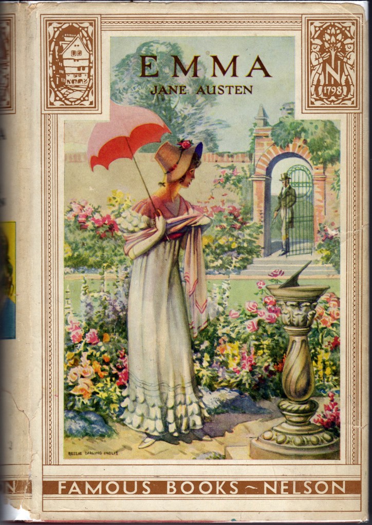
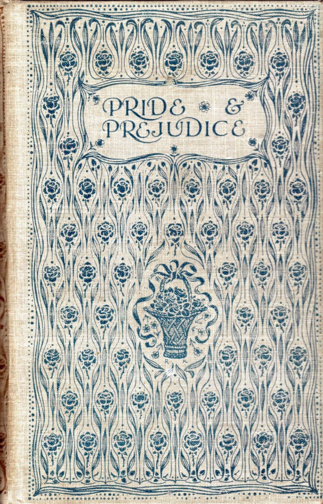
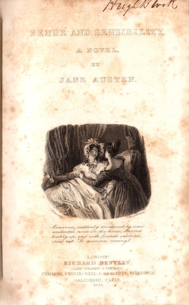
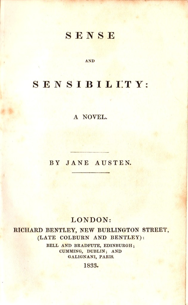
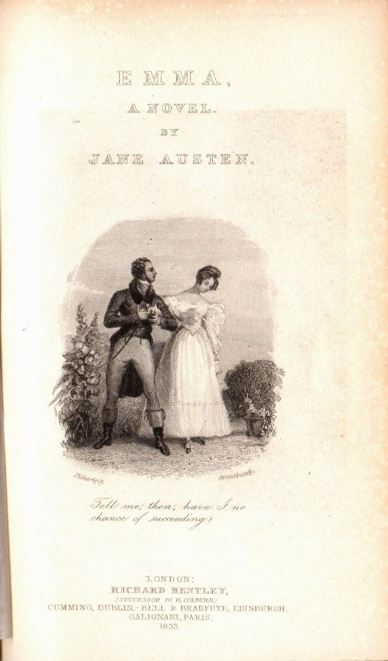
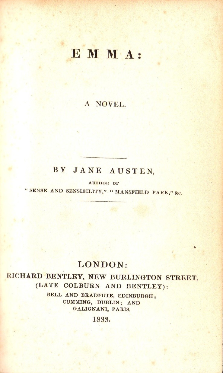
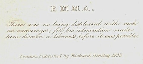
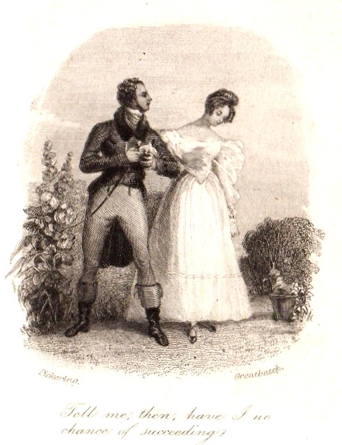
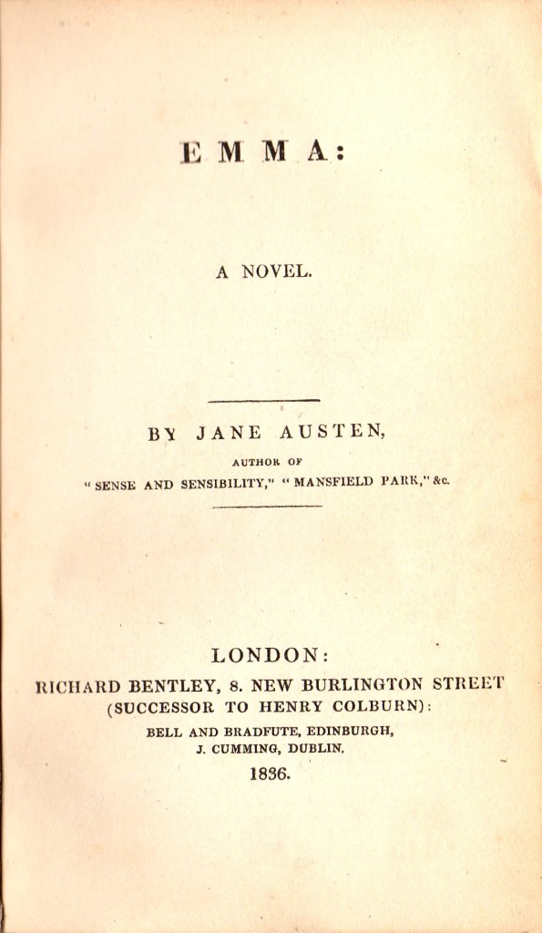
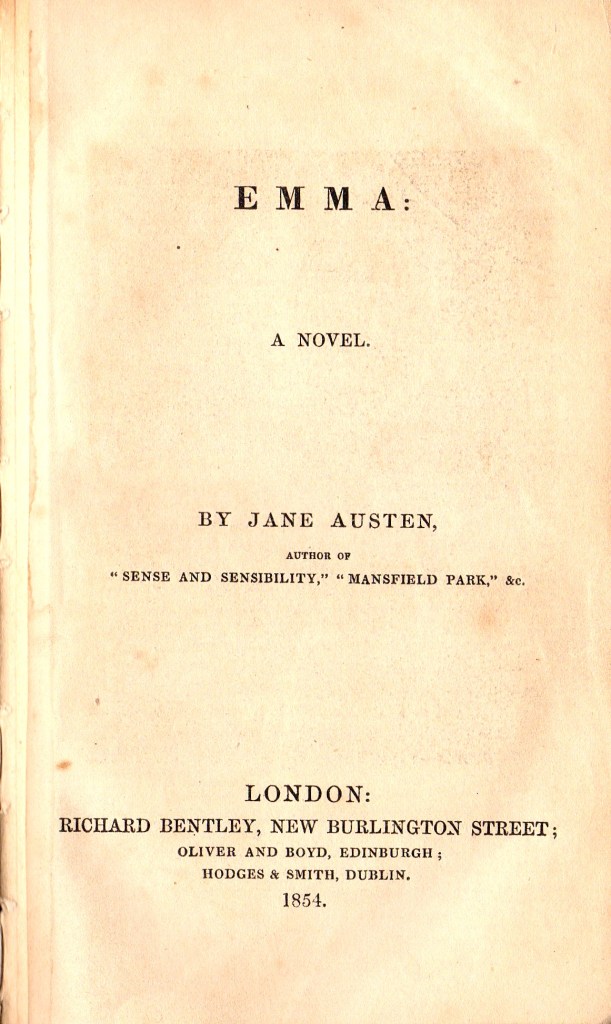
If the book is a classic or prize winning or ground-breaking work, then it will be intrinsically more desirable. For most authors, there are one or a few stand-out titles which are the most collected. For George Orwell for instance, I think that everyone would identify “Animal Farm” and “1984” as his most desirable books. On the other hand, almost anything by Charles Dickens, Jane Austen or the Brontes would be very desirable.
The nature of the text is also important. Most collectors prefer the detective fiction of Dorothy Sayers to her religious works; similarly, the Narnia books and the three space fiction novels of CS Lewis are more collected than his academic or religious books. Most collectors would rather have Rider Haggard’s “King Solomon’s Mines” or “She”, rather than his scarce first book, “Cetewayo and his White Neighbours”, or his later books on farming. 
Charles Darwin’s “On The Origin of Species” probably is a unique book in its profound impact on human ideas and life. Any copy of this text has some interest to collectors, from the first edition of 1859 down to the many modern reprints that have appeared since.
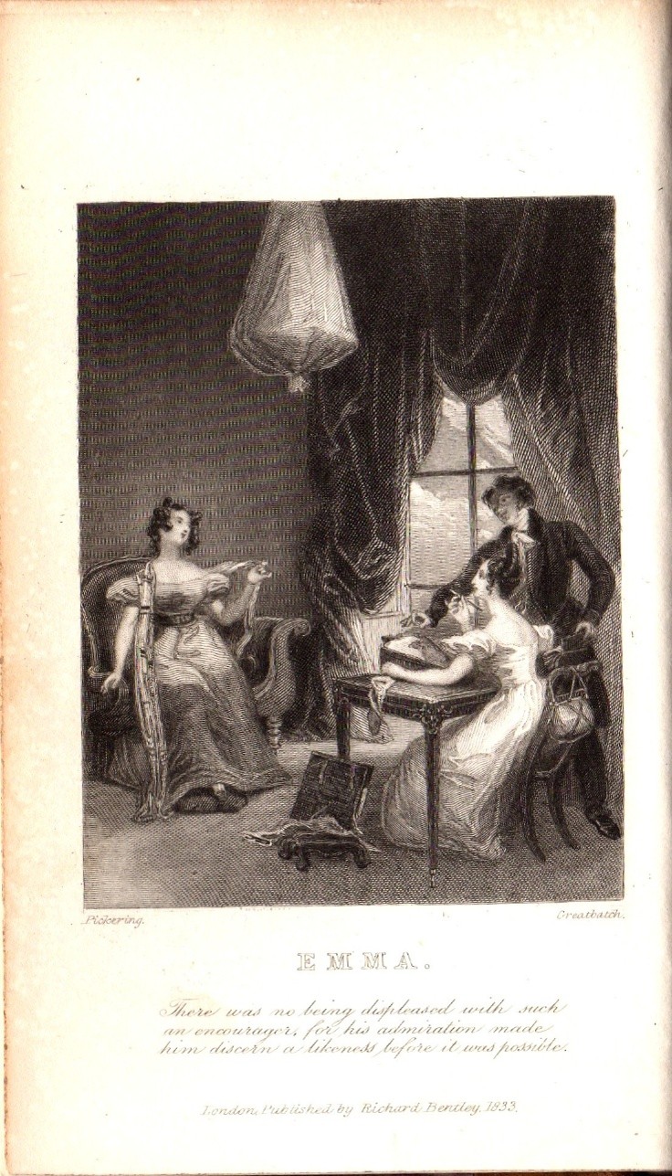
Illustration

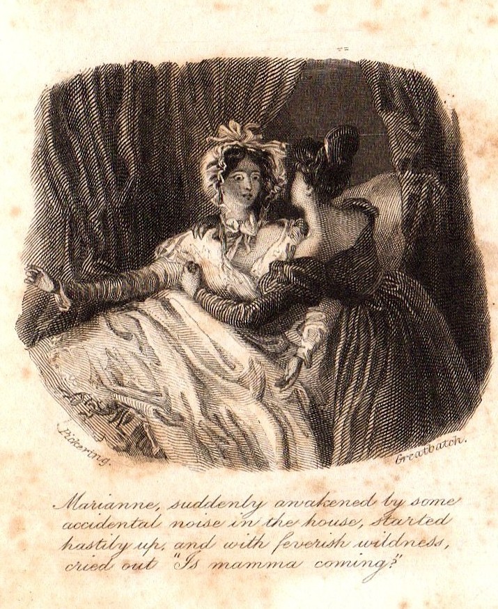
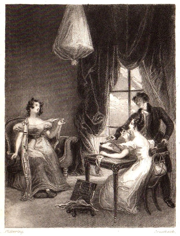
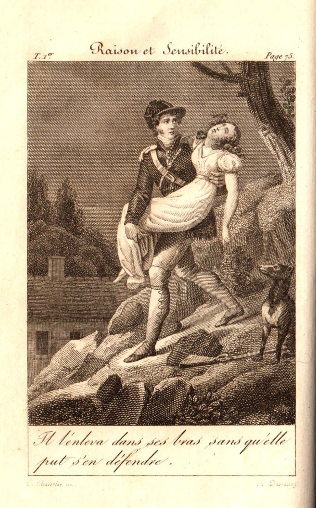
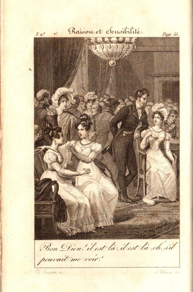
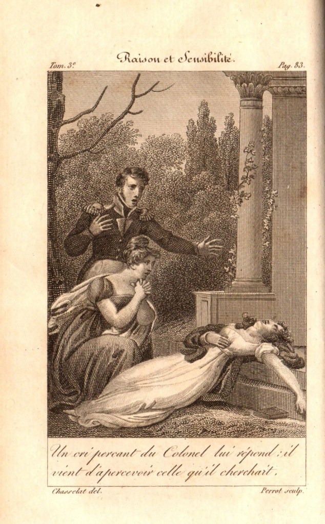
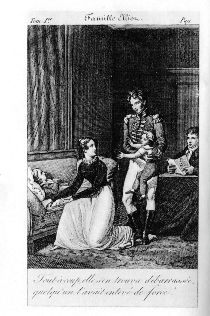
Illustrated books also have a content collectibility over and above the written text. Many books have been published in un-illustrated first editions, which, after the book’s success as text has been established, are re-issued in lavishly illustrated and finely bound editions that many collectors crave. For collectors of English books, the golden age of book illustration is generally held to be the period 1875 to 1914.
I personally have collected editions of the Alice books of Lewis Carroll illustrated by many illustrators over the last hundred years or so. Although the original illustrations in the first editions of 1865 and 1871 were famously and iconically created by Sir John Tenniel, many famous illustrators have produced wonderful illustrations since then. In a future blog, I will discuss these books and illustrations.

Rarity

Rarity is determined by a number of factors. Age is certainly one, and although old books are not necessarily highly collectible, there is no doubt that age will have an effect on survival of any book, and so will affect rarity.
The size of an edition is also a key factor. The first edition of the first book by an unknown author is usually published in very small numbers, as the publishers want to limit their risk of losses. If the book is successful, then the publisher can print more copies and issue new editions, according to the book’s popularity. Nowadays, if a film is made of the book, new editions are published to take advantage of the marketing of the film.
An interesting recent example of the first book phenomenon is offered by the Harry Potter books of J K Rowling. The first book in the series, “Harry Potter and the Philosopher’s stone” (1997), as the first book by an unknown author, was published in a standard small first UK hardback edition of 500 copies in laminated boards, along with a paperback edition of a few thousand books. 300 of the 500 hardbacks were sold to the English School Library system, where they will have been read to destruction, leaving only 200 copies for book collectors. These now attract massive prices, around $50,000, in specialist book auctions. Copies signed by Rowling will cost even more.
The second book “Harry Potter and the Chamber of Secrets” (1998) and third book “Harry Potter and the Prisoner of Azkaban” (1999) were both published in UK hardback first editions of about 10,000 copies each. These are also highly collected and quite expensive, generally costing around $1000 , depending on condition and issue, rising to $7500 if they are signed by the author.
By the fourth book “Harry Potter and the Goblet of Fire“, (2000), the Harry Potter phenomenon had well and truly taken off. The first UK hardback edition numbered one million books! Although these are still collectible, they are easy to find, and not very expensive. The same is true for the last three books, published in massive first editions and therefore relatively common and easy to find. Interestingly, the first UK hardback edition of the first James bond book “Casino Royale” (1953) is also very rare and highly desirable, due to a small edition being printed (about 4500 books), of which half went to the UK Public Library Service and were read to destruction… a similar story to the first Harry Potter book.

In a parallel story,  the first edition of Charles Darwin’s “On the Origin of Species“, was published by John Murray on 24th November 1859 in a first edition of only 1250 copies of which 1170 copies were available for sale. 500 of these were purchased by Mudie’s Library and all of the rest were pre-sold before publication, mainly due to the intense interest in the subject at the time. Many ended up in institutional libraries, so that the number of copies in private hands, which are those that tend to become available to the rare book trade, was very limited. A first edition can still sometimes be offered for sale in 2015, but it will cost around $250,000. A copy famously sold for around this price on the 150th anniversary of its publication in 2009.

Condition

Condition is the final factor that I will consider here. Book collectors want the best possible condition of any book that they want to collect. The book should ideally be complete, in the original binding and dust jacket, with no marks, tears, scribblings, sticky tape scars, water or light damage, library detritus or stains. It should ideally look like a brand new copy of the book on the day of issue, before it has been read.
This Ideal is not always attainable, and so the more scarce and desirable a book is, the more collectors will compromise on condition. Small stains and small repaired tears and creases in the dust jacket are often acceptable. All illustrations must be present in an illustrated book, but looseness of tipped-in illustrations can be acceptable and can be easily repaired. The title page must be present and all of the text must be present, but some people will accept the loss or disfigurement of the free front end paper (the blank page often found at the front of a book, before the title page). Looseness or defects in the binding, usually found in the “gutters”, the region where the pages are attached to the boards, are grudgingly acceptable to most, and the absence of tissue guards, the protective tissues for illustrations, particularly frontispieces are common and also generally acceptable.
Foxing, the appearance of brown stains due to a mould within the paper is common and also acceptable if not too severe. (A well known comical book on book collecting, illustrated by Ronald Searle, is famously titled “Slightly Foxed, but Still Desirable”, echoing the description often given in book dealer’s catalogues.)
Not surprisingly, the older a book is, the more damaged and worse for wear it is likely to be. Most collectors will accept this and take a pragmatic view of this issue. Thus I expect a much higher standard for my Terry Pratchett first editions, all of which were published after 1983, than my Charles Dickens first editions, all of which were published between 1834 and 1870.

Featured

Chris’s Book Blog Site

This is my attempt to create a web presence about Old and Rare Books and Book Collecting. It is an entirely personal viewpoint and represents my own views and tastes, and so will reflect my own collection and collecting interests. I will try to link to useful resources and devise original posts that may be of interest to some book collectors out there.

My collecting tastes are very catholic but are generally in the area of English and children’s literature from the 19th and 20th centuries. Wow, (I hear you say), that’s a huge scope. Yes it is, but I narrow it by collecting authors who I enjoy and like, books that I admire for their form as well as their content, and some particular areas of English writing, including some travel writing by favourite authors, and detective and crime fiction by authors who use this genre to explore particular times, places and cultures.

I am also an avid collector of Penguins, now going for 85 years. I will try to gather together here some useful information, ideas and sources for Penguin collectors.

1832 Sense and Sensibility: Gilson D1

Richard Bentley, London: New Burlington Street

For more background information of the Bentley editions of Jane Austen, please read the first few paragraphs of the article on Bentley edition of Emma, Gilson D2.

Sense and Sensibility, along with the other five novels of Jane Austen that had been published between 1811 and 1817, did not appear in a new English edition until Richard Bentley decided to reprint all of the Austen novels as “Standard Novels” in 1832. The first edition of Sense and Sensibility had been published in 1811 followed by the second edition in 1813, both published by Thomas Egerton in 3 volumes. Sense and Sensibility was published by Richard Bentley on 28th December 1932, for 6 shillings. Sense and Sensibility was numbered “XXIII” (23 ) in the Standard Novel series. It was the third edition of Sense and Sensibility to be published in the UK, the first single volume edition, the first edition to have any illustrations and the first to have Jane Austen’s name as author on the title page(s). Standard Novel XXIV (24) was a translation of Madame de Stael’s Corinne, which appeared on February 1st 1833. An announcement of the intended publication of Corrine by Bentley on this date appears on the verso of the series title page of Sense and Sensibility (Figure 1). Although the publication date of Sense and Sensibility was on 28th December 1832, Bentley printed 1833 on all of the dated pages, a common practice by publishers, who used this practice to extend the apparent currency or newness of their books.

Figure 1: (left) Series title page for Gilson D1 Bentley’s Sense and Sensibility 1832

Figure 1: (right) Verso of Series Title page showing announcement of Corinne.

In Figure 2, the two illustrations for the Bentley edition of Sense and Sensibility are presented as the frontispiece on the left and the engraved title page vignette on the right. They are both drawn by Ferdinand Pickering and engraved by William Greatbatch, as is the case for all of the illustrated Bentley editions of Jane Austen’s novels. The images show figures in costumes appropriate to 1832, rather than to the earlier period when the book was written. The frontispiece shows the incident from Chapter 22 of Volume 1, where Lucy Steele is showing the miniature of Edward Ferrars to Elinor Dashwood. The text under the image reads as follows: Then taking a small miniature from her pocket, she added “To prevent the possibility of a mistake, be so good as to look at this face.” This is a slight misquotation of the original text on page 133 which reads “possibility of mistake”.

Figure 2. Frontispiece (left) and vignette (right) illustrations from Gilson D1

The vignette on the right of Figure 2 shows Marianne Dashwood suddenly awakening, startled and arising from her sickbed, held by her sister Elinor (from Volume 3, Chapter 7). The text reads: Marianne suddenly awakened by some accidental noise in the house, started hastily up, and with feverish wildness, cried out “Is mamma coming?”

The full engraved title page and the letterpress title page are shown in Figure 3 below. Note that there are some small differences in the way that the publishers details are presented on these two pages. The dates on these pages shown in figures 1, 2 and 3 are all presented as 1833, rather than 1832. There is an inscription of a previous owner of the book, “Hugh Block”, on the top of the engraved title page.

Figure 3. The engraved (left) and printed title pages for Sense and Sensibility Gilson D1

Immediately following the printed title page, Bentley presents a “Memoir of Miss Austen” which is on the preliminary pages (v) to (xiv), that is p5 to p14 in roman numerals. The memoir is unsigned and dated October 5th 1832. It has been described elsewhere as by “the Rev. Mr. Austen”, which would have been the author’s brother Henry Austen. The first part of the Memoir is an edited and revised version of the “Biographical Notice” published by Murray as a preface to the posthumous edition of Northanger Abbey/Persuasion in 1817, which is itself dated December 13th 1817. This was also generally agreed to have been written by Rev. Henry Austen. The second part of the Memoir, running from the bottom of page (x) to page (xiv), pages 10-14), are taken from a review of Northanger Abbey/Persuasion published in the Quarterly Review of January 24th 1821.

The final page of the “Memoir” is a note from the editor of Gilson D1, presumably Richard Bentley himself, which announces that the other novels of Jane Austen will follow in the Standard Novels series. The editor also comments on the importance of Jane Austen, cites the related novels of Madam D’Arblay (Fanny Burney), Miss (Maria) Edgeworth, Mrs. Opie and Miss Porter, and praises Jane Austen for “the truth, spirit, ease and refined humour of her conversations” , and her ability “to make the veriest every-day person a character of great interest.”

Figure 4 show three pages from the “Memoir” section of Gilson D1.

Figure 4. Pages v, x and xi from the Memoir of Miss Austen

Richard Bentley arranged the text of Sense and Sensibility to correspond to the same chapter and volume arrangement as in the first and second editions. Accordingly, the book remains divided into 3 volumes, with Volume The First consisting of 22 chapters occupying pages 1-116; Volume the Second has 14 chapters running through pages 117-219 and Volume the Third also has 14 chapters running from page 220 to the final page 331. Throughout the book, most of the chapters do not start on a new page, and are separated by a simple centrally placed ruled line about half the width of the page. The chapters are numbered in large Roman numerals, whereas the page numbers are printed as Arabic numbers at the outer top corners of the pages. The first and last pages are shown in Figure 5 below.

Figure 5. Pages 1 and 331 of 1832 Bentley edition of Sense and Sensibility

Gilson D1, Sense and Sensibility, would have been originally bound in plum-coloured, glazed linen boards, with black labels on the spine which were printed in gold. This binding was used by Bentley for the Standard novels issued between 1831 and 1838, and is generally called Sadlier style 1. Examples of this can be seen in my copies of Mansfield Park (Gilson D3) and Northanger Abbey/Persuasion (Gilson D4). However, my copy of Sense and Sensibility has been rebound in marbled paper-covered boards, half-bound in green morocco with gilt labelling on the spine in two gold lined compartments (Figure 6) . The spine has faded from green to light brown. The binding looks mid-19th century, but has recently been rebound, with the addition of new yellow endpapers.

Figure 6. Binding of my copy of the Bentley edition of Sense and Sensibility.

Later reprints of Bentley’s Sense and Sensibility Gilson D1

The 1832 issue of Bentley’s first edition of Sense and Sensibility shown in this article is the only issue that I currently have of this Standard Novels edition, I do also have a copy of the 1856 issue, which is as a part of a set of The Novels of Miss Austen (Gilson D6). There are other known reprinted issues of Bentley’s Sense and Sensibility that appeared in 1837, 1846, 1853, and 1854 in the Standard Novels series, all designated Gilson D7, and a further reprinted set of Gilson D6 in 1866. A “New Edition” of Sense and Sensibility is published by Bentley in 1970 as Gilson D8. That is the subject of a separate article in this series.

Return to the Index page for Illustrated Editions of Jane Austen.

1833 Emma; 2nd UK edition

Richard Bentley, London, Gilson D2

The first edition of Emma, the fourth novel to be published by Jane Austen, was published in 3 volumes in December 1815 by John Murray. Like all of the first editions of Austen it was not illustrated. It was the first Austen title published by John Murray, following some dissatisfaction with Thomas Egerton, who had published the first three Austen novels. The first edition of Emma was issued as 2000 copies, which all sold within one year of publication. Following Jane Austen’s death on 18th July 1817, John Murray resisted efforts by the Austen family, notably the author’s brother Henry and sister Cassandra, to publish a second edition of Emma.

Richard Bentley (1794-1871) had been born into a distinguished family of three generations of printers and publishers. After initially working in partnership with his brother Samuel as “S. and R. Bentley” for ten years, Richard formed a new partnership with Henry Colburn in 1829. Colburn and Bentley had started to publish a series of cheap, illustrated reprints of English novels as “Colburn and Bentley’s Standard Novels” in 1831. They offered reprints of novels in a single volume for six shillings. Each volume had two illustrations, an engraved frontispiece illustration and an engraved title page which had a smaller “vignette” illustration. The first novel in the series was The Pilot by James Fennimore Cooper, published in February 1831 and the highlight of the early titles was Frankenstein by Mary Shelley published on 31st October 1831. After an acrimonious dissolution of the partnership in mid-1832, by which point 19 Standard Novels had been printed and published, Richard Bentley continued with his own series of “Standard Novels”.

Emma, along with the other five novels of Jane Austen that had been published between 1811 and 1817, did not appear in a new English edition until Richard Bentley decided to reprint all of the Austen novels as “Standard Novels” in 1832. Emma was published by Richard Bentley on 27th February 1833, following his purchase of the Austen copyrights from Cassandra Austen via Henry Austen. Emma was numbered “XXV” (25 ) in the Standard Novel series. It was the second edition of Emma to be published in the UK, the first single volume edition, the first edition to have any illustrations and the first to have Jane Austen’s name as author on the title page(s). It was the second of Austen’s novels to be published by Bentley, following Sense and Sensibility (Gilson D1), which was published as Standard Novel number XXIII (23) on 28th December 1932, although it was dated 1833. Standard Novel XXIV (24) was a translation of Madame de Stael’s Corinne, which appeared on February 1st 1833.

The format of Bentley’s Standard Novels was indeed standardised, so that each volume had a “series title page”, which identified it as a part of the Bentley’s Standard Novels series with a date of publication and a series number, a full page engraved frontispiece, an engraved title page, normally with an engraved date, and a letterpress or printed title page which had the title, authors name, Bentley’s name and address and a publication date. These four pages for first Bentley edition of Emma are shown in figure 1.

Figure 1. Series Title, Frontispiece, Engraved Title and Letterpress Title pages

Bentley published Emma in the same volume and chapter format as the original three volume first edition published by John Murray in December 1815. The novel starts with Emma | Volume the First | Chapter I. on page 1, and finishes Volume the First with the end of Chapter XVIII (18) on page 134 with the line “End of the First Volume”. Volume the Second begins with Chapter I of the second volume on page 135 and ends on page 279 at the end of Chapter XVIII (19) of the second volume, with the line “End of the Second Volume”. Volume the Third then begins on page 280 and the novel ends on page 435 with the last page of Chapter XIX (19) of Volume three with the simple words “The End”. By maintaining the volume and chapter structure of the first edition, Bentley has ensured that any sentence from any chapter of any book will be found in the same chapter and book in the Bentley edition as it was in the Murray first edition.

The book ends with the printer’s colophon on the verso of page 435. It reads “London: Printed by A. & R, Spottiswoode, New-street-Square.” on three lines. The only page missing from the Bentley edition of Emma is the dedication page that was included in the first edition of 1815, where Jane Austen dedicated Emma to the Prince Regent with these words: “To His Royal Highness, The Prince Regent, this work is, by His Royal Highness’s permission, most respectfully dedicated, by His Royal Highness’s dutiful and obedient humble servant, The Author.” It is not clear why Bentley chose not to include the dedication. It may be due to the fact that the Bentley edition of Emma was first published in 1833, in the reign of King William IV, younger brother and successor to the late, former Prince Regent, who had eventually reigned in his own right from 1820 to 1830 as King George IV. Perhaps respect to the present king outweighed respect to his predecessor.

Illustrations in Bentley’s 1833 edition of Emma

The two illustrations in this edition of Emma were drawn by Ferdinand Pickering (1810-1889) and engraved on wood by William Greatbatch (1802-1872). The identity of the artist had been uncertain for many years. The illustrations in Emma are clearly signed “Pickering”, which led David Gilson to suggest that they were by George Pickering (ca 1794-1857). However, other illustrations in the Standard Novel series that have many similarities of style to those in Emma are clearly signed “F. Pickering”, which has led to the corrected identification of Ferdinand Pickering as the artist. An enlarged version of the frontispiece is shown in Figure 2.

Figure 2. Frontispiece of Emma from Gilson D2.

The name “Pickering” can be clearly seen at the bottom left of the image and “Greatbatch” at the bottom right. The picture depicts Emma Woodhouse drawing a portrait of her friend Harriet Smith, while Mr. Elton is playing very close attention to Emma. The style of the costumes is from the 1830s rather than being correct for the late 18th century to Regency period. The legend of the frontispiece is shown below as Figure 3.

Figure 3. Text below the frontispiece of Emma

The text reads “There was no being displeased with such an encourager, for his admiration made him discern a likeness before it was possible.” It is a direct quotation from Chapter 6 of Emma. Mr. Elton is lavishing praise on Emma, who he greatly admires, despite Emma’s attempts to deflect his attentions to Harriet. The final line in a smaller font reads “London, Published by Richard Bentley. 1833.” This is the publisher asserting his ownership of the copyright of the image, which he commissioned from Pickering and Greatbatch.

The engraved title page, together with an enlarged picture of the illustration, are shown below in Figure 4.

Figure 4. Engraved title page and vignette image from Emma

The engraved title page announces at the top that this is “EMMA. | A NOVEL. | BY | JANE AUSTEN.”. At the bottom of the page the publishers details are given thus: LONDON | RICHARD BENTLEY | (SUCESSOR TO H. COLBURN) | CUMMING, DUBLIN BELL & BRADFUTE, EDINBURGH | GALIGNANI, PARIS | 1833 . In the vignette, in the right hand panel, we see Emma out walking with Mr. Knightley, who has just declared his love for her. He then asks her “Tell me, then, have I no chance of succeeding?” which is the text below the image. This is taken directly from Chapter 49 of Emma. You can also see the names of Pickering and Greatbatch on the left and right lower corners of the image.

Reprints of the Bentley 1833 edition of Emma (Gilson D7)

Bentley’s edition of Emma was reprinted several times in the subsequent 35 years. Stereotype plates were created and used for reprints of Emma (Gilson D2) for the Standard Novels series that were published in 1836, 1841, 1851, and 1854. Emma was also reprinted as a part of five volume sets of “The Novels of Miss Austen” that were published in 1833, 1853, 1856 and 1866. All of the reprinted Bentley editions of the Austen novels were designated D7 by David Gilson. I have copies of the 1833, 1836 and 1854 issues of Emma and of the 1856 five volume set of the six novels. In Figure 5 below, I show the printed title pages for my Emma editions of 1836, 1854 and 1856. As well as having a different date from the 1833 edition, these are differences in the page layout, Bentley’s address and the Edinburgh and Dublin publisher’s details.

Figure 5. Emma Title pages from Gilson D7 editions of 1836, 1854 and 1856

All these three reprinted editions also contain the original engraved frontispiece from 1833. The 1836 and 1856 editions also contain the engraved title page that was first published in the 1833 edition, shown in Figure 1 above. The engraved pages all still show the date 1833.

The two Standard Novel reprints of 1836 and 1854 do not have a series title page, whereas the 1856 reprint from The Novels of Miss Austen set has a half title which just bears the single word “EMMA”. The page and chapter layout for the three reprinted editions are all identical to that of the 1833 first Bentley edition. However, the printers colophons on the verso of page 435 are all different from the 1833 edition. All editions have “London:” on the first line and “New-street-Square” on the third line but are all different in the second line. These are shown below.

  • 1833 edition: Printed by A.& R. Spottiswoode,
  • 1836 edition: Printed by A. Spotiswoode,
  • 1854 edition: A. & G. A. Spottiswoode,
  • 1856 edition: Printed by Spottiswoode and Co.,

Provenance of my Bentley Emma edition of 1854

In Figure 6 below, the front endpapers of my 1854 Bentley edition of Emma are shown. They show the provenance of this book in more recent years.

Figure 6. Front endpapers of my 1854 copy of Emma (Gilson D7)

The most obvious and prominent feature in Figure 6 is the bookplate of David John Gilson on the front pastedown. This is the Gilson who compiled the standard bibliography of Jane Austen and its is an absolute privilege for me to have this copy in my Austen collection. Gilson actually mentions this copy on page 229 of the Oak Knoll Press second edition of A Bibliography of Jane Austen. Above the Gilson bookplate there is an inscription in pencil which reads: ” D7: 1854 | Given to me by | David G | 3/8/85″. This was written by Gilson’s friend John Jordan, whose bookplate is on the lower right of the free front endpaper. The two other inscriptions are: “T. Lindsay, 1914″, doubtless a previous owner of the book, and the lower line which reads ” Rebound: Ferney-Voltaire; 1953″. The book is bound in an obviously 20th century ivory textured cloth binding.

Ferney-Voltaire is a small commune of around 10,000 in south-eastern France, close to the Swiss border. It was the residence of Voltaire from 1758-1778 and his Chateau can still be visited there. As well as the Voltaire museum in the Chateau Voltaire, there is a small workshop and museum of printing and bookbinding in Ferney-Voltaire called Atelier du Livre. It is currently run by an Englishman, Andrew Brown. This may be where the 1854 Emma was rebound in 1953, by a previous owner.

Return to the Index page for Illustrated Editions of Jane Austen.

1828 Raison et Sensibilité.

Published by Arthus Bertrand Paris. 2nd ed. 3 vols. Gilson C8

Illustrated by Charles-Abraham Chasselat

The first French edition of a Jane Austen novel to appear was Raison et Sensibilité, translated from Sense and Sensibility by Mme Isabelle de Montelieu and published in Paris by Arthus Bertrand in 1815 in four volumes. It did not have any illustrations. There is no mention of this translation in any of Jane Austen’s letters, so one might conclude that she was not aware of it.

A second French edition of Raison et Sensibilité was published by Bertrand in Paris dated 1828. It is possible that this second edition was published in December 1827. This time, the Raison et Sensibilité, now published in three volumes, had a frontispiece in each of the three volumes. This is the first illustrated edition of Sense and Sensibility to be published anywhere. The illustrator for all three images was Charles-Abraham Chasselat, just as in the 1821 edition of La Famille Elliot described in a related article. The engraver was Auguste Delvaux for volumes 1 and 2, and then Jean-Simon-Narcisse Perrot (born 1796) for volume 3. The three frontispiece illustrations for Raison et Sensibilité are shown below in Figure 1.

Figure 1. Frontispieces for volumes 1,2 and 3 of Raison et Sensibilité

In volume 1 (Fig. 1 left), the picture shows Willoughby carrying Marianne back down the hill to safety, after she had twisted her ankle. The text below the image reads “Il l’enleva dans ses bras sans qu’elle put s’en défendre“, which can be translated as “He took her into his arms without her being able to defend herself” , which seems somewhat at odds with Austen’s description of the event. She also appears to have fainted in this picture.

In volume 2 (Fig. 1 centre), the scene is at a party in London, some while after Willoughby has “dumped” Marianne. She sees him across the room and exclaims, according to the figure legend. “Bien Dieu! il est là, ll est là, oh! s’il pouvait me voir!” This is not too far removed from Austen’s original text which read “‘Good heavens!’ she exclaimed, ‘he is there-he is there-Oh! why does he not look at me?” Elinor, who is seated next to Marianne tries to calm her down and prevent an embarrassing scene.

In volume 3 (Fig. 1 right), the picture shows Elinor and Colonel Brandon, who have found Marianne, who has rather melodramatically fainted by a small classical temple. The text reads “Un en’ percant du Colonel lui répend: il vient d’apercevoir celle qu’il cherchait”. This translates to something like “A piercing message from the Colonel answers him: he has just seen the one he was looking for.”

Readers, you will search in vain for this incident in Jane Austen’s Sense and Sensibility, as it simply does not occur. My view is that Mme. de Montolieu has added in this scene as a counterbalance to the rescue of Marianne by Willoughby shown in the left hand panel. In a way, it can be seen as validating Colonel Brandon as a suitor for Marianne, who is thus seen to be at least as gallant as Willoughby.

There are many other changes in the text, and the whole plot is rather distilled down to an account of the romantic tribulations of Marianne and her infatuation with Willoughby; Elinor and Edward Ferrars hardly get a look in, and Margaret, the third and youngest Dashwood sister, is virtually ignored and renamed “Emma”. Mme. de Montolieu gave her Raison et Sensibilité the subtitle “ou les deux manières d’aimer“, translated perhaps as “or the two ways of loving”. Those familiar with Sense and Sensibility might expect that this refers to the difference in approaches to romance of Marianne and Elinor, but for Mme. de Montolieu, I fear it represents the differences between Willoughby and Colonel Brandon.

Return to the Index page for Illustrated Editions of Jane Austen.

1821 La Famille Elliot.

First Illustrated Austen Novel

Published by Arthus Bertrand, Paris. 2 vols. Gilson C12

Illustrated by Charles-Abraham Chasselat

It seems ironic that the first illustrated edition of any novel by Jane Austen, that most English of authors, was published in France, but here it is. The first editions of the canonic six great novels of Jane Austen were published in London between 1811 and 1817 without any illustrations. Following Austen’s death in July 1817 and the posthumous publication of Northanger Abbey and Persuasion by John Murray in December 1817, there were no further editions of Austen’s novels published in Britain for 15 years. However in 1821, four years after the author’s death, a French translation of Persuasion was published by Arthus Bertrand in Paris in two volumes, under the title “La Famille Elliot” which translates to “The Elliot Family” in English. Each volume has a frontispiece illustration by Charles-Abraham Chasselat (1782-1843), a well-known painter of historical subjects, who also illustrated books by Voltaire, Racine and Moliere. The engraver of these frontispieces is given as “Delvaux”, which was Auguste Delvaux, (1786-1836), who was one of a pair of brothers, both of whom were fine engravers. Figure 1 shows the title page from volume 1 and the two frontispieces from La Famille Elliot.

Figure 1. Title page of Vol. 1 (left), frontispieces of Vol. 1 (centre) and Vol. 2 (right).

The title page headings read as follows (in French followed by English):

La Famille Elliot ou L’Ancienne Inclination. —– The Elliot Family or The Old Inclination

Traduction Libre de L’Anglais ———- Free Translation from English

D’Un Roman Posthume de Miss Jane Austen ——-From a posthumous novel by Jane Austen

Par Mme de Montolieu —— By Madame (Isabelle) de Montolieu.

This 1821 edition of a translation of Jane Austen’s Persuasion is not only the first Austen novel to have any illustrations; it is also the first time that the name “Jane Austen” is printed on the title page of any of her novels.

The translator, Madame de Montolieu had been born Jeanne-Isabelle-Pauline Polier de Botten in Lausanne in the French speaking part of Switzerland in 1751. After her first husband, Benjamin de Crousaz, has died in 1775, the year of Jane Austen’s birth, she remarried Baron Louis de Montolieu in 1786. After the baron died in 1800, she lived on for more than 30 years as a widow, publishing under the names Madame de Montolieu, Isabelle de Montolieu or La Baronne Isabelle de Montolieu, until her death in 1832. Her other translation of an Austen novel was Raison et Sensibilité, which was also published by Arthus Bertrand in Paris in 1815. This four volume edition was not illustrated, but a second edition in three volumes was published in 1828 with three frontispieces by the same illustrator as La Famille Elliot.

Legends for the two Frontispieces

The frontispiece to Volume One of La Famille Elliot has a text caption below the image which identifies the incident depicted. It reads: “Tout à coup elle s’en trouva debarrasseé, quelqu’ un l’avait enlevé de force.” This can be translated as: “Suddenly she found herself free of him; someone had taken him by force.” This refers to an incident where Anne Elliot is consoling her nephew Charles Musgrove, who is ill, but while she is trying to do this, Charles’ younger brother Walter Musgrove is climbing all over Anne’s back to get some attention, and is making a nuisance of himself. Captain Wentworth removes Walter Musgrove from Anne Elliot’s back. (Persuasion, Vol 1, Chapter IX p80.) This incident demonstrates the protective care that Wentworth feels that he should offer the young woman who he admires.

The frontispiece to Volume Two of La Famille Elliot also has a text caption below the image which identifies the incident depicted. It reads: “Il s’approcha de la table, montre la lettre à Alice, et sortit sans dire un mot!” This is easily translated to “He walked over to the table, showed Alice the letter, and left without saying a word!” This is the incident towards the end of the story, where Captain Wentworth presents a letter to Anne Elliot to explain his feelings (Persuasion, Vol 2, Chapter XI, p. 236).

You will note that the text refers to Anne Elliot as “Alice”. For some reason, the only name that Mme. de Montolieu alters in the book is Anne Elliot, who she renames Alice Elliot. Ironically, the translator has chanced upon the correct title for the book, as we learn from Jane Austen’s letters, published more than 50 years after the death of Mme. de Montolieu, that her working name for Persuasion was “The Elliot Family.” The name Persuasion was almost certainly coined by Jane Austen’s brother Henry Austen, who arranged the posthumous publication of the text by John Murray in 1817.

La Famille Elliot was reissued by Arthus Bertrand in 1828 in a complete edition of the works of Mme. de Montolieu. The text and illustrations were retained from the 1821 edition.

Return to the Index page for Illustrated Editions of Jane Austen.

Illustrated editions of Jane Austen

A summary and list

The following articles will be an detailed account of the most important and most attractive illustrated editions of the novels of Jane Austen. In this first part, I will simply list the editions that will be covered and give a brief summary of the illustrator and the edition. These editions will be listed in the order of first publication. This page will therefore be an index page for the following pages as they are developed. I will mostly focus on English editions, but there will be some notable exceptions. For every book that I cover, a reference will be given from the second revised 1997 edition of the magisterial bibliography of Jane Austen published by the late David Gilson, in the form of a “Gilson number” (eg. “Gilson D1”, which refers to the first Bentley edition of Sense and Sensibility published in December 1832). Each of the individual articles will present many examples of the illustrations, scanned from my own copies where possible. Where there are illustrated dust wrappers, I will show these as well.

In the Beginning…

None of the first English or American editions of the Austen novels were illustrated, so the story of illustrated editions of Austen begins surprisingly in France. The first French edition of a Jane Austen novel to appear was Raison et Sensibilité, translated from Sense and Sensibility by Mme Isabelle de Montelieu and published in Paris by Arthus Bertrand in 1815 in four volumes. It did not have any illustrations. The second French edition to appear was La Famille Elliot, translated by Mme de Montelieu from Persuasion and published by Arthus Bertrand in two volumes in 1821. It had two illustrations, a frontispiece to each volume. This is the first edition of any Austen novel to have any illustrations. Second editions of both of these books were published by Bertrand in Paris in 1828. This time, the Raison et Sensibilité (in three volumes) had a frontispiece in each of the three volumes. The two illustrations from the 1821 edition of La Famille Elliot were reissued in the 1828 second edition.

My listing of the illustrated editions of the Jane Austen Novels therefore begins with these two entries:

The next Austen novels to be published with illustrations were the individual volumes and the five volume set offered by Richard Bentley with frontispieces and title page vignettes:

These were the first English illustrated editions of Jane Austen’s novels. The novels were reprinted many times before being reissued in a new edition by Bentley starting in 1870. The details of the reprints and the second Bentley edition of 1870 will be given in the individual articles.

The first Austen novel to have illustrations throughout the text block was the edition of Mansfield Park published by Richard Groombridge and Sons in 1875. It had 7 full page illustrations engraved from pictures by A.F. Lydon.

More books will be added to the list as new articles are developed.

Keep watching.

1875 Mansfield Park.

Published by Groombridge and Sons, London. Gilson E43

Illustrated by Andrew Francis Lydon.

The First Illustrated edition of Mansfield Park

Mansfield Park by Jane Austen was first published in 1814 by T. Egerton as a three volume novel. A second edition, also in three volumes, was published in 1816 by John Murray. Neither of these two editions had any illustrations. The next edition to be published was a single volume edition published in 1833 by Richard Bentley (Gilson D3). It had an engraved frontispiece and an engraved title page with a vignette illustration. Technically, the Bentley edition is the first edition of Mansfield Park to have any illustrations, but in most collector’s opinions this would not count as an illustrated edition, as there are no illustrations either embedded or interleaved in the text.

Several other editions of Mansfield Park were published following the Bentley edition, particularly editions by Simms and M’Intyre (1846), Routledge (1857), Derby and Jackson (1857), Ticknor and Fields (1863) and Tauchnitz (1867). None of these were illustrated, even with a frontispiece.

The first illustrated edition of Mansfield Park was an undated edition published by Groombridge and Sons, 5 Paternoster Row, London. It is generally accepted that this edition was published in October 1875. The book contains 7 full-page engraved illustrations of drawings by Andrew Francis Lydon. Not only is this the first edition of Mansfield Park with a set of illustrations, it is the first edition of any Jane Austen novel to be published in English with a set of illustrations. The top board, engraved title page and letterpress title page of my copy of the Groombridge Mansfield Park are shown in Figure 1 below. Note the unusual rendering of “a” in the engraved page.

A F Lydon, the illustrator and B Fawcett, the printer

The seven illustrations were all engraved by the firm of Benjamin Fawcett (1808-1893), a fine printer and engraver, from original drawings by Alexander Francis Lydon (1836-1917), an Anglo-Irish watercolourist and engraver. The pictures are all signed “A F Lydon” as the artist, but they also have small and indistinct second signatures or marks by the individual engravers. This is underlined by the statement on the printed title page “Illustrated from Drawings by A.F.Lydon”. Indeed, much of the firm’s work was engraved by Benjamin Fawcett himself. Lydon was in fact an employee of Benjamin Fawcett (1808-1893), and had served his appenticeship as an engraver with Fawcett. This was mutually convenient as Driffield, a town in East Yorkshire, was both Lydon’s family home and the site of Fawcett’s business. There is a modern pub in Driffield today called “The Benjamin Fawcett”.

Lydon and Fawcett worked together over many years to produce mainly illustrations of wildlife, landscapes or architectural subjects. Lydon excelled in fine watercolour paintings of birds and plants, and also of grand houses in landscaped parks.

The binding is a standard one used by Groombridge and Sons for some of their published fiction. The last page of the text block of my Groombridge edition of Mansfield Park is numbered 440, and bears the name of the printer, “B Fawcett, Engraver and Printer, Driffield.” The page height is 18.7 cm. These three characteristics all support the idea that this edition was printed de novo, rather than being a reprint of an earlier known edition, as no other known edition of Mansfield Park fits this description. David Gilson gives this book the designation E43 in his A Bibliography of Jane Austen, where he reports a publication date of October 1875, derived from the English Catalogue of Books. WorldCat also gives the date 1975, which comes from the deposit copy held by the British Library, the only copy listed on WorldCat. This is a very rare book, which means that few people have seen the illustrations. I will show all seven on them in the following section.

The Lydon illustrations for Mansfield Park

The illustrations for the Groombridge edition of Mansfield Park are all black and white printings of finely executed engravings on woodblocks of line drawings by Lydon. Several of them show off the artist’s skill in landscapes. This starts with the frontispiece, shown below in Figure 2.

Black and white picture of woman in woods viewing a distant house.
Figure 2. Frontispiece to Mansfield Park

This shows the heroine, Fanny Price, looking back towards the riding party of Edmund Bertram and Miss Crawford in front of the house at Mansfield Park. The incident is from chapter 7. Lydon’s expertise in the depiction of landscape is very much to the fore in this design.

The second illustration (Figure 3, left) shows an incident from chapter 9, where Fanny, Edmund and Miss Crawford have rested on a seat during a walk in the woods. Edmund and Miss Crawford then walk on together to the end of the wood, leaving Fanny still on the seat to watch them disappear together down the path.

The illustration shown on the right of Figure 3 depicts Edmund explaining to Fanny his concerns about the propriety of the amateur dramatics that the house party is engaged in.

In the next illustration (Figure 4), which is from chapter 25, we return to Lydon’s love of landscape as he depicts Henry Crawford’s story of stumbling across the village of Thornton Lacey, his promised living, while walking his lame horse back to Mansfield Park.

Figure 4 Henry Crawford views Thornton Lacey.

In the next illustration (Figure 5 left), taken from chapter 35, we see Edmund and Fanny walking together arm in arm as Edmund tries to find out what feelings she might have for Henry Crawford. In Figure 5 (right), we have moved on to chapter 41, where Henry Crawford is talking about his future prospects to Fanny Price at Portsmouth docks, rather wishing that Fanny’s younger sister, Susan, was not present.

The final illustration, shown in Figure 6 below, comes from an event in chapter 46, when Fanny, accompanied by her excited sister Susan and a nervous Edmund Bertram, returns to Mansfield Park by carriage from Portsmouth. This picture shows off Lydon’s facility in drawing country houses and landscaped grounds.

Figure 6 Fanny’s return to Mansfield Park

These seven drawings give an interesting view of an Austen novel through the eyes of a landscape and wildlife artist. Although the clothes depicted are decidedly from the 1860s and 1870s rather than Regency period, the drawings offer an interesting contrast to the classic illustrations of Austen by some other illustrators, whom tended to concentrate on fine drawings of interiors, with accurate depictions of costume, manners and decor of paramount importance.

This is the only novel of Jane Austen known to be illustrated by A. F. Lydon.

A few comments on the publisher, Groombridge and Sons

Richard Groombridge started as a publisher in 1833, when he operated out of his home, 6 Panyer Alley, using the imprint of Richard Groombridge or R. Groombridge. Four of his sons served as his apprentices and joined the firm to work as publishers and booksellers. In 1845, when his two eldest sons were 28 and 25 years old respectively, the imprint of the firm was changed to “Groombridge and Sons”, usually followed by “5, Paternoster Row” on the title page. Following Richard Groombridge’s death in 1855 the firm was run jointly by the two oldest sons. Sadly, the three oldest sons all died between 1860 and 1868, leaving the youngest, Charles Groombridge, as the last surviving son of the founder. He seems to have lost interest in publishing sometime during the 1860s, and by the 1870s, the firm was run by three grandsons of Richard Groombridge until it ceased to trade sometime around 1900.

R. Groombridge and Groombridge and Sons were best known as publishers of books on religion, agriculture and natural history, although they did also reprint several of the novels of Grace Aguilar (1816-1847), a popular writer on themes of Jewish history and religion. The Groombridges worked closely with Benjamin Fawcett, publishing many of his finely illustrated books between 1844 and 1890.

It is not known why Groombridge and Sons decided to publish an illustrated edition of Mansfield Park in 1875. It is even possible that the genesis of the book came from the printer, Benjamin Fawcett or the illustrator A F Lydon. We shall probably never know. For more details about the Groombridge family of publishers, read my Groombridge, Publishers page.

Return to the Index page for Illustrated Editions of Jane Austen.

The Routledge and Warne publishing families: Part 4

The start of Routledge’s Railway Library

George Routledge continued to operate as a publisher at 36 Soho Square through the mid 1840s, and published an eclectic mixture of titles, mainly reprints of English and American fiction and non-fiction. He continued to publish the very successful biblical commentaries of the American Reverend Barnes that he had started selling in the early 1840s. He introduced the world at large to the unconventional, socially-concerned fiction of Henry Cockton (1807-1853), by reprinting “The Life and Adventures of Valentine Fox, the Ventriloquist”, an expose of the parlous state of British mental asylums and lunacy laws, first published in 1840, and “The Life and Adventures of George St. Julien, the Prince of Swindlers” (1841). Both were first reprinted by Routledge in 1844. He was probably able to publish these books because of the bankruptcy of Cockton in 1842. Routledge continued to publish reprints of “Valentine Fox” for many years, and more than 400,000 copies of this now mostly forgotten title were published by the end of the 19th century.

Most of the Routledge reprints of Cockton’s books reproduced the illustrations by Thomas Onwhyn from the first editions. Onwhyn had gained notoriety following his publication of pirated versions of Charles Dickens’ Pickwick Papers and Nicholas Nickleby containing his own illustrations; Dickens famously complained of “the singular vileness of the illustrations.”

Routledge also published reprints of some of the novels of William Harrison Ainsworth during this period. Ainsworth, a friend and collaborator of Dickens, had come to the public’s notice with the publication by Richard Bentley of his first novel, “Rookwood”, in 1834. Just as with Cockton, Routledge republished Ainsworth’s novels with their original illustrations, many of which were by Dickens’ main illustrators, Cruikshank and “Phiz”.

George Cruikshank illustration from Ainsworth’s “The Tower of London” reprinted by Routledge

By the end of the 1840s, Routledge was trying to find a better way of publishing his reprints. He had noticed the reprinted novels published by Simms and McIntyre in Belfast in 1846 under the series title of “The Parlour Novels”, which in 1847 became “The Parlour Library”. These were low-price publications in attractive embossed cloth bindings. Routledge used to travel around the country selling his own books directly to provincial booksellers. He started doing this by stagecoach, but by the mid to late 1840s he travelled on the rapidly-developing British railway system, which had become both extensive and cheap in the period 1835-1845. During these journeys, he noticed the growing popularity of reading on trains, an activity which had become possible due to the much smoother ride that the railway offered, compared to the stagecoach.

Routledge put these two observations together and decided to produce high quality but low-cost reprints, specifically targeted at the growing population of railway travellers. This became Routledge’s Railway Library, which was launched in 1849. The books were mainly sold by the bookseller W.H. Smith, who had developed the first bookstalls in British railway stations in 1848. Routledge’s Railway Library was a huge success, and although it was soon copied by other publishers, it was the financial making of George Routledge. The series was launched with about a dozen titles available in 1849. By 1898, when the series ended, more than 1270 titles had been published in the Routledge Railway Library series.

The changing styles of the card-bound books issued as part of the Railway Library over its first fifteen years are illustrated above. The left-hand panel shows James Fenimore Cooper’s “The Pilot”, published in 1849 as the first book in the series. The British copyright for Fenimore Cooper was held by Richard Bentley at this time, but Routledge ignored this, and in fact published six Fenimore Cooper titles in his first ten Railway Library books. Later on, after the success of the Railway Library had been assured, Routledge belatedly paid Bentley his royalties for the copyright infringements, and entered into an arrangement with Bentley to reprint thirty-six of Bentley’s Standard Novels as Routledge’s Standard Novels, a series that ran from 1851 to 1860.

The middle panel shows another American book, this time by Nathaniel Hawthorne, reprinted by Routledge in the Railway Library series in 1852. You can see that by this time, the success of the Railway Library had allowed Routledge to move his publishing business to 2 Farringdon Street, a much better address than 36 Soho Square, although Soho Square remained the family home until the late 1850s. The business move to Farringdon St. happened in the second half of 1851.

In the right-hand panel, we can see that by 1863, the firm had matured into Routledge, Warne and Routledge, by the inclusion into the partnership of George Routledge’s brother in law, Frederick Warne, and Routledge’s eldest son Robert Warne Routledge. The firm was still operating at 2 Farringdon Street at this time, and the book shown is by an English author, Mrs. Catherine Gore, who was one of the most prolific and popular writers of the 19th century. Her obituary in The Times in 1861 described her as “the best novel writer of her class and the wittiest woman of her age.”

Note that the price of the Railway Library books had been kept at one shilling for all three of these books issued over a 14 year period. The basic price remained at one shilling for the card-bound books until the 1870s, although cloth-bound versions, which shamelessly copied the binding style of the Simms and McIntyre Parlour Library, were also available at 1s 6d.

The first ten books issued in the Railway Library series were:

1The PilotJames Fenimore Cooper
2Jane SinclairWilliam Carleton
3The Last of the MohicansJames Fenimore Cooper
4The PioneersJames Fenimore Cooper
5The PrairieJames Fenimore Cooper
6The Dutchman’s FiresideJames Kirke Paulding
7The SpyJames Fenimore Cooper
8Sense and SensibilityJane Austen
9The Water WitchJames Fenimore Cooper
10Pride and PrejudiceJane Austen

An almost complete list of the first 100 titles can be found here.

The success of The Railway Library series encouraged George Routledge to take a considerable financial gamble in 1853. On December 27th of that year, he signed a contract with the author Sir Edward Bulwer Lytton for the right for ten years to publish reprints of nineteen of Lytton’s novels in The Railway Library series, for what Routledge described as “the immense sum of twenty thousand pounds.” It turned out to be a successful investment, so much so that when the contract expired in 1863, Routledge agreed to pay a further ten thousand pounds to extend the publication rights for another ten years. The outcome of these arrangements is that novels by Sir Edward, later Lord Lytton, are the commonest titles from Routledge’s Railway Library to be found in the secondhand book world today.

In later years, the appearance of the Railway Library series continued to change. By the mid 1850’s the very popular “Yellowback” binding style had been adopted by Routledge for the Railway Library, which made the books look rather similar to books from several other publishers of cheap reprints at that time. Some examples of these Routledge Railway Library Yellowbacks, which were priced at 2 shillings, are shown below.

In the next installment of this series I will look at the changes that occurred in George Routledge’s family and his business in the years 1850 to 1870.

The Routledge and Warne publishing families: Part 3

Starting out together in the book trade.

In Part 1 of this series, the Cumberland origins of George Routledge and how he started as a Soho bookseller are described. In Part 2, the Gloucestershire origins of the Warne family and how Frederick Warne became a neighbour of George Routledge is explained. This post, Part 3, will cover how the Routledge and Warne families started working together in the book trade.

The Beginnings of George Routledge, Publisher

George Routledge arrived in London in October 1833, having just completed his apprenticeship as a bookseller in Carlisle. He rented 11 Ryder’s Court in Soho as his home. For the next three years, he worked for an established bookseller/publisher, Baldwin and Craddock of Paternoster Row. In September 1836, following the failure of the firm of Baldwin and Craddock, George Routledge set himself up as a bookseller at 11 Ryder’s Court. He published his first book from that address just before the end of 1836.

In 1827, Frederick Warne, then aged 2, together with his five year old brother, William Henry Warne (1822-1859) moved with their parents and siblings from 5 Ryder’s Court to live literally just around the corner at 41 Lisle Street where Frederick was to remain until 1852. The move allowed his father Edmund to separate his family home from his business by also renting 42 Lisle Street as a workshop and showroom. The first known interaction between the Warne family and George Routledge was the witnessing of the will of Frederick’s oldest and short-lived brother Robert Alexander Warne (1808-1834) by George Routledge in 1834. This was followed by three other much more significant events.

Shortly after he opened his bookshop at 11 Rider’s Court in 1836, George Routledge engaged the fourteen year old William Henry Warne as his assistant and apprentice. Although the main business from 11 Ryder’s Court was selling books, George Routledge began to publish books in 1836 and these early Routledge publications from Ryder’s Court are now very scarce. Shown below are two early Routledge title pages, both published from Ryder’s Court in 1840.

It was very common in the 18th and 19th century for booksellers to become publishers. This made a lot of sense, as it provided a ready supply of books for sale, both through retail via a bookshop, but also to the wholesale market, the circulating libraries and within the book trade to other booksellers. These last three activities helped to mitigate some of the economic risks of publishing. Sometimes two or more booksellers would combine to publish a book in order to share the risks, and the profits.

George Routledge marries.

The ties between the Warne family and George Routledge became even closer on 25th January 1837, when George Routledge married Marie Elizabeth Warne (1814-1855), the sister of Frederick and William Henry Warne. The wedding took place at the church of St. Anne’s Soho, in Westminster. This was the local parish church for the Warne family and for George Routledge and, despite being largely destroyed in 1940 in the Blitz, it was rebuilt and is still the parish church today.

St Anne’s Soho in the 19th century by J. McN. Whistler

In 1839, the links between the Warne family and George Routledge strengthened, when the fourteen year old Frederick Warne joined his older brother William Henry as an assistant to George Routledge, bookseller. George and Marie Routledge lived above the bookshop at 11 Ryder’s Court, where the first four of their eight children were born. These included the two oldest sons of George Routledge, Robert Warne Routledge (1837-1899) and Edmund Routledge (1843-1899), who were both to play important parts in Routledge publishing history.

36 Soho Square

In May 1843, the Routledge family and business were still at 11 Ryder’s Court. Sometime in the second half of 1843, George Routledge, his wife and four children, and business, all moved from Ryder’s Court to much larger premises at 36 Soho Square, about 300 metres north of Ryder’s Court. George continued to refer to himself as a bookseller for the next few years, but gradually changed his description in the later 1840s to “Bookseller and Publisher”.

The next three Routledge children, Maria, William Henry and George, were all born at 36 Soho Square. The building has survived in good shape into the 21st century, where it is a Grade II listed building that is rented for office space. For much of the 20th century, it housed the music publishing department of Oxford University Press. It clearly provided good accommodation in the upper floors for a growing family, while providing the bookshop and publishing spaces on the ground floor.

36 Soho Square today

The page below is from one of the most profitable series of books published by Routledge from Soho Square in the 1840s. It is one of twenty-one volumes of Rev. Albert Barnes’ commentaries on the bible. Barnes was an American pastor who was a prolific author of religious books. Routledge published all 21 volumes of Barnes’ commentaries, starting in 1845. The page shown is an advertisement for the series from my copy of the Thessalonians commentary published in 1846.

Advertisement page from 1846

In Part 4 of this series of posts, the development and expansion of Routledge’s publishing activities from 1845 to 1865 will be discussed.

The Routledge and Warne publishing families: Part 2.

Frederick Warne (1825 – 1901)

Frederick Warne and his siblings

Frederick Warne was born at 5 Ryder’s Court in Soho, London on 13th October 1825. He was the eleventh of the thirteen children born to Edmund Warne (1783-1870) and his wife Matilda Stannard (1787 -1863). Only one of his twelve siblings, Maria Warne (1809-1810), died in infancy, while one other sister, Louisa Jane Warne (1818-1833), died at the age of 14. All of Frederick’s other ten siblings lived to reach adult life, with four of them dying relatively young, between the ages of 25 and 45, while four others lived beyond their 80th year, including Frederick’s closest sibling in terms of birth year, Stannard Warne (1824-1919), who lived for over 95 years. The life expectancy for Frederick and his siblings would have been 33 years according to London records. Their actual average lifespan was 57 years, showing that the family must have been quite well housed and fed, in spite of their large size. Frederick’s older brother, William Henry Warne (1822-1859) was to play an important role in the development of Frederick Warne as a publisher.

Origins of the Warne family

Frederick Warne’s father Edmund Warne (1783-1870) worked in London as a carpenter, surveyor and builder, but was not born in London. He was christened on 1st January 1784 in Newent, a small medieval market town in Gloucestershire, about 10 miles (16 km) north west of the city of Gloucester. Newent was a initially Romano-British settlement and is mentioned in the Domesday Book as belonging in 1066 to the king Edward the Confessor, as part of the Royal Forest of Dean. Edmund Warne’s father, also an Edmund Warne (1745 – 1818), grandfather John Warne (1711-1786) and great grandfather Thomas Warne (c1675-c1765) all lived in Newent and worked as carpenters.

Frederick Warne’s paternal grandparents

Edmund Warne senior (1745-1818) was christened in Newent on 1st January 1746 and married Anne Beale (1751-1827) at Eldersfield in Worcestershire on 31st January 1777. Eldersfield, which is now in Gloucestershire, is a small town about 10 miles (16km) north east of Newent. Edmund Warne and Anne Beale had eight children all of whom were born in Newent between 1778 and 1787. The couple had 4 sons and four daughters. Edmund Warne senior seems to have moved with his family to St. Pancras, London in 1787. This can be inferred by the birth of his youngest son James Warne in 1787 in Newent, followed by the christening of James Warne on 30th August 1787 at Fitzroy Chapel in Maple Street, St. Pancras in London. The next mention of Edmund Warne in London is as a master carpenter living in St. Pancras who takes on an apprentice on 30th August 1791. In 1798 and 1799, Edmund is recorded as renting premises at 12 shillings from Lord Southampton on the west side of Tottenham Court Road. Presumably he both lived and worked in that building, which might have been 120 Tottenham Court Road as that was Edmund Warne’s son William Warne’s business address as a carpenter in 1810. 120 Tottenham Court Road is on the west side of the street, within 100 meters of Maple Street, where the Fitzroy chapel was before its destruction in 1945. In the early 19th century, Baron Southampton was the major owner of the buildings and land on the west side of Tottenham Court Road, whereas the Duke of Bedford was the owner of the premises on the east side.

Edmund senior died in January 1818 in the parish of St. Pancras, but was buried in the nearby St James parish church in Westminster, rather than in the parish of St Pancras. Nine years later, his widow Anne also died as a resident of St Pancras in 1827, and was buried at St James parish church in Westminster, presumably in the same grave as her husband Edmund Warne senior.

The Warnes and the Stannards: a triple wedding

Edmund Warne junior (1783-1870), the father of Frederick Warne married Matilda Stannard (1787 -1863) at St Anne’s Soho in Westminster on 18th May 1805. Remarkably, two of Edmund’s brothers William Warne and George Darling Warne married two of Matilda Stannard’s sisters at the same church on the same day: William Warne (1780-1863) married Mary Elizabeth Stannard (1781-1837) and George Darling Warne (1782-1843) married Ann Stannard (1785-1852). The three Stannard sisters were the daughters of Robert Alexander Stannard (1757-1823) and Martha Negus (1764-1819). Robert and Martha had also married at St Anne’s Soho on 29 October 1780 and had eight children, six daughters and two sons. Robert Alexander Stannard was a painter and glazier by trade. He was originally from Norfolk and was probably born in Norwich. His father Robert Stannard seems to have moved the family from Norfolk to London in the 1770s.

The Stannard family lived at 16 Ryder Court in Soho, the same court where Edmund Warne junior and George Darling Warne set up as carpenters together at number 5, specialising in the manufacture of “reeded handrails for staircases”, and where George Routledge, at number 11, established his first book business in London. Ryder’s Court, which no longer exists, was just to the north of Leicester Square and was owned in the early 19th century by the Marquis of Salisbury.

It seems that the Warne brothers set up their carpentry business in Ryders Court because they had married the Stannard sisters who were already living there, as there was no record of the Warne brothers’ business in Ryder’s Court in the tenant’s list for 1806, the year following their marriages, but the name Warne does appear on the tenant’s list for 1808 and Edmund and George Darling Warne are listed as carpenters in Ryder’s Court in a trade directory for 1810. Rental records show that George and Edmond Warne were joint tenants from 1812 until 1817, but that by 1820, only Edmund Warne was recorded as the tenant of 5 Ryder’s Court. George Darling Warne had moved with his family to St. Pancras by 1820, perhaps to live with his widowed mother. By 1825, he lived at 8 Mill Street, St George Hanover Square, now part of Mayfair, where he remained until his death in 1843.

Later years of Edmund Warne

Edmund Warne 1784 – 1870

Edmund Warne lived with his growing family at 5 Ryder’s Court from 1806 until 1827, when the family moved to live at 41 Lisle Street, with his business located next door at 42 Lisle Street. Edmund and his family were recorded at 41 Lisle Street in the March 30th 1851 census. At this time, Edmund was describing himself as a builder and surveyor. Only the two youngest children were still living with their parents: Frederick Warne, described as “bookseller”, and Rosa Margaret Warne. Rosa Margaret married on 29 April 1851 and left home, and Frederick Warne married in July 1852. Edmund and Matilda were still at Lisle Street in 1858, but by 1861, they had moved to Tottenham in North London, where they lived in a house in the Green Lanes area that Edmund called Newent Villa, as a reminder of his birth place. He was still apparently working as a surveyor when his wife Matilda died at home on 28th August 1863. Seven years later, Edmund Warne died at Newent Villa in February 1870 and was buried at Kensal Green cemetery on 24th February 1870.

In the next post, I will look at how the Warne and Routledge families started together in the book trade.

The Routledge and Warne publishing families: Part 1.

Routledge and Warne: Two publishing families

George Routledge (1812-1888) and Frederick Warne (1825-1901) started two of the leading publishing houses that operated in Britain from the mid-19th to the mid-20th century. The two men had both professional and personal connections; they also shared a commitment to make available hundreds of thousands of inexpensive books of high quality to the readership of the English speaking world. This is the first part of their story as men, booksellers and publishers.

Publishing fiction in the 19th century

For most of the 19th century, publishing of high quality fiction in England was dominated by a small group of established publishers who were committed to production of new fiction in the form of the three volume edition (known as a triple decker), which was sold for 31 shillings and sixpence (a guinea and a half). This format and price survived for most the 19th century, starting in the Regency period, when Jane Austen’s works were first published, and ending around 1896.

The three volume format was very much supported and encouraged by the circulating lending libraries, of which Mudie’s Subscription Library was the dominant player. Mudie’s alone would often purchase, at a considerable discount, 30-50% of the edition of a new book, and would lend it to their subscribers, one volume at a time.

The leading publishers for most of this era were the big seven; Chapman and Hall, Smith, Elder and Co., Longmans in their various guises, John Murray, Blackwoods, Macmillans, and Bradbury and Evans. These seven firms managed to publish most of the significant new fiction of the 19th century. In spite of the introduction of serialisation by several of these publishers, led by Chapman and Hall with Dickens’ “Pickwick Papers” in 1837, they were all committed to the triple decker. The two big university presses, Oxford with the Clarendon Press and the Cambridge University Press, did not enter the world of fiction until the end of the 19th century. Until then, they had confined their efforts to publishing academic and religious books, including their domination of the lucrative bible trade.

Second rank publishers

The second level of publishers tended to specialise in cheaper reprinted editions. Routledge and Warne were in this group, along with Richard Bentley, Cassells, and, later on, Thomas Nelson and a host of others. By 1860, there were more than 200 publishers operating in London alone, and at least 600 booksellers. Another 20 publishers operated out of Edinburgh, which was the centre of the book trade in Scotland. This might seem to suggest a high level of competition, but the trade was careful not to rock the boat and had become very conservative. The second rank publishers had to create their own niches in order to thrive. Into this world stepped George Routledge and Frederick Warne.

George Routledge

Family origins

George Routledge was born on 23rd September 1812 in Brampton, Cumberland (now called Cumbria), a small market town close to the Scottish border. It is 15km north-east of Carlisle and only 3km from Hadrian’s Wall. His father, Robert Francis Routledge, had also been born in Brampton on 17th June 1760. Little is known about the origins of Robert’s father and Georges’s grandfather, a John Routledge, who had been born somewhere in Scotland around 1730. John Routledge moved down to Cumberland as a young man and on 15th July 1752, he married a member of a Cumberland branch of the Routledge family, Sybil or Sybella Routledge in Bewcastle, Cumberland. Sibil had been born in Bewcastle on 2nd October 1726, the daughter of another John Routledge from Lanercost, a small village in Cumberland 5km north-east of Brampton. Bewcastle is small hamlet of fewer than 500 inhabitants, which nestles in a valley some 8km northeast of Lanercost, very close to the Scottish border. St Cuthbert’s church in Bewcastle, where John and Sibil Routledge were married, is famous today for having in its churchyard the oldest Anglo-Saxon standing stone cross and sundial in Britain.

All of this means that George Routledge is descended from both a Scottish and an English branch of the Routledge family. Descendants of those families can be found today in the region, still bearing the Routledge name on both sides of the Scottish-English border.

George’s immediate family

George’s mother was Mary Calvert (1766-1843), the daughter of Robert Calvert of Lanercost. Mary Calvert and Robert Francis Routledge were married on 7th January 1796 in Lanercost, and had eight children born between 1797 and 1812, one of whom, Catherine, died in infancy. George Routledge was the youngest of these eight children.

Life must have become much harder for George’s mother Mary, who was always known as “Malley”, when her husband Robert Francis died on 12th July 1815, leaving Malley with 7 children to care for, from the three year old George up to the oldest child, Mary Routledge who was 18 when her father died. Three years later, young Mary Routledge married a local farm worker called David Latimer, with whom she had 10 children in Brampton, leaving Malley with a family of six to manage.

Mally ran a grocery shop in Front Street, Brampton in order to support herself and her children. Two of her daughters Margaret and Anne never married and helped her to run the shop, taking it over when Malley died in 1843, and running between them until the late 1870s. Margaret and Ann Routledge eventually died as spinsters in Brampton in 1880 and 1881 respectively.

George had three older brothers who all married and had diverse careers. The eldest, John Routledge (1800-1859) stayed in Brampton with his wife Rachel and their two daughters. John was the High Constable in Brampton for the last 20 years of his life. The next brother, Robert Routledge (1802-1861) married a Scot called Mary Dicks in Perthshire, where they had one child, a son also called Robert. The family moved to Manchester, where Robert worked as a supervisor in the Inland Revenue until his death. George’s third brother, William Routledge (1804-1875) took holy orders and achieved a Doctor of Divinity. Together with his wife, Henrietta, William ran “The Routledge Classical School” for several years in Bishops Hull, Somerset , before reverting to life as a parish clergyman, ending up as the Rector of Cotleigh in Devon, where he died in the rectory in March 1875. William and Henrietta successfully raised two daughters and two sons, the youngest of whom became the Reverend Charles Francis Routledge following on in his father’s profession.

From this history it is evident that none of George’s siblings had anything to do with the book trade, or with London. So, how did George Routledge become a bookseller and publisher in London?

George Routledge, bookseller

George Routledge moved from Brampton to nearby Carlisle in June 1827, where he became apprenticed to Charles Hutchinson Thurnam, a Scot from Edinburgh, who had opened a bookshop and library at 5 English Street in 1817. George completed his apprenticeship on 3rd September 1833, and he moved to London in October 1833. Thurnam and Sons bookshop and printing business in Carlisle continued to operate for nearly 200 years until, unfortunately, the business failed and was closed on May 28th 2008.

In London, George initially lived in Ryder’s Court in St. Anne’s parish in Soho. This area of Soho was very much a district of craftsmen and artisans in the early part of the 19th century. Ryder’s Court is no longer extant, but used to run south towards Leicester Square from the junction of Lisle Street and Newport Street. The area is now part of London’s Chinatown.

George started his life in London by working for the publishers Baldwin and Cradock at 47 Paternoster Row in the centre of the London book trade. Robert Baldwin with his partners Craddock and Joy were most successful in publishing maps and atlases under the rubric of The Society for the Diffusion of Useful Knowledge. When Baldwin and Cradock failed in September 1836, George Routledge decided to open a bookshop at 11 Ryder’s Court, from where he also started to operate as an occasional publisher.

In my collection, I have several books published by George Routledge from Ryder’s Court. The oldest is Beauties of Gilsland – A Sketch of the Most Remarkable Objects Near Gilsland Spa by William Steele, which was published by Routledge in late 1836. This was in fact the first book ever published by George Routledge.

Gilsland Spa was a well known hotel in Gilsland, a village which sits on Hadrian’s Wall and spans the boundary between Cumberland and Northumberland. The hotel had been built in 1760, and was the place where Sir Walter Scott, then plain Walter Scott, was reputed to have proposed to his future wife in 1797 at the “Popping Stone”. Routledge would have known the area from his youth, as Gilsland is about 15km east of Brampton. The author, William Steele, may have been known to George Routledge from his time in Cumberland. There were at least five men called William Steele living in the northern parts of Cumberland according to the 1841 census. Any one of these could have been the author of the book.

My copy of the book seems to be in the original cloth binding that Routledge would have chosen. The title page is shown in the picture below. Sadly, the book was a commercial failure, but now is a great scarcity. Note that the date on the title page is given in the Latin form of “M DCCCXXXVI” rather than “1836”. This is slightly unusual, as most books published by Routledge used standard Arabic numerals for their dates.

Routledge meets the Warne family

One of George’s neighbours in Soho was Edmund Warne (1783-1870), a builder who had lived at 5 Ryder’s Court. Edmund the builder had been born in Gloucestershire, the son of another Edmund Warne, a carpenter who had moved his family from Gloucestershire to London in the late 1780s, when the younger Edmund was about 5 years old. Edmund the builder had married a Matilda Stannard in 1805 and had lived with his growing family at 5 Ryder’s Court from 1805 until 1827, when the family moved nearby to 41 Lisle Street, which is where they were living when George Routledge arrived in Soho. The Warne family remained at 41 Lisle Street until at least 1851. By 1861, when all their children had grown up and left home, Edmund and Matilda had moved to Hornsea in North London. Matilda Stannard was very much a local Soho girl, as she was the daughter of Robert Alexander Stannard, a painter who lived at 16 Ryder’s Court.

The earliest evidence of George Routledge’s presence in Soho and of his relationship with the Warne family is his signature as a witness on the 1834 will of Robert Alexander Warne (1808-1834), the oldest but short-lived son of Edmund Warne and Matilda Stannard.

George Routledge’s signature on the will of Robert Alexander Warne, 1834

Edmund and Matilda were to become more significant in the life of George Routledge, as they were also the parents of George Routledge’s first wife, Marie Elizabeth Warne, and his first two business partners William Henry Warne and Frederick Warne.

End of Part 1.

The story continues with an exploration of origins of the Warne family in Part 2.