1832 Sense and Sensibility: Gilson D1

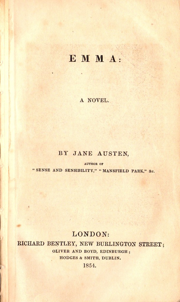
Richard Bentley, London: New Burlington Street

For more background information of the Bentley editions of Jane Austen, please read the first few paragraphs of the article on Bentley edition of Emma, Gilson D2.

Sense and Sensibility, along with the other five novels of Jane Austen that had been published between 1811 and 1817, did not appear in a new English edition until Richard Bentley decided to reprint all of the Austen novels as “Standard Novels” in 1832. The first edition of Sense and Sensibility had been published in 1811 followed by the second edition in 1813, both published by Thomas Egerton in 3 volumes. Sense and Sensibility was published by Richard Bentley on 28th December 1932, for 6 shillings. Sense and Sensibility was numbered “XXIII” (23 ) in the Standard Novel series. It was the third edition of Sense and Sensibility to be published in the UK, the first single volume edition, the first edition to have any illustrations and the first to have Jane Austen’s name as author on the title page(s). Standard Novel XXIV (24) was a translation of Madame de Stael’s Corinne, which appeared on February 1st 1833. An announcement of the intended publication of Corrine by Bentley on this date appears on the verso of the series title page of Sense and Sensibility (Figure 1). Although the publication date of Sense and Sensibility was on 28th December 1832, Bentley printed 1833 on all of the dated pages, a common practice by publishers, who used this practice to extend the apparent currency or newness of their books.

Figure 1: (left) Series title page for Gilson D1 Bentley’s Sense and Sensibility 1832

Figure 1: (right) Verso of Series Title page showing announcement of Corinne.

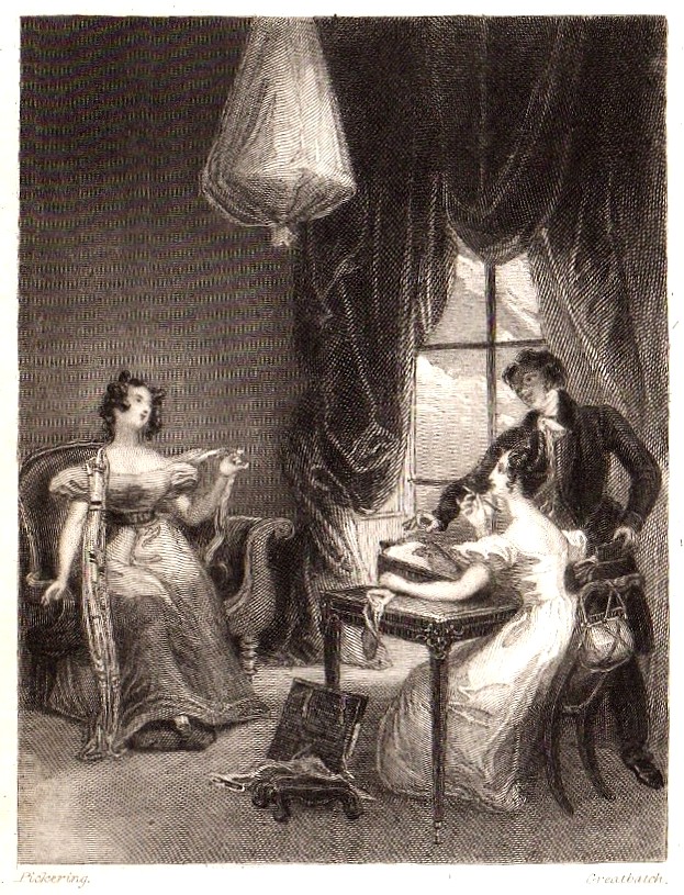
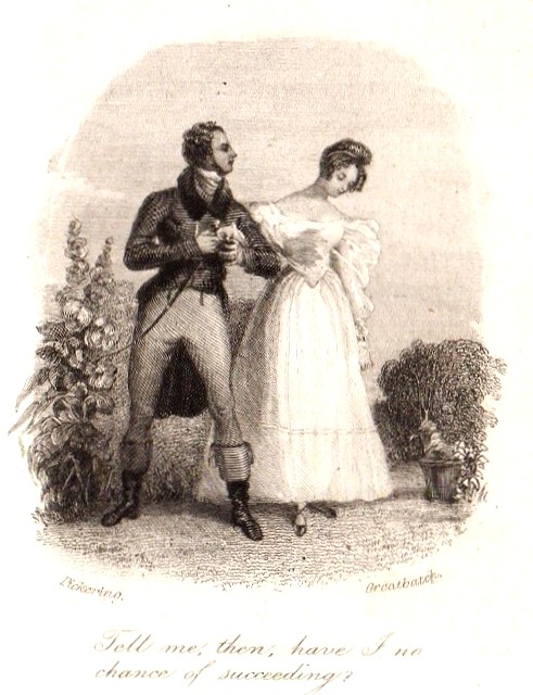
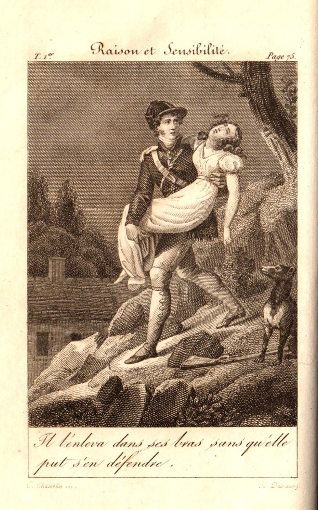
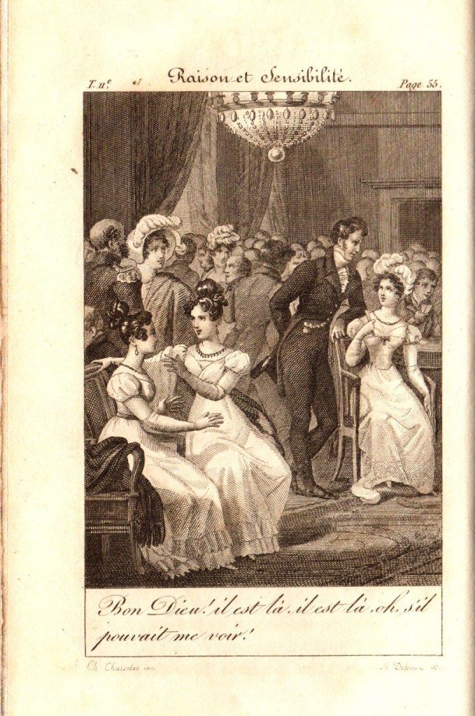
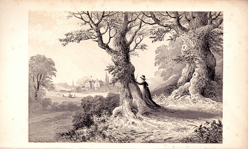
In Figure 2, the two illustrations for the Bentley edition of Sense and Sensibility are presented as the frontispiece on the left and the engraved title page vignette on the right. They are both drawn by Ferdinand Pickering and engraved by William Greatbatch, as is the case for all of the illustrated Bentley editions of Jane Austen’s novels. The images show figures in costumes appropriate to 1832, rather than to the earlier period when the book was written. The frontispiece shows the incident from Chapter 22 of Volume 1, where Lucy Steele is showing the miniature of Edward Ferrars to Elinor Dashwood. The text under the image reads as follows: Then taking a small miniature from her pocket, she added “To prevent the possibility of a mistake, be so good as to look at this face.” This is a slight misquotation of the original text on page 133 which reads “possibility of mistake”.

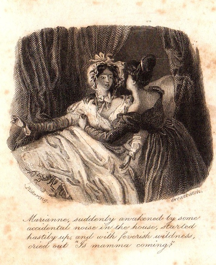
Figure 2. Frontispiece (left) and vignette (right) illustrations from Gilson D1

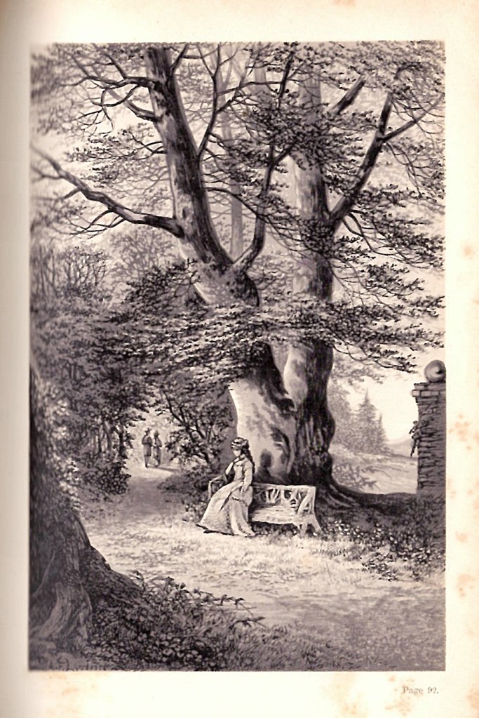
The vignette on the right of Figure 2 shows Marianne Dashwood suddenly awakening, startled and arising from her sickbed, held by her sister Elinor (from Volume 3, Chapter 7). The text reads: Marianne suddenly awakened by some accidental noise in the house, started hastily up, and with feverish wildness, cried out “Is mamma coming?”

The full engraved title page and the letterpress title page are shown in Figure 3 below. Note that there are some small differences in the way that the publishers details are presented on these two pages. The dates on these pages shown in figures 1, 2 and 3 are all presented as 1833, rather than 1832. There is an inscription of a previous owner of the book, “Hugh Block”, on the top of the engraved title page.

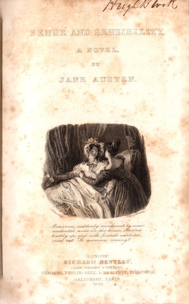
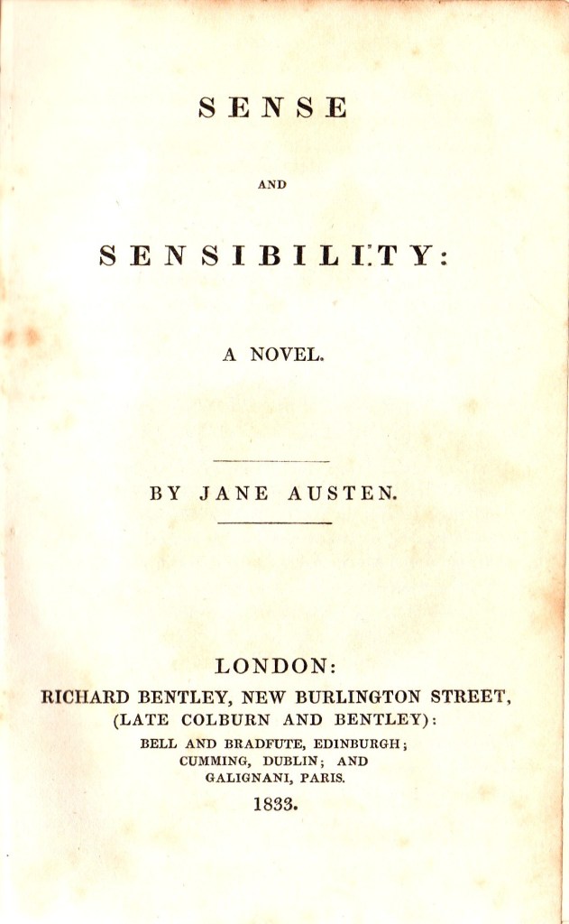
Figure 3. The engraved (left) and printed title pages for Sense and Sensibility Gilson D1

Immediately following the printed title page, Bentley presents a “Memoir of Miss Austen” which is on the preliminary pages (v) to (xiv), that is p5 to p14 in roman numerals. The memoir is unsigned and dated October 5th 1832. It has been described elsewhere as by “the Rev. Mr. Austen”, which would have been the author’s brother Henry Austen. The first part of the Memoir is an edited and revised version of the “Biographical Notice” published by Murray as a preface to the posthumous edition of Northanger Abbey/Persuasion in 1817, which is itself dated December 13th 1817. This was also generally agreed to have been written by Rev. Henry Austen. The second part of the Memoir, running from the bottom of page (x) to page (xiv), pages 10-14), are taken from a review of Northanger Abbey/Persuasion published in the Quarterly Review of January 24th 1821.

The final page of the “Memoir” is a note from the editor of Gilson D1, presumably Richard Bentley himself, which announces that the other novels of Jane Austen will follow in the Standard Novels series. The editor also comments on the importance of Jane Austen, cites the related novels of Madam D’Arblay (Fanny Burney), Miss (Maria) Edgeworth, Mrs. Opie and Miss Porter, and praises Jane Austen for “the truth, spirit, ease and refined humour of her conversations” , and her ability “to make the veriest every-day person a character of great interest.”

Figure 4 show three pages from the “Memoir” section of Gilson D1.

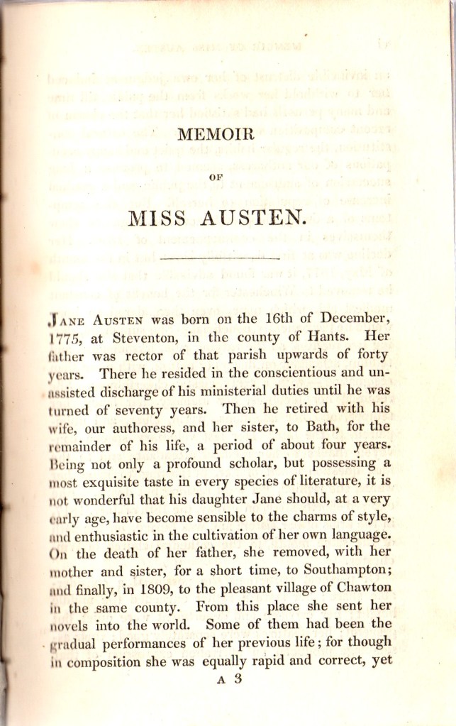
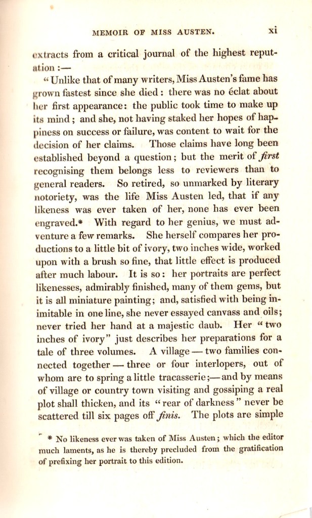
Figure 4. Pages v, x and xi from the Memoir of Miss Austen

Richard Bentley arranged the text of Sense and Sensibility to correspond to the same chapter and volume arrangement as in the first and second editions. Accordingly, the book remains divided into 3 volumes, with Volume The First consisting of 22 chapters occupying pages 1-116; Volume the Second has 14 chapters running through pages 117-219 and Volume the Third also has 14 chapters running from page 220 to the final page 331. Throughout the book, most of the chapters do not start on a new page, and are separated by a simple centrally placed ruled line about half the width of the page. The chapters are numbered in large Roman numerals, whereas the page numbers are printed as Arabic numbers at the outer top corners of the pages. The first and last pages are shown in Figure 5 below.

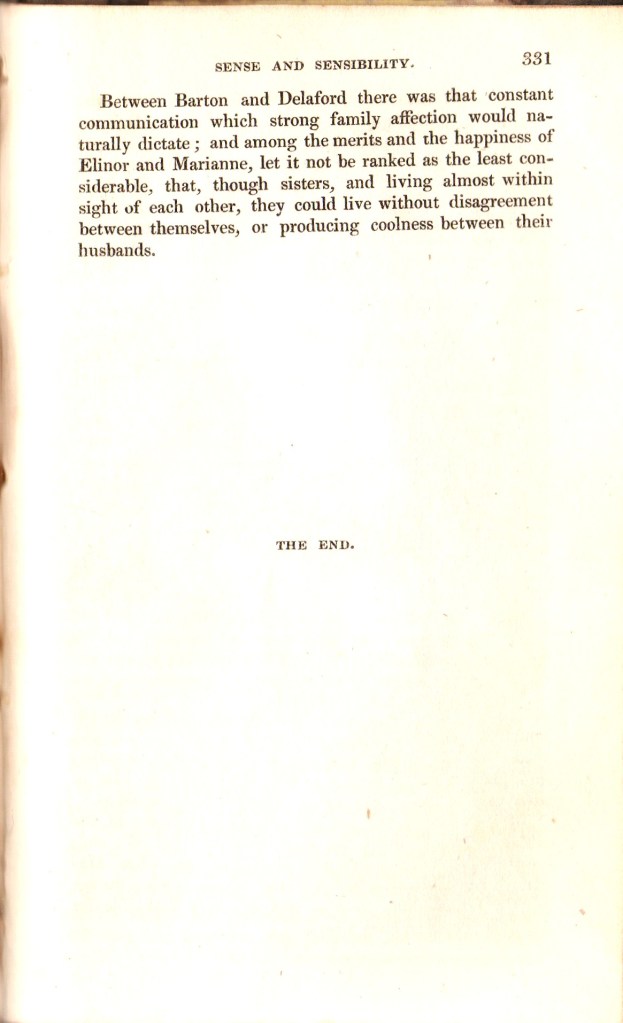
Figure 5. Pages 1 and 331 of 1832 Bentley edition of Sense and Sensibility

Gilson D1, Sense and Sensibility, would have been originally bound in plum-coloured, glazed linen boards, with black labels on the spine which were printed in gold. This binding was used by Bentley for the Standard novels issued between 1831 and 1838, and is generally called Sadlier style 1. Examples of this can be seen in my copies of Mansfield Park (Gilson D3) and Northanger Abbey/Persuasion (Gilson D4). However, my copy of Sense and Sensibility has been rebound in marbled paper-covered boards, half-bound in green morocco with gilt labelling on the spine in two gold lined compartments (Figure 6) . The spine has faded from green to light brown. The binding looks mid-19th century, but has recently been rebound, with the addition of new yellow endpapers.

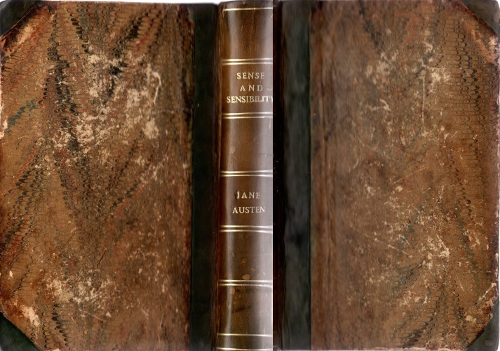
Figure 6. Binding of my copy of the Bentley edition of Sense and Sensibility.

Later reprints of Bentley’s Sense and Sensibility Gilson D1

The 1832 issue of Bentley’s first edition of Sense and Sensibility shown in this article is the only issue that I currently have of this Standard Novels edition, I do also have a copy of the 1856 issue, which is as a part of a set of The Novels of Miss Austen (Gilson D6). There are other known reprinted issues of Bentley’s Sense and Sensibility that appeared in 1837, 1846, 1853, and 1854 in the Standard Novels series, all designated Gilson D7, and a further reprinted set of Gilson D6 in 1866. A “New Edition” of Sense and Sensibility is published by Bentley in 1970 as Gilson D8. That is the subject of a separate article in this series.

Return to the Index page for Illustrated Editions of Jane Austen.

1833 Emma; 2nd UK edition

Richard Bentley, London, Gilson D2

The first edition of Emma, the fourth novel to be published by Jane Austen, was published in 3 volumes in December 1815 by John Murray. Like all of the first editions of Austen it was not illustrated. It was the first Austen title published by John Murray, following some dissatisfaction with Thomas Egerton, who had published the first three Austen novels. The first edition of Emma was issued as 2000 copies, which all sold within one year of publication. Following Jane Austen’s death on 18th July 1817, John Murray resisted efforts by the Austen family, notably the author’s brother Henry and sister Cassandra, to publish a second edition of Emma.

Richard Bentley (1794-1871) had been born into a distinguished family of three generations of printers and publishers. After initially working in partnership with his brother Samuel as “S. and R. Bentley” for ten years, Richard formed a new partnership with Henry Colburn in 1829. Colburn and Bentley had started to publish a series of cheap, illustrated reprints of English novels as “Colburn and Bentley’s Standard Novels” in 1831. They offered reprints of novels in a single volume for six shillings. Each volume had two illustrations, an engraved frontispiece illustration and an engraved title page which had a smaller “vignette” illustration. The first novel in the series was The Pilot by James Fennimore Cooper, published in February 1831 and the highlight of the early titles was Frankenstein by Mary Shelley published on 31st October 1831. After an acrimonious dissolution of the partnership in mid-1832, by which point 19 Standard Novels had been printed and published, Richard Bentley continued with his own series of “Standard Novels”.

Emma, along with the other five novels of Jane Austen that had been published between 1811 and 1817, did not appear in a new English edition until Richard Bentley decided to reprint all of the Austen novels as “Standard Novels” in 1832. Emma was published by Richard Bentley on 27th February 1833, following his purchase of the Austen copyrights from Cassandra Austen via Henry Austen. Emma was numbered “XXV” (25 ) in the Standard Novel series. It was the second edition of Emma to be published in the UK, the first single volume edition, the first edition to have any illustrations and the first to have Jane Austen’s name as author on the title page(s). It was the second of Austen’s novels to be published by Bentley, following Sense and Sensibility (Gilson D1), which was published as Standard Novel number XXIII (23) on 28th December 1932, although it was dated 1833. Standard Novel XXIV (24) was a translation of Madame de Stael’s Corinne, which appeared on February 1st 1833.

The format of Bentley’s Standard Novels was indeed standardised, so that each volume had a “series title page”, which identified it as a part of the Bentley’s Standard Novels series with a date of publication and a series number, a full page engraved frontispiece, an engraved title page, normally with an engraved date, and a letterpress or printed title page which had the title, authors name, Bentley’s name and address and a publication date. These four pages for first Bentley edition of Emma are shown in figure 1.

Figure 1. Series Title, Frontispiece, Engraved Title and Letterpress Title pages

Bentley published Emma in the same volume and chapter format as the original three volume first edition published by John Murray in December 1815. The novel starts with Emma | Volume the First | Chapter I. on page 1, and finishes Volume the First with the end of Chapter XVIII (18) on page 134 with the line “End of the First Volume”. Volume the Second begins with Chapter I of the second volume on page 135 and ends on page 279 at the end of Chapter XVIII (19) of the second volume, with the line “End of the Second Volume”. Volume the Third then begins on page 280 and the novel ends on page 435 with the last page of Chapter XIX (19) of Volume three with the simple words “The End”. By maintaining the volume and chapter structure of the first edition, Bentley has ensured that any sentence from any chapter of any book will be found in the same chapter and book in the Bentley edition as it was in the Murray first edition.

The book ends with the printer’s colophon on the verso of page 435. It reads “London: Printed by A. & R, Spottiswoode, New-street-Square.” on three lines. The only page missing from the Bentley edition of Emma is the dedication page that was included in the first edition of 1815, where Jane Austen dedicated Emma to the Prince Regent with these words: “To His Royal Highness, The Prince Regent, this work is, by His Royal Highness’s permission, most respectfully dedicated, by His Royal Highness’s dutiful and obedient humble servant, The Author.” It is not clear why Bentley chose not to include the dedication. It may be due to the fact that the Bentley edition of Emma was first published in 1833, in the reign of King William IV, younger brother and successor to the late, former Prince Regent, who had eventually reigned in his own right from 1820 to 1830 as King George IV. Perhaps respect to the present king outweighed respect to his predecessor.

Illustrations in Bentley’s 1833 edition of Emma

The two illustrations in this edition of Emma were drawn by Ferdinand Pickering (1810-1889) and engraved on wood by William Greatbatch (1802-1872). The identity of the artist had been uncertain for many years. The illustrations in Emma are clearly signed “Pickering”, which led David Gilson to suggest that they were by George Pickering (ca 1794-1857). However, other illustrations in the Standard Novel series that have many similarities of style to those in Emma are clearly signed “F. Pickering”, which has led to the corrected identification of Ferdinand Pickering as the artist. An enlarged version of the frontispiece is shown in Figure 2.

Figure 2. Frontispiece of Emma from Gilson D2.

The name “Pickering” can be clearly seen at the bottom left of the image and “Greatbatch” at the bottom right. The picture depicts Emma Woodhouse drawing a portrait of her friend Harriet Smith, while Mr. Elton is playing very close attention to Emma. The style of the costumes is from the 1830s rather than being correct for the late 18th century to Regency period. The legend of the frontispiece is shown below as Figure 3.

Figure 3. Text below the frontispiece of Emma

The text reads “There was no being displeased with such an encourager, for his admiration made him discern a likeness before it was possible.” It is a direct quotation from Chapter 6 of Emma. Mr. Elton is lavishing praise on Emma, who he greatly admires, despite Emma’s attempts to deflect his attentions to Harriet. The final line in a smaller font reads “London, Published by Richard Bentley. 1833.” This is the publisher asserting his ownership of the copyright of the image, which he commissioned from Pickering and Greatbatch.

The engraved title page, together with an enlarged picture of the illustration, are shown below in Figure 4.

Figure 4. Engraved title page and vignette image from Emma

The engraved title page announces at the top that this is “EMMA. | A NOVEL. | BY | JANE AUSTEN.”. At the bottom of the page the publishers details are given thus: LONDON | RICHARD BENTLEY | (SUCESSOR TO H. COLBURN) | CUMMING, DUBLIN BELL & BRADFUTE, EDINBURGH | GALIGNANI, PARIS | 1833 . In the vignette, in the right hand panel, we see Emma out walking with Mr. Knightley, who has just declared his love for her. He then asks her “Tell me, then, have I no chance of succeeding?” which is the text below the image. This is taken directly from Chapter 49 of Emma. You can also see the names of Pickering and Greatbatch on the left and right lower corners of the image.

Reprints of the Bentley 1833 edition of Emma (Gilson D7)

Bentley’s edition of Emma was reprinted several times in the subsequent 35 years. Stereotype plates were created and used for reprints of Emma (Gilson D2) for the Standard Novels series that were published in 1836, 1841, 1851, and 1854. Emma was also reprinted as a part of five volume sets of “The Novels of Miss Austen” that were published in 1833, 1853, 1856 and 1866. All of the reprinted Bentley editions of the Austen novels were designated D7 by David Gilson. I have copies of the 1833, 1836 and 1854 issues of Emma and of the 1856 five volume set of the six novels. In Figure 5 below, I show the printed title pages for my Emma editions of 1836, 1854 and 1856. As well as having a different date from the 1833 edition, these are differences in the page layout, Bentley’s address and the Edinburgh and Dublin publisher’s details.

Figure 5. Emma Title pages from Gilson D7 editions of 1836, 1854 and 1856

All these three reprinted editions also contain the original engraved frontispiece from 1833. The 1836 and 1856 editions also contain the engraved title page that was first published in the 1833 edition, shown in Figure 1 above. The engraved pages all still show the date 1833.

The two Standard Novel reprints of 1836 and 1854 do not have a series title page, whereas the 1856 reprint from The Novels of Miss Austen set has a half title which just bears the single word “EMMA”. The page and chapter layout for the three reprinted editions are all identical to that of the 1833 first Bentley edition. However, the printers colophons on the verso of page 435 are all different from the 1833 edition. All editions have “London:” on the first line and “New-street-Square” on the third line but are all different in the second line. These are shown below.

  • 1833 edition: Printed by A.& R. Spottiswoode,
  • 1836 edition: Printed by A. Spotiswoode,
  • 1854 edition: A. & G. A. Spottiswoode,
  • 1856 edition: Printed by Spottiswoode and Co.,

Provenance of my Bentley Emma edition of 1854

In Figure 6 below, the front endpapers of my 1854 Bentley edition of Emma are shown. They show the provenance of this book in more recent years.

Figure 6. Front endpapers of my 1854 copy of Emma (Gilson D7)

The most obvious and prominent feature in Figure 6 is the bookplate of David John Gilson on the front pastedown. This is the Gilson who compiled the standard bibliography of Jane Austen and its is an absolute privilege for me to have this copy in my Austen collection. Gilson actually mentions this copy on page 229 of the Oak Knoll Press second edition of A Bibliography of Jane Austen. Above the Gilson bookplate there is an inscription in pencil which reads: ” D7: 1854 | Given to me by | David G | 3/8/85″. This was written by Gilson’s friend John Jordan, whose bookplate is on the lower right of the free front endpaper. The two other inscriptions are: “T. Lindsay, 1914″, doubtless a previous owner of the book, and the lower line which reads ” Rebound: Ferney-Voltaire; 1953″. The book is bound in an obviously 20th century ivory textured cloth binding.

Ferney-Voltaire is a small commune of around 10,000 in south-eastern France, close to the Swiss border. It was the residence of Voltaire from 1758-1778 and his Chateau can still be visited there. As well as the Voltaire museum in the Chateau Voltaire, there is a small workshop and museum of printing and bookbinding in Ferney-Voltaire called Atelier du Livre. It is currently run by an Englishman, Andrew Brown. This may be where the 1854 Emma was rebound in 1953, by a previous owner.

Return to the Index page for Illustrated Editions of Jane Austen.

1828 Raison et Sensibilité.

Published by Arthus Bertrand Paris. 2nd ed. 3 vols. Gilson C8

Illustrated by Charles-Abraham Chasselat

The first French edition of a Jane Austen novel to appear was Raison et Sensibilité, translated from Sense and Sensibility by Mme Isabelle de Montelieu and published in Paris by Arthus Bertrand in 1815 in four volumes. It did not have any illustrations. There is no mention of this translation in any of Jane Austen’s letters, so one might conclude that she was not aware of it.

A second French edition of Raison et Sensibilité was published by Bertrand in Paris dated 1828. It is possible that this second edition was published in December 1827. This time, the Raison et Sensibilité, now published in three volumes, had a frontispiece in each of the three volumes. This is the first illustrated edition of Sense and Sensibility to be published anywhere. The illustrator for all three images was Charles-Abraham Chasselat, just as in the 1821 edition of La Famille Elliot described in a related article. The engraver was Auguste Delvaux for volumes 1 and 2, and then Jean-Simon-Narcisse Perrot (born 1796) for volume 3. The three frontispiece illustrations for Raison et Sensibilité are shown below in Figure 1.

Figure 1. Frontispieces for volumes 1,2 and 3 of Raison et Sensibilité

In volume 1 (Fig. 1 left), the picture shows Willoughby carrying Marianne back down the hill to safety, after she had twisted her ankle. The text below the image reads “Il l’enleva dans ses bras sans qu’elle put s’en défendre“, which can be translated as “He took her into his arms without her being able to defend herself” , which seems somewhat at odds with Austen’s description of the event. She also appears to have fainted in this picture.

In volume 2 (Fig. 1 centre), the scene is at a party in London, some while after Willoughby has “dumped” Marianne. She sees him across the room and exclaims, according to the figure legend. “Bien Dieu! il est là, ll est là, oh! s’il pouvait me voir!” This is not too far removed from Austen’s original text which read “‘Good heavens!’ she exclaimed, ‘he is there-he is there-Oh! why does he not look at me?” Elinor, who is seated next to Marianne tries to calm her down and prevent an embarrassing scene.

In volume 3 (Fig. 1 right), the picture shows Elinor and Colonel Brandon, who have found Marianne, who has rather melodramatically fainted by a small classical temple. The text reads “Un en’ percant du Colonel lui répend: il vient d’apercevoir celle qu’il cherchait”. This translates to something like “A piercing message from the Colonel answers him: he has just seen the one he was looking for.”

Readers, you will search in vain for this incident in Jane Austen’s Sense and Sensibility, as it simply does not occur. My view is that Mme. de Montolieu has added in this scene as a counterbalance to the rescue of Marianne by Willoughby shown in the left hand panel. In a way, it can be seen as validating Colonel Brandon as a suitor for Marianne, who is thus seen to be at least as gallant as Willoughby.

There are many other changes in the text, and the whole plot is rather distilled down to an account of the romantic tribulations of Marianne and her infatuation with Willoughby; Elinor and Edward Ferrars hardly get a look in, and Margaret, the third and youngest Dashwood sister, is virtually ignored and renamed “Emma”. Mme. de Montolieu gave her Raison et Sensibilité the subtitle “ou les deux manières d’aimer“, translated perhaps as “or the two ways of loving”. Those familiar with Sense and Sensibility might expect that this refers to the difference in approaches to romance of Marianne and Elinor, but for Mme. de Montolieu, I fear it represents the differences between Willoughby and Colonel Brandon.

Return to the Index page for Illustrated Editions of Jane Austen.

1875 Mansfield Park.

Published by Groombridge and Sons, London. Gilson E43

Illustrated by Andrew Francis Lydon.

The First Illustrated edition of Mansfield Park

Mansfield Park by Jane Austen was first published in 1814 by T. Egerton as a three volume novel. A second edition, also in three volumes, was published in 1816 by John Murray. Neither of these two editions had any illustrations. The next edition to be published was a single volume edition published in 1833 by Richard Bentley (Gilson D3). It had an engraved frontispiece and an engraved title page with a vignette illustration. Technically, the Bentley edition is the first edition of Mansfield Park to have any illustrations, but in most collector’s opinions this would not count as an illustrated edition, as there are no illustrations either embedded or interleaved in the text.

Several other editions of Mansfield Park were published following the Bentley edition, particularly editions by Simms and M’Intyre (1846), Routledge (1857), Derby and Jackson (1857), Ticknor and Fields (1863) and Tauchnitz (1867). None of these were illustrated, even with a frontispiece.

The first illustrated edition of Mansfield Park was an undated edition published by Groombridge and Sons, 5 Paternoster Row, London. It is generally accepted that this edition was published in October 1875. The book contains 7 full-page engraved illustrations of drawings by Andrew Francis Lydon. Not only is this the first edition of Mansfield Park with a set of illustrations, it is the first edition of any Jane Austen novel to be published in English with a set of illustrations. The top board, engraved title page and letterpress title page of my copy of the Groombridge Mansfield Park are shown in Figure 1 below. Note the unusual rendering of “a” in the engraved page.

A F Lydon, the illustrator and B Fawcett, the printer

The seven illustrations were all engraved by the firm of Benjamin Fawcett (1808-1893), a fine printer and engraver, from original drawings by Alexander Francis Lydon (1836-1917), an Anglo-Irish watercolourist and engraver. The pictures are all signed “A F Lydon” as the artist, but they also have small and indistinct second signatures or marks by the individual engravers. This is underlined by the statement on the printed title page “Illustrated from Drawings by A.F.Lydon”. Indeed, much of the firm’s work was engraved by Benjamin Fawcett himself. Lydon was in fact an employee of Benjamin Fawcett (1808-1893), and had served his appenticeship as an engraver with Fawcett. This was mutually convenient as Driffield, a town in East Yorkshire, was both Lydon’s family home and the site of Fawcett’s business. There is a modern pub in Driffield today called “The Benjamin Fawcett”.

Lydon and Fawcett worked together over many years to produce mainly illustrations of wildlife, landscapes or architectural subjects. Lydon excelled in fine watercolour paintings of birds and plants, and also of grand houses in landscaped parks.

The binding is a standard one used by Groombridge and Sons for some of their published fiction. The last page of the text block of my Groombridge edition of Mansfield Park is numbered 440, and bears the name of the printer, “B Fawcett, Engraver and Printer, Driffield.” The page height is 18.7 cm. These three characteristics all support the idea that this edition was printed de novo, rather than being a reprint of an earlier known edition, as no other known edition of Mansfield Park fits this description. David Gilson gives this book the designation E43 in his A Bibliography of Jane Austen, where he reports a publication date of October 1875, derived from the English Catalogue of Books. WorldCat also gives the date 1975, which comes from the deposit copy held by the British Library, the only copy listed on WorldCat. This is a very rare book, which means that few people have seen the illustrations. I will show all seven on them in the following section.

The Lydon illustrations for Mansfield Park

The illustrations for the Groombridge edition of Mansfield Park are all black and white printings of finely executed engravings on woodblocks of line drawings by Lydon. Several of them show off the artist’s skill in landscapes. This starts with the frontispiece, shown below in Figure 2.

Black and white picture of woman in woods viewing a distant house.
Figure 2. Frontispiece to Mansfield Park

This shows the heroine, Fanny Price, looking back towards the riding party of Edmund Bertram and Miss Crawford in front of the house at Mansfield Park. The incident is from chapter 7. Lydon’s expertise in the depiction of landscape is very much to the fore in this design.

The second illustration (Figure 3, left) shows an incident from chapter 9, where Fanny, Edmund and Miss Crawford have rested on a seat during a walk in the woods. Edmund and Miss Crawford then walk on together to the end of the wood, leaving Fanny still on the seat to watch them disappear together down the path.

The illustration shown on the right of Figure 3 depicts Edmund explaining to Fanny his concerns about the propriety of the amateur dramatics that the house party is engaged in.

In the next illustration (Figure 4), which is from chapter 25, we return to Lydon’s love of landscape as he depicts Henry Crawford’s story of stumbling across the village of Thornton Lacey, his promised living, while walking his lame horse back to Mansfield Park.

Figure 4 Henry Crawford views Thornton Lacey.

In the next illustration (Figure 5 left), taken from chapter 35, we see Edmund and Fanny walking together arm in arm as Edmund tries to find out what feelings she might have for Henry Crawford. In Figure 5 (right), we have moved on to chapter 41, where Henry Crawford is talking about his future prospects to Fanny Price at Portsmouth docks, rather wishing that Fanny’s younger sister, Susan, was not present.

The final illustration, shown in Figure 6 below, comes from an event in chapter 46, when Fanny, accompanied by her excited sister Susan and a nervous Edmund Bertram, returns to Mansfield Park by carriage from Portsmouth. This picture shows off Lydon’s facility in drawing country houses and landscaped grounds.

Figure 6 Fanny’s return to Mansfield Park

These seven drawings give an interesting view of an Austen novel through the eyes of a landscape and wildlife artist. Although the clothes depicted are decidedly from the 1860s and 1870s rather than Regency period, the drawings offer an interesting contrast to the classic illustrations of Austen by some other illustrators, whom tended to concentrate on fine drawings of interiors, with accurate depictions of costume, manners and decor of paramount importance.

This is the only novel of Jane Austen known to be illustrated by A. F. Lydon.

A few comments on the publisher, Groombridge and Sons

Richard Groombridge started as a publisher in 1833, when he operated out of his home, 6 Panyer Alley, using the imprint of Richard Groombridge or R. Groombridge. Four of his sons served as his apprentices and joined the firm to work as publishers and booksellers. In 1845, when his two eldest sons were 28 and 25 years old respectively, the imprint of the firm was changed to “Groombridge and Sons”, usually followed by “5, Paternoster Row” on the title page. Following Richard Groombridge’s death in 1855 the firm was run jointly by the two oldest sons. Sadly, the three oldest sons all died between 1860 and 1868, leaving the youngest, Charles Groombridge, as the last surviving son of the founder. He seems to have lost interest in publishing sometime during the 1860s, and by the 1870s, the firm was run by three grandsons of Richard Groombridge until it ceased to trade sometime around 1900.

R. Groombridge and Groombridge and Sons were best known as publishers of books on religion, agriculture and natural history, although they did also reprint several of the novels of Grace Aguilar (1816-1847), a popular writer on themes of Jewish history and religion. The Groombridges worked closely with Benjamin Fawcett, publishing many of his finely illustrated books between 1844 and 1890.

It is not known why Groombridge and Sons decided to publish an illustrated edition of Mansfield Park in 1875. It is even possible that the genesis of the book came from the printer, Benjamin Fawcett or the illustrator A F Lydon. We shall probably never know. For more details about the Groombridge family of publishers, read my Groombridge, Publishers page.

Return to the Index page for Illustrated Editions of Jane Austen.