1832 Sense and Sensibility: Gilson D1

Richard Bentley, London: New Burlington Street

For more background information of the Bentley editions of Jane Austen, please read the first few paragraphs of the article on Bentley edition of Emma, Gilson D2.

Sense and Sensibility, along with the other five novels of Jane Austen that had been published between 1811 and 1817, did not appear in a new English edition until Richard Bentley decided to reprint all of the Austen novels as “Standard Novels” in 1832. The first edition of Sense and Sensibility had been published in 1811 followed by the second edition in 1813, both published by Thomas Egerton in 3 volumes. Sense and Sensibility was published by Richard Bentley on 28th December 1932, for 6 shillings. Sense and Sensibility was numbered “XXIII” (23 ) in the Standard Novel series. It was the third edition of Sense and Sensibility to be published in the UK, the first single volume edition, the first edition to have any illustrations and the first to have Jane Austen’s name as author on the title page(s). Standard Novel XXIV (24) was a translation of Madame de Stael’s Corinne, which appeared on February 1st 1833. An announcement of the intended publication of Corrine by Bentley on this date appears on the verso of the series title page of Sense and Sensibility (Figure 1). Although the publication date of Sense and Sensibility was on 28th December 1832, Bentley printed 1833 on all of the dated pages, a common practice by publishers, who used this practice to extend the apparent currency or newness of their books.

Figure 1: (left) Series title page for Gilson D1 Bentley’s Sense and Sensibility 1832

Figure 1: (right) Verso of Series Title page showing announcement of Corinne.

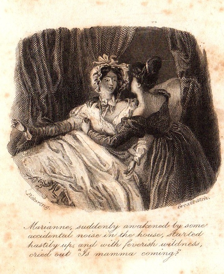
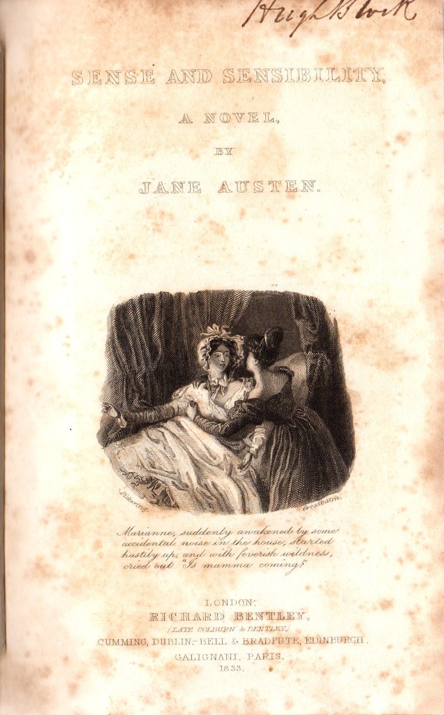
In Figure 2, the two illustrations for the Bentley edition of Sense and Sensibility are presented as the frontispiece on the left and the engraved title page vignette on the right. They are both drawn by Ferdinand Pickering and engraved by William Greatbatch, as is the case for all of the illustrated Bentley editions of Jane Austen’s novels. The images show figures in costumes appropriate to 1832, rather than to the earlier period when the book was written. The frontispiece shows the incident from Chapter 22 of Volume 1, where Lucy Steele is showing the miniature of Edward Ferrars to Elinor Dashwood. The text under the image reads as follows: Then taking a small miniature from her pocket, she added “To prevent the possibility of a mistake, be so good as to look at this face.” This is a slight misquotation of the original text on page 133 which reads “possibility of mistake”.

Figure 2. Frontispiece (left) and vignette (right) illustrations from Gilson D1

The vignette on the right of Figure 2 shows Marianne Dashwood suddenly awakening, startled and arising from her sickbed, held by her sister Elinor (from Volume 3, Chapter 7). The text reads: Marianne suddenly awakened by some accidental noise in the house, started hastily up, and with feverish wildness, cried out “Is mamma coming?”

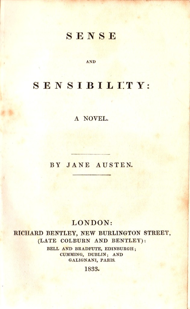
The full engraved title page and the letterpress title page are shown in Figure 3 below. Note that there are some small differences in the way that the publishers details are presented on these two pages. The dates on these pages shown in figures 1, 2 and 3 are all presented as 1833, rather than 1832. There is an inscription of a previous owner of the book, “Hugh Block”, on the top of the engraved title page.

Figure 3. The engraved (left) and printed title pages for Sense and Sensibility Gilson D1

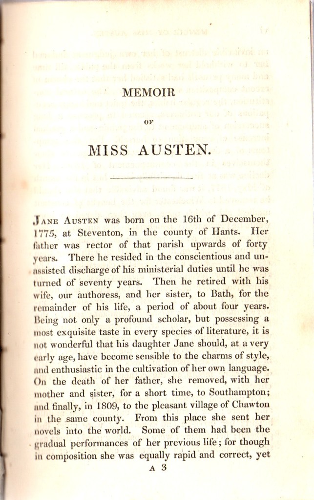
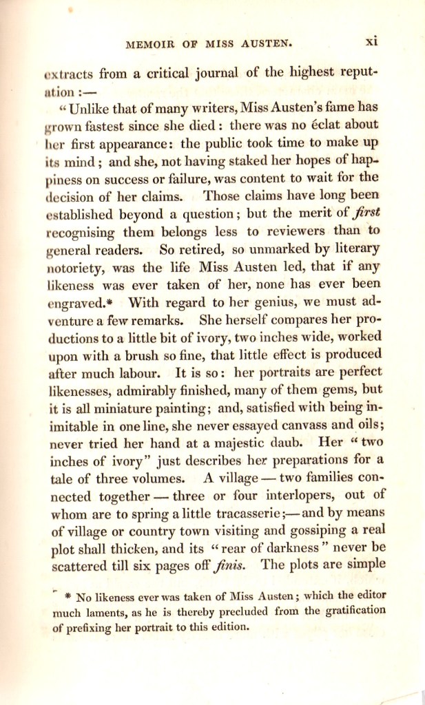
Immediately following the printed title page, Bentley presents a “Memoir of Miss Austen” which is on the preliminary pages (v) to (xiv), that is p5 to p14 in roman numerals. The memoir is unsigned and dated October 5th 1832. It has been described elsewhere as by “the Rev. Mr. Austen”, which would have been the author’s brother Henry Austen. The first part of the Memoir is an edited and revised version of the “Biographical Notice” published by Murray as a preface to the posthumous edition of Northanger Abbey/Persuasion in 1817, which is itself dated December 13th 1817. This was also generally agreed to have been written by Rev. Henry Austen. The second part of the Memoir, running from the bottom of page (x) to page (xiv), pages 10-14), are taken from a review of Northanger Abbey/Persuasion published in the Quarterly Review of January 24th 1821.

The final page of the “Memoir” is a note from the editor of Gilson D1, presumably Richard Bentley himself, which announces that the other novels of Jane Austen will follow in the Standard Novels series. The editor also comments on the importance of Jane Austen, cites the related novels of Madam D’Arblay (Fanny Burney), Miss (Maria) Edgeworth, Mrs. Opie and Miss Porter, and praises Jane Austen for “the truth, spirit, ease and refined humour of her conversations” , and her ability “to make the veriest every-day person a character of great interest.”

Figure 4 show three pages from the “Memoir” section of Gilson D1.

Figure 4. Pages v, x and xi from the Memoir of Miss Austen

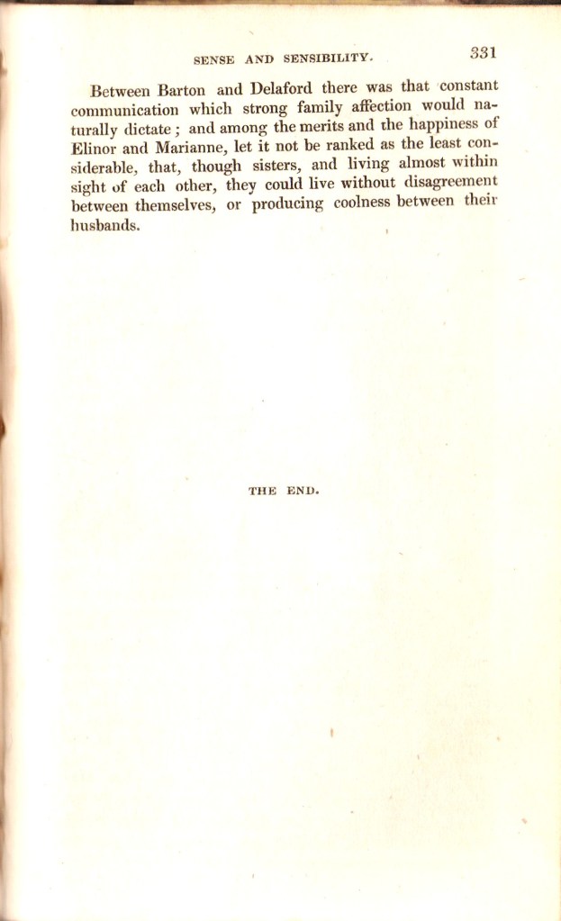
Richard Bentley arranged the text of Sense and Sensibility to correspond to the same chapter and volume arrangement as in the first and second editions. Accordingly, the book remains divided into 3 volumes, with Volume The First consisting of 22 chapters occupying pages 1-116; Volume the Second has 14 chapters running through pages 117-219 and Volume the Third also has 14 chapters running from page 220 to the final page 331. Throughout the book, most of the chapters do not start on a new page, and are separated by a simple centrally placed ruled line about half the width of the page. The chapters are numbered in large Roman numerals, whereas the page numbers are printed as Arabic numbers at the outer top corners of the pages. The first and last pages are shown in Figure 5 below.

Figure 5. Pages 1 and 331 of 1832 Bentley edition of Sense and Sensibility

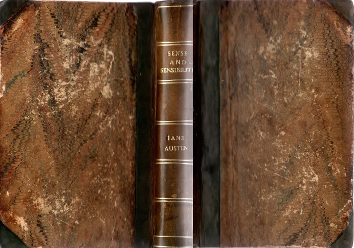
Gilson D1, Sense and Sensibility, would have been originally bound in plum-coloured, glazed linen boards, with black labels on the spine which were printed in gold. This binding was used by Bentley for the Standard novels issued between 1831 and 1838, and is generally called Sadlier style 1. Examples of this can be seen in my copies of Mansfield Park (Gilson D3) and Northanger Abbey/Persuasion (Gilson D4). However, my copy of Sense and Sensibility has been rebound in marbled paper-covered boards, half-bound in green morocco with gilt labelling on the spine in two gold lined compartments (Figure 6) . The spine has faded from green to light brown. The binding looks mid-19th century, but has recently been rebound, with the addition of new yellow endpapers.

Figure 6. Binding of my copy of the Bentley edition of Sense and Sensibility.

Later reprints of Bentley’s Sense and Sensibility Gilson D1

The 1832 issue of Bentley’s first edition of Sense and Sensibility shown in this article is the only issue that I currently have of this Standard Novels edition, I do also have a copy of the 1856 issue, which is as a part of a set of The Novels of Miss Austen (Gilson D6). There are other known reprinted issues of Bentley’s Sense and Sensibility that appeared in 1837, 1846, 1853, and 1854 in the Standard Novels series, all designated Gilson D7, and a further reprinted set of Gilson D6 in 1866. A “New Edition” of Sense and Sensibility is published by Bentley in 1970 as Gilson D8. That is the subject of a separate article in this series.

Return to the Index page for Illustrated Editions of Jane Austen.

1833 Emma; 2nd UK edition

Richard Bentley, London, Gilson D2

The first edition of Emma, the fourth novel to be published by Jane Austen, was published in 3 volumes in December 1815 by John Murray. Like all of the first editions of Austen it was not illustrated. It was the first Austen title published by John Murray, following some dissatisfaction with Thomas Egerton, who had published the first three Austen novels. The first edition of Emma was issued as 2000 copies, which all sold within one year of publication. Following Jane Austen’s death on 18th July 1817, John Murray resisted efforts by the Austen family, notably the author’s brother Henry and sister Cassandra, to publish a second edition of Emma.

Richard Bentley (1794-1871) had been born into a distinguished family of three generations of printers and publishers. After initially working in partnership with his brother Samuel as “S. and R. Bentley” for ten years, Richard formed a new partnership with Henry Colburn in 1829. Colburn and Bentley had started to publish a series of cheap, illustrated reprints of English novels as “Colburn and Bentley’s Standard Novels” in 1831. They offered reprints of novels in a single volume for six shillings. Each volume had two illustrations, an engraved frontispiece illustration and an engraved title page which had a smaller “vignette” illustration. The first novel in the series was The Pilot by James Fennimore Cooper, published in February 1831 and the highlight of the early titles was Frankenstein by Mary Shelley published on 31st October 1831. After an acrimonious dissolution of the partnership in mid-1832, by which point 19 Standard Novels had been printed and published, Richard Bentley continued with his own series of “Standard Novels”.

Emma, along with the other five novels of Jane Austen that had been published between 1811 and 1817, did not appear in a new English edition until Richard Bentley decided to reprint all of the Austen novels as “Standard Novels” in 1832. Emma was published by Richard Bentley on 27th February 1833, following his purchase of the Austen copyrights from Cassandra Austen via Henry Austen. Emma was numbered “XXV” (25 ) in the Standard Novel series. It was the second edition of Emma to be published in the UK, the first single volume edition, the first edition to have any illustrations and the first to have Jane Austen’s name as author on the title page(s). It was the second of Austen’s novels to be published by Bentley, following Sense and Sensibility (Gilson D1), which was published as Standard Novel number XXIII (23) on 28th December 1932, although it was dated 1833. Standard Novel XXIV (24) was a translation of Madame de Stael’s Corinne, which appeared on February 1st 1833.

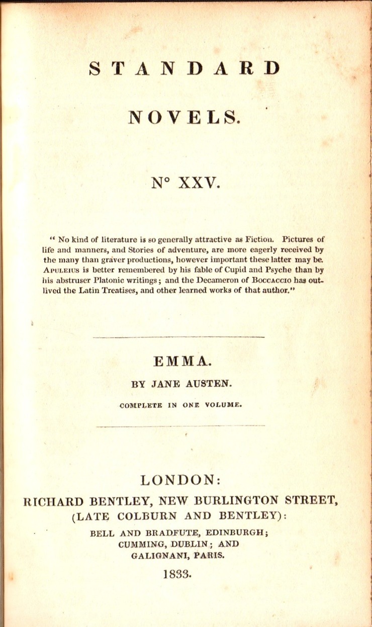
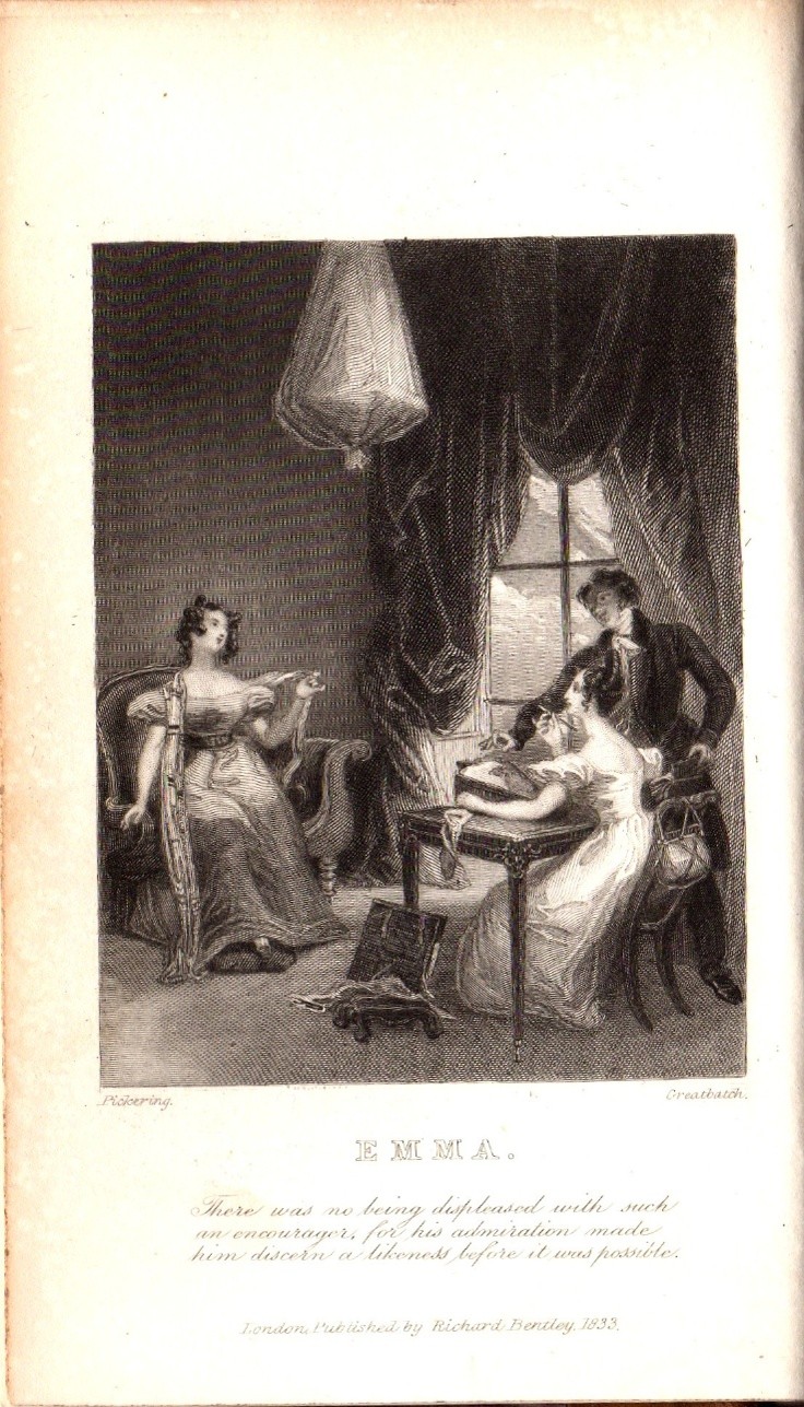
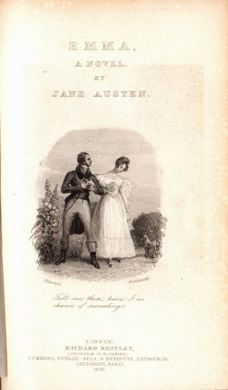
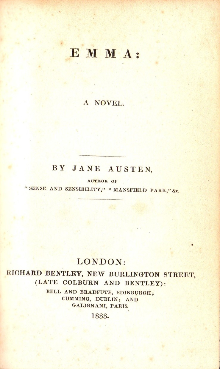
The format of Bentley’s Standard Novels was indeed standardised, so that each volume had a “series title page”, which identified it as a part of the Bentley’s Standard Novels series with a date of publication and a series number, a full page engraved frontispiece, an engraved title page, normally with an engraved date, and a letterpress or printed title page which had the title, authors name, Bentley’s name and address and a publication date. These four pages for first Bentley edition of Emma are shown in figure 1.

Figure 1. Series Title, Frontispiece, Engraved Title and Letterpress Title pages

Bentley published Emma in the same volume and chapter format as the original three volume first edition published by John Murray in December 1815. The novel starts with Emma | Volume the First | Chapter I. on page 1, and finishes Volume the First with the end of Chapter XVIII (18) on page 134 with the line “End of the First Volume”. Volume the Second begins with Chapter I of the second volume on page 135 and ends on page 279 at the end of Chapter XVIII (19) of the second volume, with the line “End of the Second Volume”. Volume the Third then begins on page 280 and the novel ends on page 435 with the last page of Chapter XIX (19) of Volume three with the simple words “The End”. By maintaining the volume and chapter structure of the first edition, Bentley has ensured that any sentence from any chapter of any book will be found in the same chapter and book in the Bentley edition as it was in the Murray first edition.

The book ends with the printer’s colophon on the verso of page 435. It reads “London: Printed by A. & R, Spottiswoode, New-street-Square.” on three lines. The only page missing from the Bentley edition of Emma is the dedication page that was included in the first edition of 1815, where Jane Austen dedicated Emma to the Prince Regent with these words: “To His Royal Highness, The Prince Regent, this work is, by His Royal Highness’s permission, most respectfully dedicated, by His Royal Highness’s dutiful and obedient humble servant, The Author.” It is not clear why Bentley chose not to include the dedication. It may be due to the fact that the Bentley edition of Emma was first published in 1833, in the reign of King William IV, younger brother and successor to the late, former Prince Regent, who had eventually reigned in his own right from 1820 to 1830 as King George IV. Perhaps respect to the present king outweighed respect to his predecessor.

Illustrations in Bentley’s 1833 edition of Emma

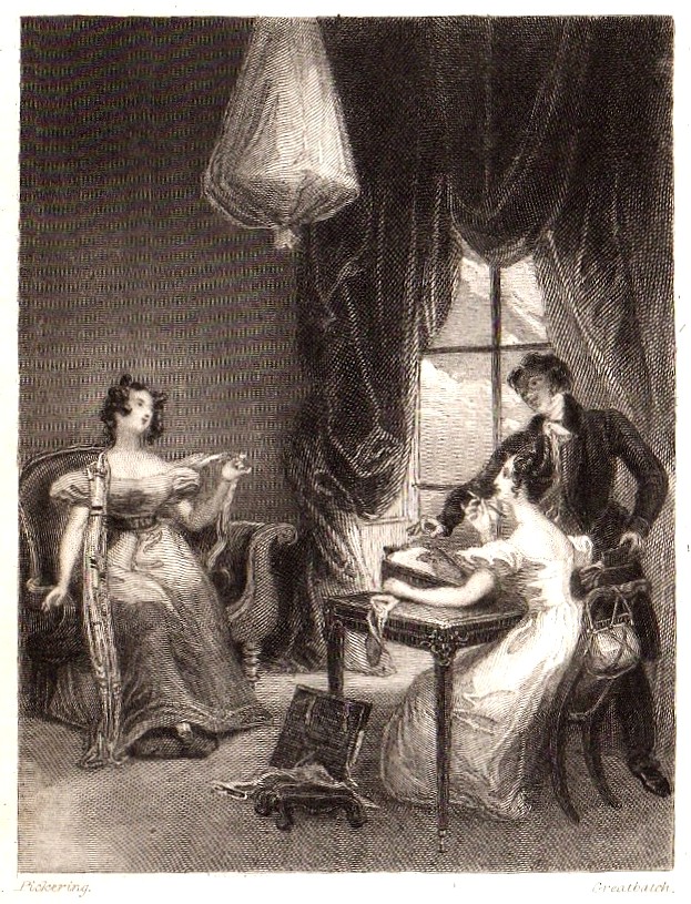
The two illustrations in this edition of Emma were drawn by Ferdinand Pickering (1810-1889) and engraved on wood by William Greatbatch (1802-1872). The identity of the artist had been uncertain for many years. The illustrations in Emma are clearly signed “Pickering”, which led David Gilson to suggest that they were by George Pickering (ca 1794-1857). However, other illustrations in the Standard Novel series that have many similarities of style to those in Emma are clearly signed “F. Pickering”, which has led to the corrected identification of Ferdinand Pickering as the artist. An enlarged version of the frontispiece is shown in Figure 2.

Figure 2. Frontispiece of Emma from Gilson D2.

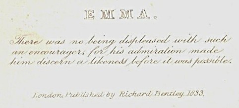
The name “Pickering” can be clearly seen at the bottom left of the image and “Greatbatch” at the bottom right. The picture depicts Emma Woodhouse drawing a portrait of her friend Harriet Smith, while Mr. Elton is playing very close attention to Emma. The style of the costumes is from the 1830s rather than being correct for the late 18th century to Regency period. The legend of the frontispiece is shown below as Figure 3.

Figure 3. Text below the frontispiece of Emma

The text reads “There was no being displeased with such an encourager, for his admiration made him discern a likeness before it was possible.” It is a direct quotation from Chapter 6 of Emma. Mr. Elton is lavishing praise on Emma, who he greatly admires, despite Emma’s attempts to deflect his attentions to Harriet. The final line in a smaller font reads “London, Published by Richard Bentley. 1833.” This is the publisher asserting his ownership of the copyright of the image, which he commissioned from Pickering and Greatbatch.

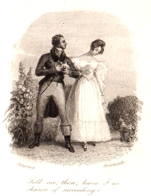
The engraved title page, together with an enlarged picture of the illustration, are shown below in Figure 4.

Figure 4. Engraved title page and vignette image from Emma

The engraved title page announces at the top that this is “EMMA. | A NOVEL. | BY | JANE AUSTEN.”. At the bottom of the page the publishers details are given thus: LONDON | RICHARD BENTLEY | (SUCESSOR TO H. COLBURN) | CUMMING, DUBLIN BELL & BRADFUTE, EDINBURGH | GALIGNANI, PARIS | 1833 . In the vignette, in the right hand panel, we see Emma out walking with Mr. Knightley, who has just declared his love for her. He then asks her “Tell me, then, have I no chance of succeeding?” which is the text below the image. This is taken directly from Chapter 49 of Emma. You can also see the names of Pickering and Greatbatch on the left and right lower corners of the image.

Reprints of the Bentley 1833 edition of Emma (Gilson D7)

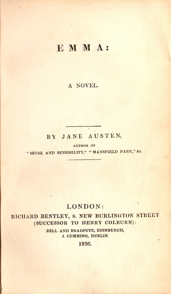
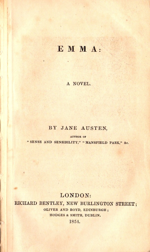
Bentley’s edition of Emma was reprinted several times in the subsequent 35 years. Stereotype plates were created and used for reprints of Emma (Gilson D2) for the Standard Novels series that were published in 1836, 1841, 1851, and 1854. Emma was also reprinted as a part of five volume sets of “The Novels of Miss Austen” that were published in 1833, 1853, 1856 and 1866. All of the reprinted Bentley editions of the Austen novels were designated D7 by David Gilson. I have copies of the 1833, 1836 and 1854 issues of Emma and of the 1856 five volume set of the six novels. In Figure 5 below, I show the printed title pages for my Emma editions of 1836, 1854 and 1856. As well as having a different date from the 1833 edition, these are differences in the page layout, Bentley’s address and the Edinburgh and Dublin publisher’s details.

Figure 5. Emma Title pages from Gilson D7 editions of 1836, 1854 and 1856

All these three reprinted editions also contain the original engraved frontispiece from 1833. The 1836 and 1856 editions also contain the engraved title page that was first published in the 1833 edition, shown in Figure 1 above. The engraved pages all still show the date 1833.

The two Standard Novel reprints of 1836 and 1854 do not have a series title page, whereas the 1856 reprint from The Novels of Miss Austen set has a half title which just bears the single word “EMMA”. The page and chapter layout for the three reprinted editions are all identical to that of the 1833 first Bentley edition. However, the printers colophons on the verso of page 435 are all different from the 1833 edition. All editions have “London:” on the first line and “New-street-Square” on the third line but are all different in the second line. These are shown below.

  • 1833 edition: Printed by A.& R. Spottiswoode,
  • 1836 edition: Printed by A. Spotiswoode,
  • 1854 edition: A. & G. A. Spottiswoode,
  • 1856 edition: Printed by Spottiswoode and Co.,

Provenance of my Bentley Emma edition of 1854

In Figure 6 below, the front endpapers of my 1854 Bentley edition of Emma are shown. They show the provenance of this book in more recent years.

Figure 6. Front endpapers of my 1854 copy of Emma (Gilson D7)

The most obvious and prominent feature in Figure 6 is the bookplate of David John Gilson on the front pastedown. This is the Gilson who compiled the standard bibliography of Jane Austen and its is an absolute privilege for me to have this copy in my Austen collection. Gilson actually mentions this copy on page 229 of the Oak Knoll Press second edition of A Bibliography of Jane Austen. Above the Gilson bookplate there is an inscription in pencil which reads: ” D7: 1854 | Given to me by | David G | 3/8/85″. This was written by Gilson’s friend John Jordan, whose bookplate is on the lower right of the free front endpaper. The two other inscriptions are: “T. Lindsay, 1914″, doubtless a previous owner of the book, and the lower line which reads ” Rebound: Ferney-Voltaire; 1953″. The book is bound in an obviously 20th century ivory textured cloth binding.

Ferney-Voltaire is a small commune of around 10,000 in south-eastern France, close to the Swiss border. It was the residence of Voltaire from 1758-1778 and his Chateau can still be visited there. As well as the Voltaire museum in the Chateau Voltaire, there is a small workshop and museum of printing and bookbinding in Ferney-Voltaire called Atelier du Livre. It is currently run by an Englishman, Andrew Brown. This may be where the 1854 Emma was rebound in 1953, by a previous owner.

Return to the Index page for Illustrated Editions of Jane Austen.

1828 Raison et Sensibilité.

Published by Arthus Bertrand Paris. 2nd ed. 3 vols. Gilson C8

Illustrated by Charles-Abraham Chasselat

The first French edition of a Jane Austen novel to appear was Raison et Sensibilité, translated from Sense and Sensibility by Mme Isabelle de Montelieu and published in Paris by Arthus Bertrand in 1815 in four volumes. It did not have any illustrations. There is no mention of this translation in any of Jane Austen’s letters, so one might conclude that she was not aware of it.

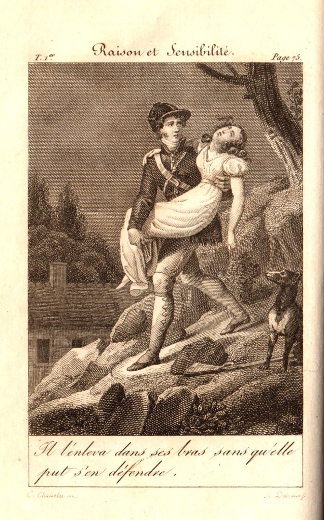
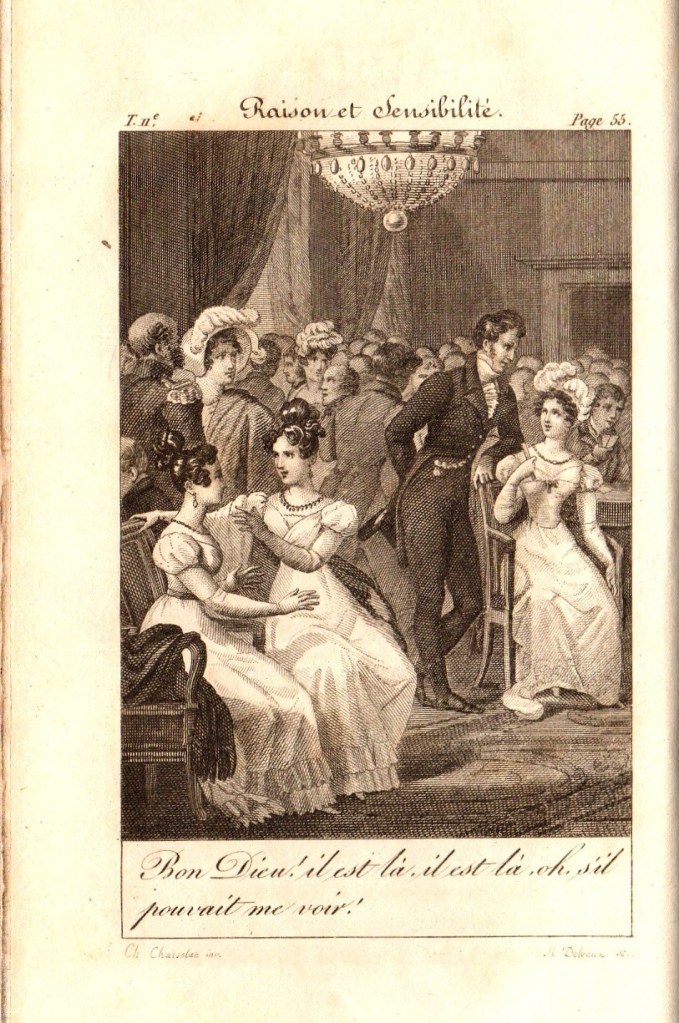
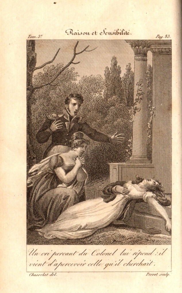
A second French edition of Raison et Sensibilité was published by Bertrand in Paris dated 1828. It is possible that this second edition was published in December 1827. This time, the Raison et Sensibilité, now published in three volumes, had a frontispiece in each of the three volumes. This is the first illustrated edition of Sense and Sensibility to be published anywhere. The illustrator for all three images was Charles-Abraham Chasselat, just as in the 1821 edition of La Famille Elliot described in a related article. The engraver was Auguste Delvaux for volumes 1 and 2, and then Jean-Simon-Narcisse Perrot (born 1796) for volume 3. The three frontispiece illustrations for Raison et Sensibilité are shown below in Figure 1.

Figure 1. Frontispieces for volumes 1,2 and 3 of Raison et Sensibilité

In volume 1 (Fig. 1 left), the picture shows Willoughby carrying Marianne back down the hill to safety, after she had twisted her ankle. The text below the image reads “Il l’enleva dans ses bras sans qu’elle put s’en défendre“, which can be translated as “He took her into his arms without her being able to defend herself” , which seems somewhat at odds with Austen’s description of the event. She also appears to have fainted in this picture.

In volume 2 (Fig. 1 centre), the scene is at a party in London, some while after Willoughby has “dumped” Marianne. She sees him across the room and exclaims, according to the figure legend. “Bien Dieu! il est là, ll est là, oh! s’il pouvait me voir!” This is not too far removed from Austen’s original text which read “‘Good heavens!’ she exclaimed, ‘he is there-he is there-Oh! why does he not look at me?” Elinor, who is seated next to Marianne tries to calm her down and prevent an embarrassing scene.

In volume 3 (Fig. 1 right), the picture shows Elinor and Colonel Brandon, who have found Marianne, who has rather melodramatically fainted by a small classical temple. The text reads “Un en’ percant du Colonel lui répend: il vient d’apercevoir celle qu’il cherchait”. This translates to something like “A piercing message from the Colonel answers him: he has just seen the one he was looking for.”

Readers, you will search in vain for this incident in Jane Austen’s Sense and Sensibility, as it simply does not occur. My view is that Mme. de Montolieu has added in this scene as a counterbalance to the rescue of Marianne by Willoughby shown in the left hand panel. In a way, it can be seen as validating Colonel Brandon as a suitor for Marianne, who is thus seen to be at least as gallant as Willoughby.

There are many other changes in the text, and the whole plot is rather distilled down to an account of the romantic tribulations of Marianne and her infatuation with Willoughby; Elinor and Edward Ferrars hardly get a look in, and Margaret, the third and youngest Dashwood sister, is virtually ignored and renamed “Emma”. Mme. de Montolieu gave her Raison et Sensibilité the subtitle “ou les deux manières d’aimer“, translated perhaps as “or the two ways of loving”. Those familiar with Sense and Sensibility might expect that this refers to the difference in approaches to romance of Marianne and Elinor, but for Mme. de Montolieu, I fear it represents the differences between Willoughby and Colonel Brandon.

Return to the Index page for Illustrated Editions of Jane Austen.

1821 La Famille Elliot.

First Illustrated Austen Novel

Published by Arthus Bertrand, Paris. 2 vols. Gilson C12

Illustrated by Charles-Abraham Chasselat

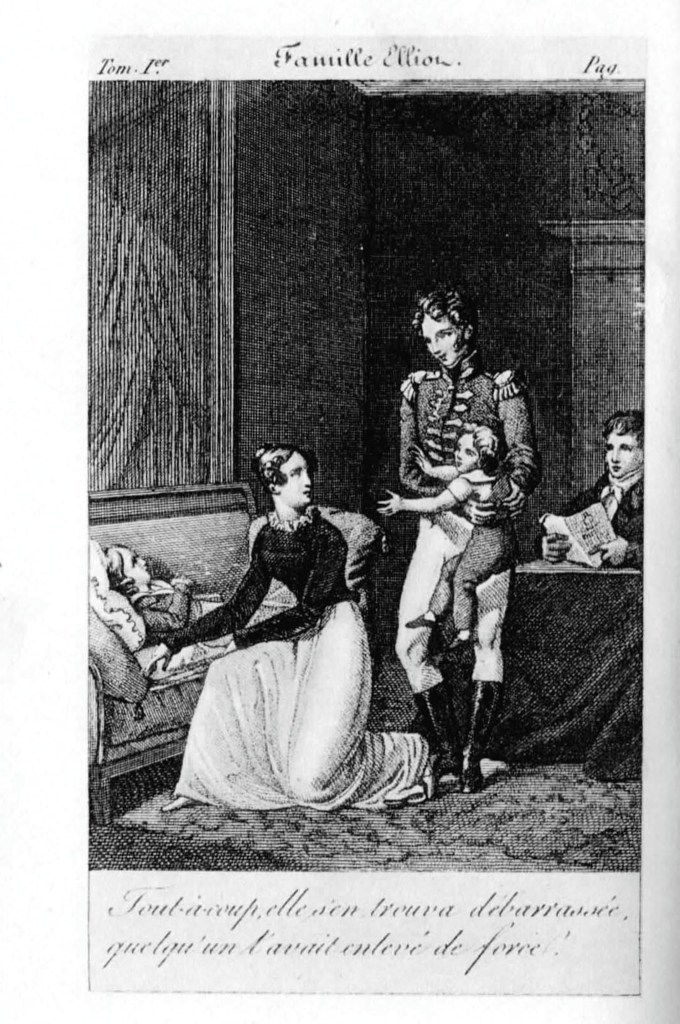
It seems ironic that the first illustrated edition of any novel by Jane Austen, that most English of authors, was published in France, but here it is. The first editions of the canonic six great novels of Jane Austen were published in London between 1811 and 1817 without any illustrations. Following Austen’s death in July 1817 and the posthumous publication of Northanger Abbey and Persuasion by John Murray in December 1817, there were no further editions of Austen’s novels published in Britain for 15 years. However in 1821, four years after the author’s death, a French translation of Persuasion was published by Arthus Bertrand in Paris in two volumes, under the title “La Famille Elliot” which translates to “The Elliot Family” in English. Each volume has a frontispiece illustration by Charles-Abraham Chasselat (1782-1843), a well-known painter of historical subjects, who also illustrated books by Voltaire, Racine and Moliere. The engraver of these frontispieces is given as “Delvaux”, which was Auguste Delvaux, (1786-1836), who was one of a pair of brothers, both of whom were fine engravers. Figure 1 shows the title page from volume 1 and the two frontispieces from La Famille Elliot.

Figure 1. Title page of Vol. 1 (left), frontispieces of Vol. 1 (centre) and Vol. 2 (right).

The title page headings read as follows (in French followed by English):

La Famille Elliot ou L’Ancienne Inclination. —– The Elliot Family or The Old Inclination

Traduction Libre de L’Anglais ———- Free Translation from English

D’Un Roman Posthume de Miss Jane Austen ——-From a posthumous novel by Jane Austen

Par Mme de Montolieu —— By Madame (Isabelle) de Montolieu.

This 1821 edition of a translation of Jane Austen’s Persuasion is not only the first Austen novel to have any illustrations; it is also the first time that the name “Jane Austen” is printed on the title page of any of her novels.

The translator, Madame de Montolieu had been born Jeanne-Isabelle-Pauline Polier de Botten in Lausanne in the French speaking part of Switzerland in 1751. After her first husband, Benjamin de Crousaz, has died in 1775, the year of Jane Austen’s birth, she remarried Baron Louis de Montolieu in 1786. After the baron died in 1800, she lived on for more than 30 years as a widow, publishing under the names Madame de Montolieu, Isabelle de Montolieu or La Baronne Isabelle de Montolieu, until her death in 1832. Her other translation of an Austen novel was Raison et Sensibilité, which was also published by Arthus Bertrand in Paris in 1815. This four volume edition was not illustrated, but a second edition in three volumes was published in 1828 with three frontispieces by the same illustrator as La Famille Elliot.

Legends for the two Frontispieces

The frontispiece to Volume One of La Famille Elliot has a text caption below the image which identifies the incident depicted. It reads: “Tout à coup elle s’en trouva debarrasseé, quelqu’ un l’avait enlevé de force.” This can be translated as: “Suddenly she found herself free of him; someone had taken him by force.” This refers to an incident where Anne Elliot is consoling her nephew Charles Musgrove, who is ill, but while she is trying to do this, Charles’ younger brother Walter Musgrove is climbing all over Anne’s back to get some attention, and is making a nuisance of himself. Captain Wentworth removes Walter Musgrove from Anne Elliot’s back. (Persuasion, Vol 1, Chapter IX p80.) This incident demonstrates the protective care that Wentworth feels that he should offer the young woman who he admires.

The frontispiece to Volume Two of La Famille Elliot also has a text caption below the image which identifies the incident depicted. It reads: “Il s’approcha de la table, montre la lettre à Alice, et sortit sans dire un mot!” This is easily translated to “He walked over to the table, showed Alice the letter, and left without saying a word!” This is the incident towards the end of the story, where Captain Wentworth presents a letter to Anne Elliot to explain his feelings (Persuasion, Vol 2, Chapter XI, p. 236).

You will note that the text refers to Anne Elliot as “Alice”. For some reason, the only name that Mme. de Montolieu alters in the book is Anne Elliot, who she renames Alice Elliot. Ironically, the translator has chanced upon the correct title for the book, as we learn from Jane Austen’s letters, published more than 50 years after the death of Mme. de Montolieu, that her working name for Persuasion was “The Elliot Family.” The name Persuasion was almost certainly coined by Jane Austen’s brother Henry Austen, who arranged the posthumous publication of the text by John Murray in 1817.

La Famille Elliot was reissued by Arthus Bertrand in 1828 in a complete edition of the works of Mme. de Montolieu. The text and illustrations were retained from the 1821 edition.

Return to the Index page for Illustrated Editions of Jane Austen.

Illustrated editions of Jane Austen

A summary and list

The following articles will be an detailed account of the most important and most attractive illustrated editions of the novels of Jane Austen. In this first part, I will simply list the editions that will be covered and give a brief summary of the illustrator and the edition. These editions will be listed in the order of first publication. This page will therefore be an index page for the following pages as they are developed. I will mostly focus on English editions, but there will be some notable exceptions. For every book that I cover, a reference will be given from the second revised 1997 edition of the magisterial bibliography of Jane Austen published by the late David Gilson, in the form of a “Gilson number” (eg. “Gilson D1”, which refers to the first Bentley edition of Sense and Sensibility published in December 1832). Each of the individual articles will present many examples of the illustrations, scanned from my own copies where possible. Where there are illustrated dust wrappers, I will show these as well.

In the Beginning…

None of the first English or American editions of the Austen novels were illustrated, so the story of illustrated editions of Austen begins surprisingly in France. The first French edition of a Jane Austen novel to appear was Raison et Sensibilité, translated from Sense and Sensibility by Mme Isabelle de Montelieu and published in Paris by Arthus Bertrand in 1815 in four volumes. It did not have any illustrations. The second French edition to appear was La Famille Elliot, translated by Mme de Montelieu from Persuasion and published by Arthus Bertrand in two volumes in 1821. It had two illustrations, a frontispiece to each volume. This is the first edition of any Austen novel to have any illustrations. Second editions of both of these books were published by Bertrand in Paris in 1828. This time, the Raison et Sensibilité (in three volumes) had a frontispiece in each of the three volumes. The two illustrations from the 1821 edition of La Famille Elliot were reissued in the 1828 second edition.

My listing of the illustrated editions of the Jane Austen Novels therefore begins with these two entries:

The next Austen novels to be published with illustrations were the individual volumes and the five volume set offered by Richard Bentley with frontispieces and title page vignettes:

These were the first English illustrated editions of Jane Austen’s novels. The novels were reprinted many times before being reissued in a new edition by Bentley starting in 1870. The details of the reprints and the second Bentley edition of 1870 will be given in the individual articles.
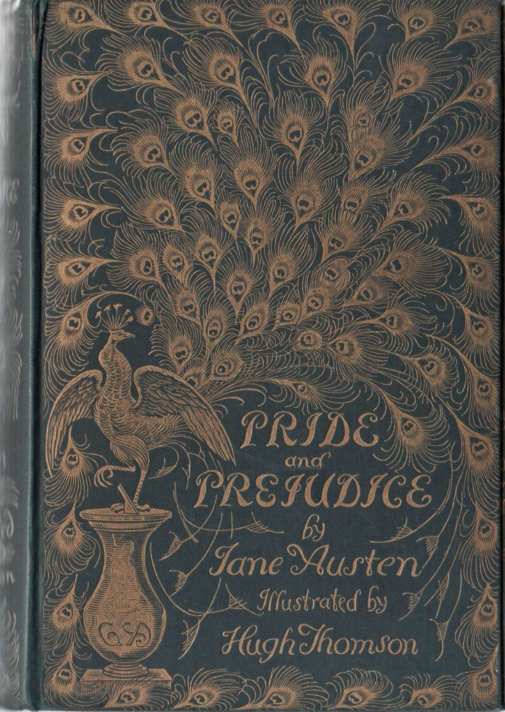
The first Austen novel to have illustrations throughout the text block was the edition of Mansfield Park published by Richard Groombridge and Sons in 1875. It had 7 full page illustrations engraved from pictures by A.F. Lydon.

More books will be added to the list as new articles are developed.

Keep watching.

Featured

Price and Provenance 0

An Index to the Price and Provenance Posts

Here is an Index with a brief description for the Price and Provenance posts.

Price and Provenance 5

Miles and Miles and Miles and Miles and Miles and Miles

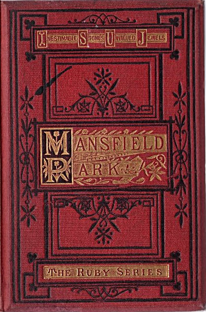
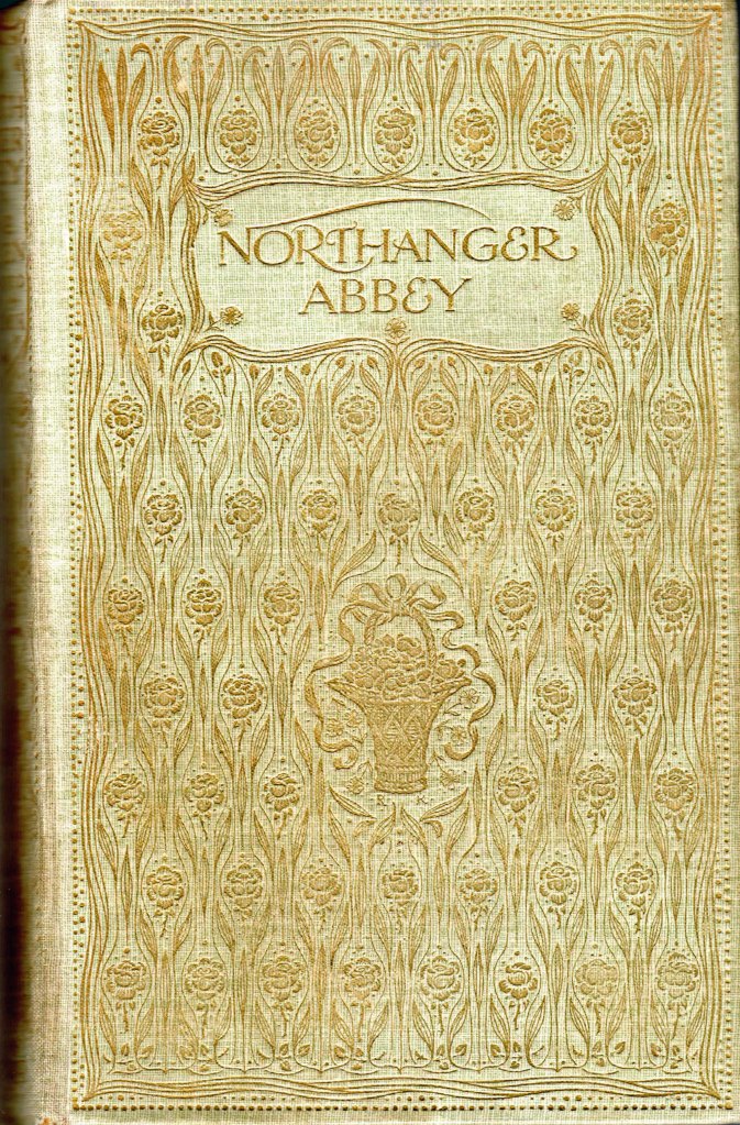
In the first few posts in this series, I have featured an edition of Jane Austen’s Mansfield Park published by Miles and Miles, a very poorly documented London publisher of Prize books, who seemed to be active during the Edwardian era. In this blog, I am looking at two other Miles and Miles books in my collection. The three Miles and Miles books that I have are shown in Figure 1 below. The top row shows the top board of the binding and the bottom row shows the end papers for the three books.

It is obvious from the appearance of these three books that the design of the top boards is identical for all three books, with the only difference being the background colour. Note that although the end-papers for the three books are all similar in style, they are in fact different in pattern and colour. For all three books, all of the page edges have been gilded, both to protect them from dust and to enhance the external appearance. This is generally referred to in book descriptions as a.e.g (all edges gilt), as compared with t.e.g. (top edge gilt) which is also commonly found in books of this period.

I would hope that everyone reading this would know that Jane Austen was the author of Mansfield Park. I doubt that many people would be able to identify the authors of the other two books, until they read a bit more of this posting.

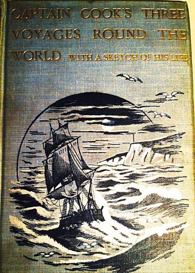
There are many published accounts of Captain Cook’s three great voyages, and most of them are not written by Captain James Cook (1728-1779) himself, although they draw heavily on his own journals and other accounts, particularly that by Joseph Banks and John Hawkworth, which was first published in 1773, in Cook’s lifetime.

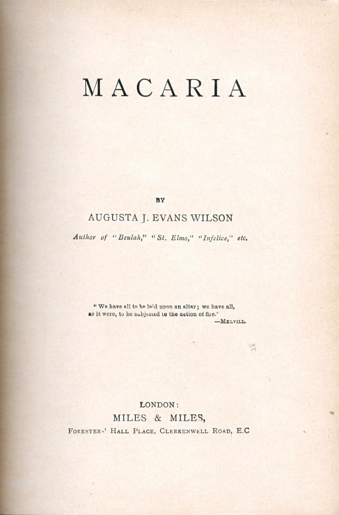
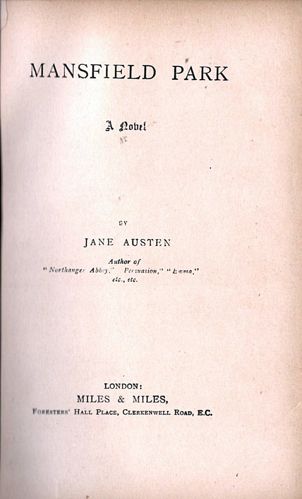
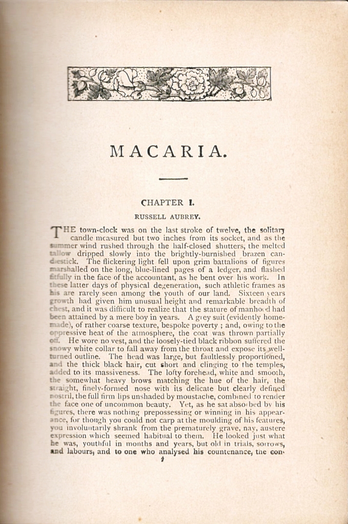
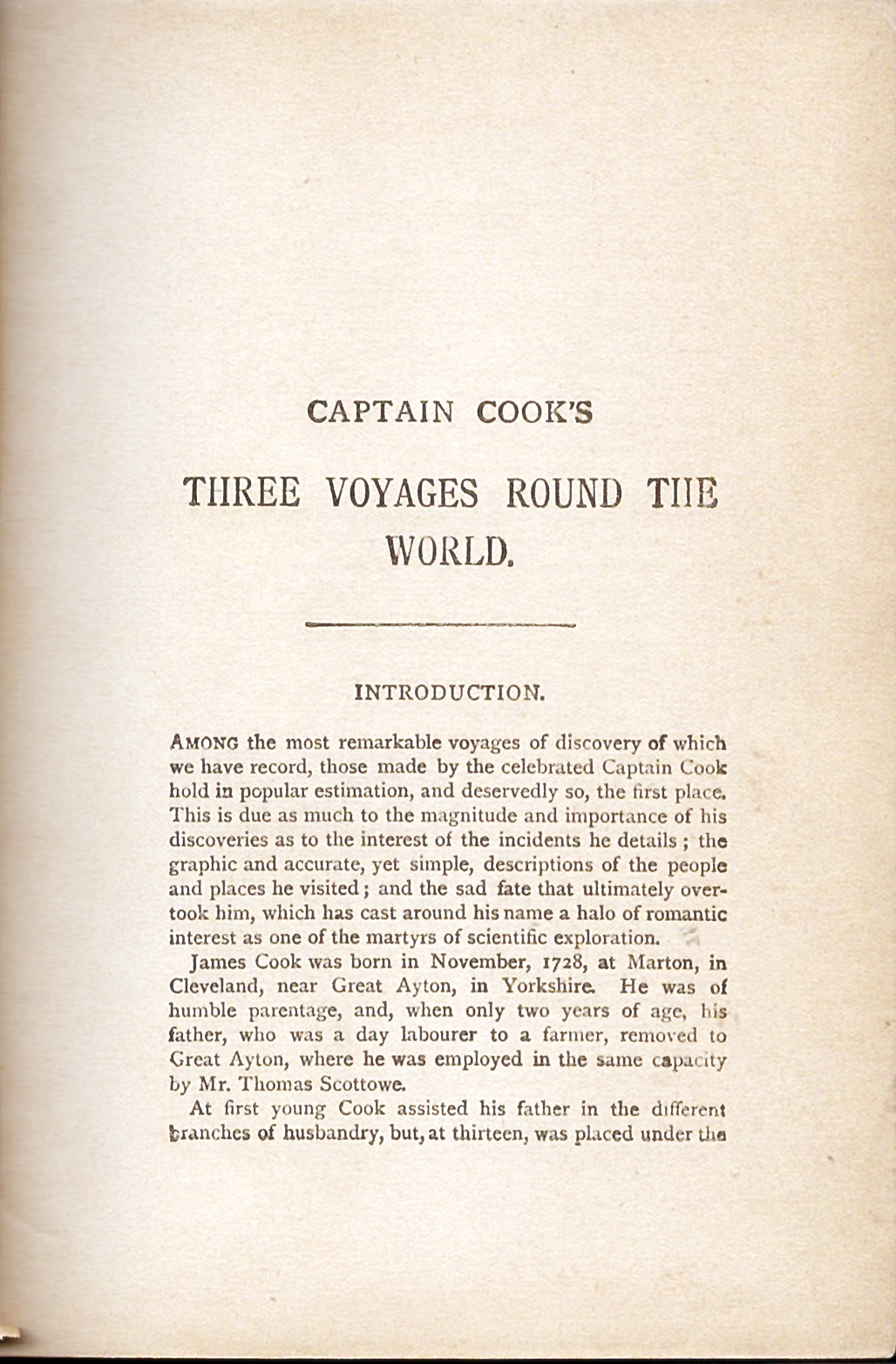
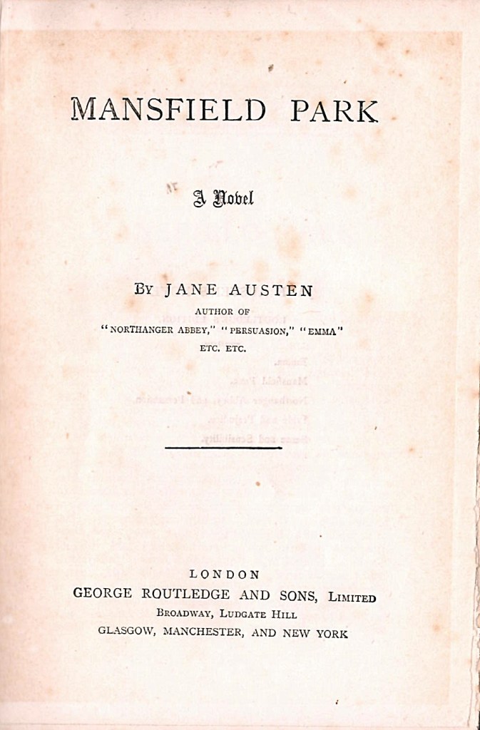
Macaria was a famous book in its day, but it has now been largely forgotten. Does anyone remember the author today? To put you out of your suspense, the answers are on the title pages of the three books, which are shown below in Figure 2.

The three title pages are generally similar in layout and look like a fairly plain standard title page of the Edwardian period. The publisher and address lines are identical on all three title pages and read “LONDON: |MILES & MILES | Foresters’ Hall Place, Clerkenwell Road, E.C.” There is no printed date of publication on the title page or anywhere else in the books. None of the books has a frontispiece or any other illustrations, nor are there any advertisements bound into the books or any identification of the name or address of the printer.

Macaria was written by Augusta J. Evans Wilson, whom we are told, was also the author of “Beulah,” “St. Elmo,” “Infelice,” etc. Captain Cook’s Three Voyages Around the World was written by Lieutenant Charles R. Low, who was “(Late) H.M. Indian Navy, Fellow of the Royal Geographical Society and Member of the Royal United Services Institute.”

In order to complete the documentation of the books we need to look at the text blocks. Macaria was published as 36 chapters printed in 380 pages. Captain Cook’s Voyages was published as sequential accounts of each of the three voyages, with no sub-division into chapters, in 512 pages. Mansfield Park was published as 48 consecutive chapters in 443 pages. This arrangement for Mansfield Park is quite common, although you also sometimes see it published with the text divided into three volumes, which was the arrangement in the first edition of 1814.

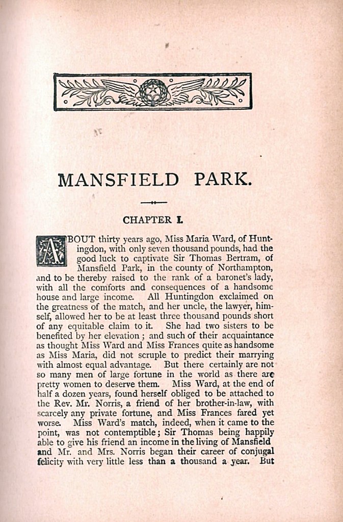
The first page of the text block is shown in Figure 3 below. It is apparent from these pages that Macaria and Mansfield Park both have a similar look, with a decoration at the top of the title page. A similar decoration is repeated at the top of the first page of each chapter in both books. Captain Cook’s Voyages does not have a decoration on the first page, nor on any of the subsequent pages.

Origin of the text blocks in these books.

It is clear from the images in Figure 3 above that Macaria and Mansfield Park are stylistically very similar, particularly in terms of the ornamentation at the top of the page. In these two books, there is also ornamentation at the bottom of the final page of each chapter. For Macaria, the chapter headings and the chapter ending designs are floral. For Mansfield Park, the ornamentation is classical in appearance with a range of different embedded emblems. It should also be noted in Figure 3 that Mansfield Park has a decorated initial capital to start every chapter, whereas Macaria has a plain initial capital.

In Price and Provenance 4, I showed that the Miles and Miles edition of Mansfield Park was printed from the same stereotype plates that were used to print Routlege and Sons’ 1883 edition of Mansfield Park, identified as Gilson E62, as well as the later Routledge “Steventon edition” of Jane Austen from around 1890.

Yet another variant of Routledge’s Mansfield Park Gilson E62

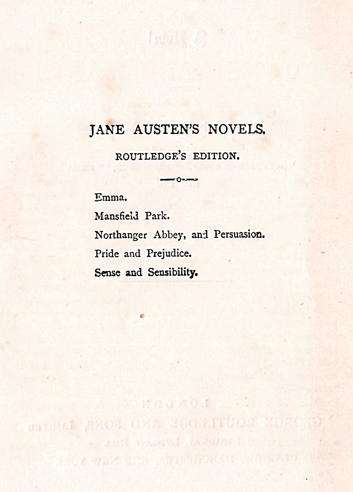
I have also recently acquired another “mystery” Routledge edition of Mansfield Park printed from those same stereotype plates, this time in a plain half-cloth binding of brown and black, and with a title page that differs from the “Steventon Editions” that I have shown in Price and Provenance 2, and the original 1883 edition of Gilson E62. This edition, indicated as part of “Routledge’s Edition of Jane Austen’s Novels” on the verso of the title page, also has a frontispiece which shows Edmond Bertram and Fanny Price with a necklace. This was described as the cover design of the original soft wrapper-bound Gilson E62, and was reported by Gilson to be present as a frontispiece of a cloth-bound variant edition of E62 at Harvard University’s Widener Library. Images of my new “mystery” edition are shown in Figure 4 below.

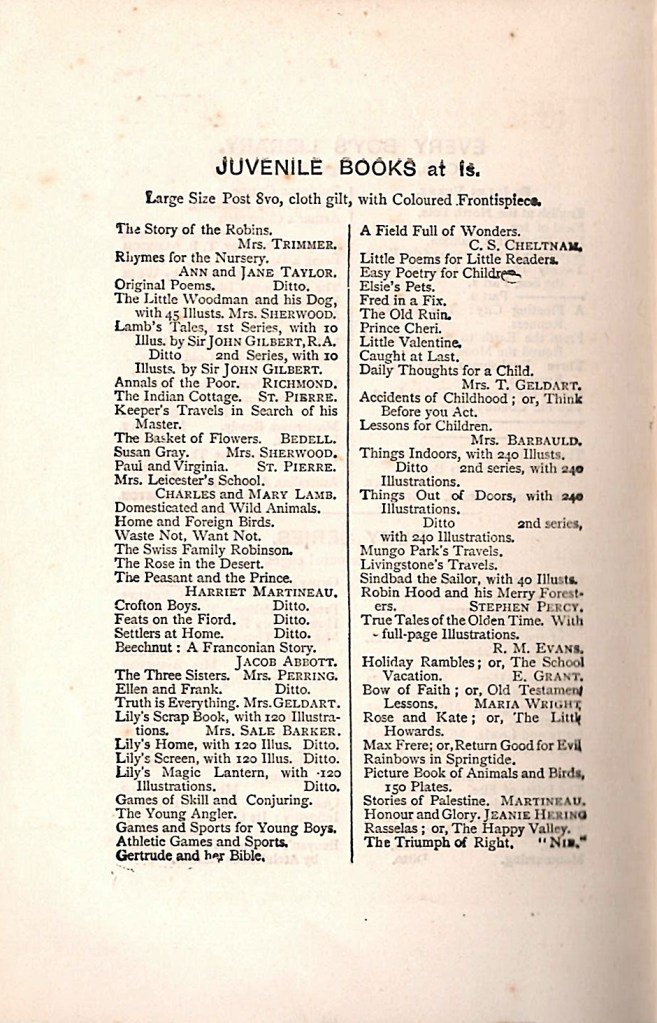
The title page gives the publisher’s details as “London| George Routledge and Sons, Limited |Broadway, Ludgate Hill | Glasgow, Manchester and New York”. From the information on my George Routledge Publisher page, this form of the publisher’s address suggests a publication date between 1889 and 1892. This is confirmed by the printer’s details on the bottom of the last page, which is given as “Woodfall & Kinder, Printers, 70 to 76 Long Acre, London W.C.” This address is indicative of the period 1888-1900. The frontispiece is clearly different in style as well as showing a completely different image from the slightly later Routledge edition shown in the left hand panel of Figure 5 of Price and Provenance 2. The book shown in figure 4 also had a four page block of publisher’s advertisements bound at the end. These are shown in Figure 5 below. An analysis of the books listed show that they were mostly first published much earlier than the 1890s. The latest one I can identify is Eighty-seven by Pansy, which was first published by Routledge in 1892.

From all of this evidence and the relative crispness of the printing, I would place this book as being published earlier than the Mansfield Park with the Sydney Carter frontispiece and the Routledge Colophon published between 1903 and 1906. Clearly the date 1892 is the most likely.

Janine Barchas, in her book The Lost Books of Jane Austen (2019), has identified several Miles and Miles books that were also printed and published by Lever Brothers between 1890 and 1897. She suspected that they were all printed from Routledge stereotype plates. She lists 100 titles that were advertised as published by Lever Brothers in 1897 on pages 107-108 of her book. Sadly for me, neither Macaria nor Captain Cook’s Voyages appear on that list. However, it is interesting that four of her 100 titles do appear in the list of the Pansy Books above. (They are Four Girls at Chatauqua, Little Fishers and Their Nets, Three People and The Chatauqua Girls at Home.) This again suggests a link between Routledge, Lever Brother and Miles and Miles when it comes to the use of the same sterotype plates.

Routledge editions of Macaria or Captain Cook’s Voyages

If my thesis is correct, then we should be able to find Routledge editions of Macaria by Augusta J Evans Wilson or Captain Cook’s Voyages by Charles Low. The easiest way to look for these is to search WorldCat.org; it is free, easy to use and searches the contents of tens of thousands of libraries world-wide. You can organise the return from the search to list the books found in order of the closeness of the library to your location. You may then to be able to interrogate the database of your local library to find out more about the book and also be able to call or reserve it for your inspection. I then followed up with a search of books offered for sale by Abe Books at AbeBooks.com to find images and details of copies of these books that might be examined or bought. In the remainder of this post, I will only examine Captain Cook’s Voyages.

Routledge editions of Captain Cook’s Voyages by Charles R Low

I searched for Captain Cook’s Voyage on WorldCat by clicking the Advance Search on the WorldCat home page, and then I entered “Routledge” in the keyword field, “Captain Cook’s Voyage” in the Title field and “Charles Low” in the Author field. I checked “Book” in the drop-down menu for Format, and then pressed Search. This returned details for seven different editions of Captain Cook’s Voyages by Charles Rathbone Low that were published by Routledge between 1880 and 1906. Each one was 512 pages, the same length as the Miles and Miles edition. In the entry in WorldCat on Charles Rathbone Low, nine different editions of Captain Cook’s Voyage were recorded between 1876 and 1906. I am not sure why there was this discrepancy.

I then searched for Captain Cook’s Voyages on Abe Books using the same three terms as I used for the World Cat search in the publisher, title, and author fields in AbeBooks advanced search form. This search returned 34 books, all published by Routledge, including several editions that were dated to between 1876 and 1879. There were several duplicates within the 33 books, and after looking through the list carefully and comparing it with the World Cat listing, I could identify nine or ten different versions, either impressions or editions, of Captain Cook’s Voyages published between by Routledge 1876 and 1910. All of them that gave a page count had text blocks of 512 pages.

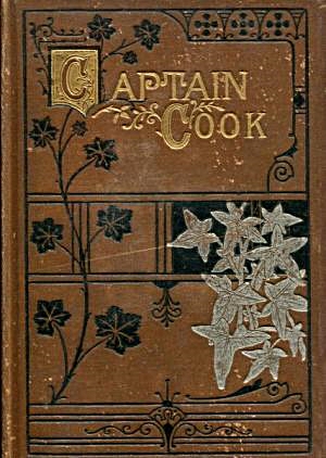
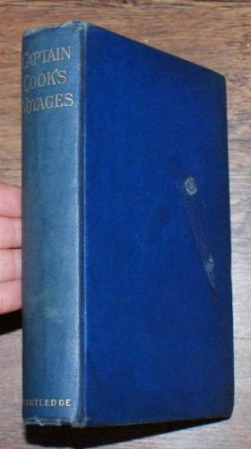
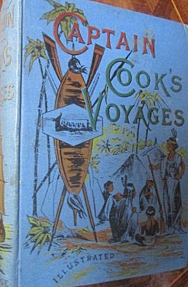
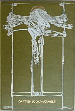
There were quite a few different bindings on view on the Abe Books site which I show in Figure 6 above. These images are taken directly from the AbeBooks.com site. The green binding on the top left is the first edition of 1876. The brown and red decorated bindings in the middle of the top row are from 1880. The plain blue binding in the top right hand corner is from the Routledge series “Sir John Lubbocks 100 Best Books”, and is dated 1892. The light-coloured binding showing a tribal camp on the left side of the bottom row is dated 1895.The blue version of the same image is undated, but will be a reprint from about 1900. The light brown book with the white Art Nouveau image of a woman is undated but will also be around 1895-1900, and the right hand image on the bottom row is from 1906.

The first edition of 1876 had six spectacular chromolithographs as illustrations, as did the reprint of 1906. Most of the editions published in the intervening years have no illustrations, black and white illustrations or a single frontispiece only.

All of these Routledge editions have a text block of 512 pages, the same page count as the Miles and Miles edition. The inscription on the title pages of every Routledge edition that I have seen has the same description of the author’s background as the Miles and Miles edition; “(Late) H.M. Indian Navy, Fellow of the Royal Geographical Society and Member of the Royal United Services Institute.”. I have found no editions of this book issued by any other publishers during the period 1876 to 1910. This allows us to say that the Miles and Miles edition is derived from the Routledge plates, but does not particularly help us with its date of publication.

UPDATE on April 21st 2020. I have recently been able to examine the text block of the 1880 edition, shown in the red binding in Figure 6 above. It matches exactly the text block of the Miles and Miles edition of Captain Cook’s Voyages. This Routledge edition of 1880 will be the 4th Routledge printing, following editions, actually impressions, of 1876, 1878 and 1879. The Routledge book has a chromolithographic frontispiece, and the text block is of a much crisper and higher quality printing than the Miles and Miles edition. It was printed by Charles Dickens and Evans, Crystal Palace Press.

A clue to the date of the Miles and Miles Captain Cook’s Voyages

On the top of the title page of my copy of the Miles and Miles edition of Captain Cook’s Voyages is an ownership signature for Doris Kenyon written in ink (Figure 2 centre). It is repeated on the free front end-paper (ffep), together with a date in the same hand Aug 23, ’99. I tentatively interpret this to be 1899, rather than 1999, as the inscription is in neat writing using a pen and nib, not a ballpoint pen. This is consistent with the report by Janine Barchas of another copy of the Miles and Miles edition of Mansfield Park in the British Library with an inscription dated 1900. Janine Barchas suggested that the Lever Brothers books printed from the Routledge stereotype plates were produced between 1890 and 1897. This would imply a date of 1897 to 1899 for my copy of the Miles and Miles edition of Captain Cook’s Voyages.

I have tried to search for Doris Kenyon in family history records, but without details of where she lived, or whether Kenyon was her maiden or married name, and with no clue as to a possible birth date, other than before 1899, or is it really 1999?, there was very little hope of any positive identification. My simple search on Ancestry.com revealed dozens of possible Doris Kenyons in the UK and almost as many in the USA. I decided to stop looking.

A brief note on the author Charles Rathbone Low (1837-1918)

Charles Rathbone Low, was a author who specialised in writing about naval topics, both factual and fictional. He served as an officer in the British Indian Navy and wrote the standard history of that organisation, History of the Indian Navy, 1613-1863 , which was published in 1877, the year after his Captain Cook’s Voyages. The earliest book I can find by him is his Tales of Naval Adventure, a novel for juveniles published in 1857. He seemed to stop writing fiction by 1875, and spent the rest of his career writing military history and biography. Routledge published two of his best selling books: The Great Battles of the British Navy (1872) and Great Battles of the British Army (1908). Below is a brief biographical fragment on him from WorldCat.org:

“Charles Rathbone Low, like so many servants of the East India Company, came from an Anglo-Irish ascendancy family, with estates in county Galway. His grandmother was a daughter of the 4th Viscount Boyne, his grandfather served in H.M. 76th Foot, his father was a Major in the Bengal Native Infantry, and he himself married the daugher of a General. Charles was born at Dublin on 30th October 1837. He entered the East India Company’s Indian Navy in 1853 and saw active service against pirates.”

from The WorldCat.org “Identities” entry for Charles Rathbone Low.

In the next posting, Price and Provenance 6, I will examine the Miles and Miles edition of Macaria in more detail.


Updated 21st April 2020

Featured

Price and Provenance 1

An Approach to the Investigation of Books

Introduction

This is the starting point for a series of posts about how to find out information about any particular copy and any particular edition and printing of an old book. As a book collector, these have been topics of great interest to me, so I thought that it might be useful to share and document some of my approaches, methods and findings. I call this series “Price and Provenance” as it is often quite difficult to find out how much an older book initially cost and also who has owned it previously. Both are issues of some interest to a serious book collector. I am taking different editions of the novels of Jane Austen as my starting point for this series of posts, partly as it reflects one of my main collecting interests, and partly as I have quite a few interesting editions to discus.

New books

Let’s start with the situation of new books. It is obviously so much easier to document the price, nature and provenance of a new book. You go to your local bookshop, or if you must, look at online vendors. Whichever way you choose, you browse around the available stock, choose your book, pay your money and take your purchase home so it can join the family of your previous purchases.

Virtually all new books today carry excellent documentation of what they are. Externally, books generally will have a removable price sticker that humans can read and also often a machine readable price bar-code. For most of the 20th century, the price was recorded on the front inner, lower corner of the dust jacket, often below a diagonal line which invited the discerning gift giver to remove the price with a pair of scissors. Dust jackets that have been mutilated in this way are generally referred to as “price-clipped”.

Books will have a title page, which will tell you the book title, author and publisher, generally in that order as you read down the page. It used to be that, through most the past 500 years, the date of publication appeared at the foot of the title page. Today, more often than not, the title page will not have the date of publication printed at the bottom. You will now have to turn the page to find it.

Now for some nomenclature which I will try to introduce gradually through these posts. We call the front of a leaf in a book or right hand page as we view an opened book the “recto” and the rear of that page, normally appearing on the left hand side of an opened book, the “verso.” So, if you look on the other side, the verso, of the title page of a new modern book, you will see a whole lot of detail which gives you a full description of the book. There will be a dated copyright statement, the date of publication, and the full name and address of the publisher, often with addresses of that publisher in multiple countries. Books published in the USA will have a statement about registration with the Library of Congress. In the UK, the equivalent is a statement about a CIP catalogue number registered with the British Library, and in Australia, where I live, there will be an equivalent statement with regard to the National Library of Australia. Towards the bottom of the page the details and address of the printer are usually given.

The details of the edition of the book also generally appear on the verso of the title page. Some times the statement will be simply “First Edition” ; other times it might say “Third impression” or it might read something like “First published in 1963, reprinted 1964 (twice), 1965, 1966”. More recently, this has been codified into a line of numbers. It generally looks like this:

1 3 5 7 9 10 8 6 4 2

or this: 1 3 5 7 9 8 6 4 2

But is may also look like this: 9 8 7 6 5 4 3 2 1

All of these tell you that the book is the first impression (printing) of the first edition. If however the line of numbers should look like this:

9 8 7 6 5 4 3 2

you are dealing with the second impression of the first edition, and you will find with each new impression, a further digit is removed. For some blockbusters, the publishers just print a number by itself to indicate the impression.

International Standard Book Number (ISBN)

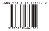
In modern books, you will also find the ISBN number. ISBN stands for International Standard Book Number. These started in 1965 as a nine-digit Standard Book Number which in 1967 became the International Standard Book Number. The format was officially established as an international standard in 1970 when a ten-digit ISBN was adopted; the earlier nine-digit numbers were updated by the addition of a leading zero. New books displayed the ten-digit ISBN, as a printed number or as a bar-code from 1970 until 2007 when the ISBN standard was redefined as a 13 digit number. While most countries adopted the ten-digit ISBN in 1970, the UK persisted with the nine-digit format until 1974. Most book readers will be familiar with the appearance of the 13 digit ISBN bar-code format shown below:

200px-EAN-13-ISBN-13.svg

Without going into the full complexities of the ISBN system, the principle is that each book should be uniquely identified, just as a URL uniquely identifies a Web page. The structure of the ISBN is built from several elements: a three-digit prefix, currently 978 or 979 known as the EAN (European Article Number), the language and or country of publication, publisher and book details. The final single digit is a technical check-sum. The elements are separated by blank spaces or by hyphens. Different formats of books (hardback, paperback, e-book) each get their own individual ISBN.

Identification and provenance of older books

For any book published before 1970, there is no ISBN, so as collectors, we have traditionally concentrated on the identification of the precise edition, printing or binding of any given book, either from inspection of the book itself, or by recourse to catalogues and bibliographies. Much less effort has been expended on understanding provenance, with the exception of the identification and collection of desirable “Association” copies of books. By Association copy, we mean a book which has been previously owned or inscribed by someone of importance, either to the book itself, or its subject matter or sometimes just by the personal fame of the associated person.

In her recent excellent book “The Lost Novels of Jane Austen”, (Johns Hopkins University Press, Baltimore, 2019, ISBN 978-1-4214-3159-8)  Professor Janine Barchas explores the topic of the provenance of hitherto unregarded, cheaper editions of the novels of Jane Austen as valuable evidence in the understanding of how the popularity of this major author was spread by the publication of editions that were accessible to the broad general reading public. Many of the books that she examined had escaped inclusion in the standard bibliographies.

Professor Barchas also uses the information of prior ownership, in combination with family history research techniques, to rediscover some of the countless unrecognised readers of Jane Austen from the past. This approach has been a facet of my book collecting practice for the past decade or so. In a series of follow-up posts, I will share some of the findings of my exploration of provenance and the previous history of the books in my collection. My first examples, like Janine Barchas’ work, will involve Jane Austen. Here are three copies of Mansfield Park which I will be exploring first.

Read the next posting to learn more about these three books.


What makes a book collectible?

I am often asked by non-book collecting friends what makes a book collectible and how can you tell if a book is valuable. Here are some thoughts on these matters.

Firstly, for a book to be collectible, there needs to be someone out there in the world who desires to own it! That may seem obvious, but really is the sine qua non of any collecting. Similarly, one may ask what is a particular book worth, and one rather obvious answer is “Whatever someone in the marketplace for books is prepared to pay for it!”
For instance, a book dealer may have a rare volume displayed in his or her shop with a price tag of say $500 on it, but if the book has been unsold in the shop at that price for 5 years, then who is to say that it is worth the price on the tag?

If we dig a little deeper into these issues, the four major determinants of “worth”, which may not be the same thing as “value” or “price” are form, content, rarity and condition. Lets consider these four issues in turn.

Form

By form, I mean the physical presentation of the book. Is it a hardback or paperback? Is it a first edition or a reprint? Is it printed or published by a desirable firm? Is it in an attractive or elegant binding? Is it illustrated? Is it signed by anyone special, such as the author, illustrator or a significant previous owner?
Does it have an interesting, well designed or famous bookplate? Some of these issues is worthy of some consideration.

Hardback or Paperback

Generally speaking, hardback, or more properly, ‘cased’ books are more collectible than paperbacks. There are many reasons for this. Most books are first published in a fully bound and cased format, at a relatively higher price, before they are then reprinted as a less expensive paperback in card covers, often with the gatherings of the pages glued to a back-strip, in what is misleadingly called ‘perfect bound’. Most paperbacks that one sees are perfect bound. In recent years, in an attempt to contain costs, large format first edition ‘trade paperbacks’ have been published at the same time as an equivalent fully cased hardback first edition. Here in Australia, for instance, in the 21st century, most first edition novels are only available as trade paperbacks, when in the UK and USA they are often published as both hardbacks and trade paperbacks. Often it is then only the trade paperback that is exported from the UK to Australia for retail sale.

Cased books for the last almost 200 years have been bound within board covers that are covered with a substance that can be labelled or decorated. The coverings were traditionally types of animal skins, leathers of various types, or vellum. In the early 19th century, book cloth was popularised as a cheaper and durable alternative to animal products.

Since the later part of the 19th century, cased books have also been covered by paper wrappers called a dust wrapper or dust jacket. These were initially disposable, plain paper covers to protect the printed pages before they were cased by a book binder, or to protect them on the journey between the publisher and the retail bookseller. As the years went by, the dust jackets were seen as a useful, if perhaps ephemeral part of the book, which could also be decorated and so be useful in the marketing of books. For the collector of Modern First Editions (however defined), the dust jacket is a highly desirable if not essential component of the book for it to be deemed complete and collectible.


Some paperbacks are highly prized and collectible, particularly certain books which were only published in paperback format, or books from certain paperback publishers, such as Penguin, Albatross, Tauchnitz and Pan.

First editions

Everyone knows that first editions are very collectible and are often highly desired. But if you give this a little thought, it does require some explanation. One thing that you can be sure of is that every book that has ever been published has existed as a first edition. Indeed, the vast majority of books, once published in their first edition, have probably failed to sell sufficiently well, and so have never been  reprinted or re-issued! So why the importance of first editions? 
Collectors will generally say that the first edition is the first appearance of the book and as the initial form of the book that the world ever sees, it has a particular power and importance beyond the raw text. They will also say that the first edition also represents the authors freshest and new ideas and inventions. However, the first appearance of a book, which is strictly the first state of the first impression of the first edition ( I will explore these terms more in a following blog) in the original publisher’s binding and dust jacket will often contain errors (known in the book collecting world as points) that are most commonly introduced by the printer, but sometimes by the editor or the binder.
Thus the earliest form of the book may not represent the author’s true intentions, and it may be later states that correctly reflect the text as presented in the author’s manuscript.

Bindings

Generally, the original publisher’s binding of  a book is the most desired form. However, from the earliest times, it has been quite common for books to be given different bindings after their purchase, that are often more ornate and attractive than the publisher’s binding. Sometimes, particular book buyers or collectors had a preferred or personalised form of binding that they always applied to their books. Some private, public and school libraries also adopted this practice.

From  early Victorian times, it was quite common to replace the publishers cloth binding with a half or quarter bound casing that used different leathers and boards, often with marbled end papers. On occasions, the publishers themselves produce a limited number of copies of a book that are bound in higher quality, more expensive bindings. 

In mid to late Victorian times, many publishers adopted more highly decorated cloth styles, with the use of impressed or embossed gilt designs or coloured cloth decorations, sometimes on beveled or more elaborately incised boards. All of these superior Victorian cloth bindings are very collectible in their own right. In addition the cheap ‘yellowback’ bindings of crime and sensational novels of the late Victorian and Edwardian age are also now highly collected.

From the early years of the twentieth century, books were mostly bound in cloth which had become very plain and undecorated, particularly after World War One. As the cloth became plainer, so the dust jackets gradually became more highly decorated. In the Art Deco period, from the early-1920s until the end of the thirties, an expectation of elegantly decorated dust jackets began to become the norm for high quality books. For some crime fiction and thrillers, some of the dust jacket decorations became quite lurid and sensational. There are collectors out there for all of these. A few authors even designed their own dust jackets, Evelyn Waugh with ‘Vile Bodies‘ and Ian Fleming with ‘Moonraker‘ are two famous examples, and Len Deighton designed a few decorated Penguin covers in the 1960s.


Signed books

Names or signatures in books can add to their desirability. However, it does matter whose name and signature it is. ” To little Freddy  from Auntie Nell, Xmas 1984, XXX “, scrawled across the title page of any book with purple broad tip Texta pen will almost certain detract from the books desirability. 

However, a copy of the James Bond book ‘Dr No‘, neatly signed “Ian Fleming” on the end-paper would be desirable. If it were inscribed “Peter, here is my latest book; your brother Ian” it would probably be more desirable. If it were to be signed “to Sean Connery from Ian Fleming, loved your performance”, it would be very highly desirable. I’m sure that you get the idea. 

Certainly a plain signature, probably written en mass for a bookstore appearance, is probably less desirable that a dedication to an unknown person, and certainly less desirable that a dedication to a famous person or a person who is significant to the book. 

Ownership signatures from famous, previous owners of the book, neatly written on an end-paper are also highly desirable. In this regard, a copy of Hitler’s “Mein Kamf”, with Sir Winston Churchill’s ownership signature would be desired by all collectors of war books or Churchilliana.

Bookplates

Book-plates are the often decorative labels pasted onto the end-papers of books to assert ownership. Many people had personalised book-plates designed for them and the presence of a discrete and tasteful book plate does not generally lessen the desirability of a book; if the book plate is particularly well designed, or sufficiently grotesque  and unusual, or if it belonged to a famous or significant person, then it probably adds to the desirability of the book.

Content

Content is a fairly straight forward matter to consider in book collecting. By content, I mean the text and the illustrations (if any). 

Text

If the book is a classic or prize winning or ground breaking work, then it will be intrinsically more desirable. For most authors, there are one or a few stand-out titles which are the most collected. For George Orwell for instance, I think that everyone would identify “Animal Farm” and “1984” as his most desirable books. On the other hand, almost anything by Charles Dickens, Jane Austen or the Brontes would be very desirable.

The nature of the text is also important. Most collectors prefer the detective fiction of Dorothy Sayers to her religious works; similarly, the Narnia books and the three space fiction novels of CS Lewis are more collected than his academic or religious books. Most collectors would rather have Rider Haggard’s “King Solomon’s Mines” or “She”, rather than his scarce first book, “Cetewayo and his White Neighbours”, or his later books on Farming. 

Charles Darwin’s “On The Origin of Species” probably is a unique book in its profound impact on human ideas and life. Any copy of this text has some interest to collectors, from the first edition of 1859 down to the many modern reprints that have appeared since.

Illustration

Illustrated books also have a content collectibility over and above the written text. Many books have been published in un-illustrated first editions, which, after the book’s success as text has been established, get re-issued in lavishly Illustrated and finely bound editions that many collectors crave. For collectors of English books, the golden age of book illustration is generally held to be the period 1875 to 1914.

I personally have collected editions of the Alice books of Lewis Carroll illustrated by many illustrators over the last hundred years or so. Although the original illustrations in the first editions of 1865 and 1871 were famously and iconically created by Sir John Tenniel, many famous illustrators have produced wonderful illustrations since then. In a future blog, I will discuss these books and illustrations.

Rarity

Rarity is determined by a number of factors. Age is certainly one, and although old books are not necessarily highly collectible, there is no doubt that age will have an affect on survival of any book, and so will effect rarity.

The size of an edition is also a key factor. The first edition of the first book by an unknown author is usually published in very small numbers, as the publishers want to limit their risk of losses. If the book is successful, then the publisher can print more copies and issue new editions, according to the book’s popularity. Nowadays, if a film is made of the book, new editions are published to take advantage of the marketing of the film.

In interesting recent example of the first book phenomenon is offered by the Harry Potter books of J K Rowling. The first book in the series, “Harry Potter and the Philosopher’s stone” (1997), as the first book by an unknown author, was published in a standard small first UK hardback edition of 500 copies in laminated boards, along with a paperback edition of a few thousand books. 300 of the 500 hardbacks were sold to the English School Library system, where they will have been read to destruction,  leaving only 200 copies for book collectors. These now attract massive prices, around $50,000, in specialist book auctions. Copies signed by Rowling will cost even more.

The second book “Harry Potter and the Chamber of Secrets” (1998) and third book “Harry Potter and the Prisoner of Astraban” (1999) were both published in UK hardback first editions of about 10,000 copies each. These are also highly collected and quite expensive, generally costing around $1000 , depending on condition and issue, rising to $7500 if they are signed by the author.

By the fourth book “Harry Potter and the Goblet of Fire“, (2000), the Harry Potter phenomenon had well and truly taken off. The first UK hardback edition numbered 1 million books! Although these are still collectible, they are easy to find, and not very expensive. The same is true for the last three books, published in massive first editions and therefore relatively common and easy to find.
Interestingly, the first UK hardback edition of the first James bond book “Casino Royale” (1953) is also very rare and highly desirable, due to a small edition being printed (about 4500 books), of which half went to the UK Public Library Service and were read to destruction… a similar story to the first Harry Potter book.

In a parallel story,  the first edition of Charles Darwin’s “On the Origin of Species“, was published by John Murray on 24th November 1859 in a first edition of only 1250 copies of which 1170 copies were available for sale. 500 of these were purchased by Mudie’s Library and all of the rest were pre-sold before publication, mainly due to the intense interest in the subject at the time. Many ended up in institutional libraries, so that the number of copies in private hands, which are those that tend to become available to the rare book trade, was very limited. A first edition can still sometimes be offered for sale in 2015, but it will cost around $250,000. A copy famously sold for around this price on the 150th anniversary of its publication in 2009.


Condition

Condition is the final consideration that I will consider here. Book collectors want the best possible condition of any book that they want to collect. The book should ideally be complete, in the original binding and dust jacket, with no marks, tears, scribblings, sticky tape scars, water or light damage, library detritus or stains. It should ideally look like a brand new copy of the book on the day of issue, before it has been read.

This Ideal is not always attainable, and so the more scarce and desirable a book is, the more collectors will compromise on condition. Small stains and small repaired tears and creases in the dust jacket are often acceptable. All illustrations must be present in an illustrated book, but looseness of tipped in illustrations can be acceptable and can be repaired. The title page must be present and all of the text must be present, but some people will accept the loss or disfigurement of the free front end paper (the blank page often found at the front of a book, before the title page). Looseness or defects in the binding, usually found in the “gutters”, the region where the pages are attached to the boards, are grudgingly acceptable to most, and the absence of protective tissues from illustrations, particularly frontispieces are common and also generally acceptable.

Foxing, the appearance of brown stains due to a mould within the paper is common and also acceptable if not too severe. (A well known comical book on book collecting, illustrated by Ronald Searle, is famously titled “Slightly Foxed, but Still Desirable”, echoing the description often given in book dealer’s catalogues.)

Not surprisingly, the older a book is, the more damaged and worse for ware it is likely to be. Most collectors will accept this and take a pragmatic view to this issue. Thus I expect a much higher standard for my Terry Pratchett first editions, all of which were published after 1983, than my Charles Dickens first editions, all of which were published between 1834 and 1870.