Price and Provenance 2

What are these three editions of Mansfield Park by Jane Austen?

This is an example of how to establish the identity and provenance of books. In this part of the blog I am concentrating on the precise identification of books. I am going to compare these three books and then look at each in detail to see what we can learn about its origin. In the next posting, I will demonstrate how to investigate their provenance.

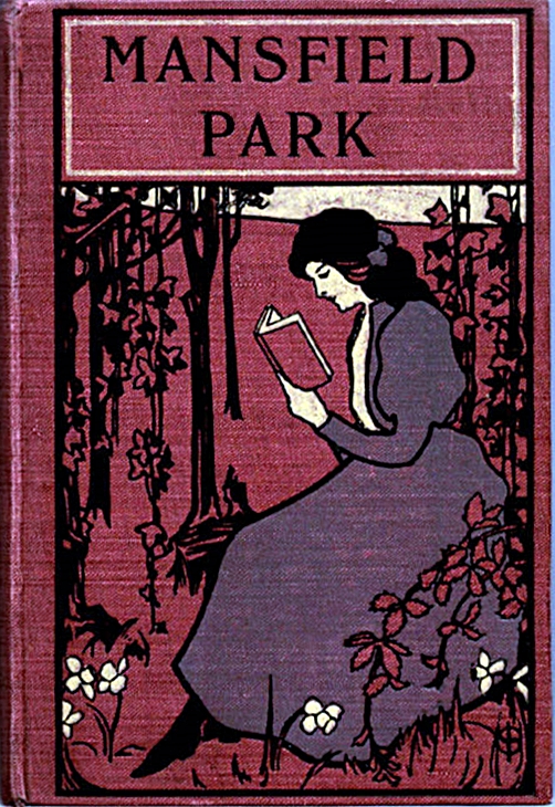
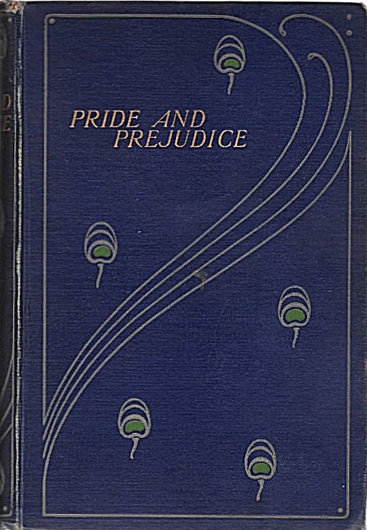
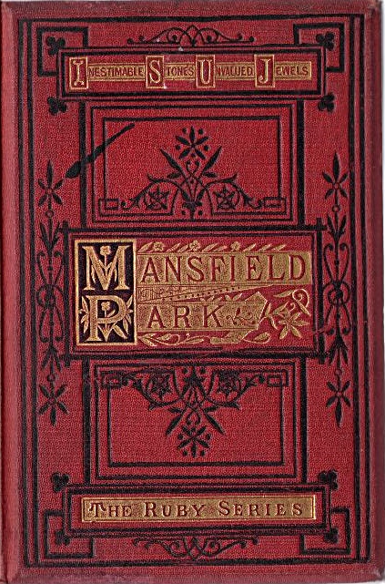
Here (Figure 1) are three different editions of Mansfield Park, all published more than 50 years after the first edition, which was published in 1814 in London by John Murray in three volumes. Only the left hand book has any extra information on the front of the binding, properly called the top board. In the upper cartouche is the phrase “Inestimable Stones Unvalued Jewels” and in the lower cartouche the phrase “The Ruby Series”. Inestimable Stones Unvalued Jewels is a quotation from Shakespeare’s play Richard III Act 1 Scene 4: “Inestimable stones, unvalued jewels, All scatter’d in the bottom of the sea“.

We can often roughly date a book by examining the appearance, style, materials and quality of the binding. All three books are cloth bound in predominantly red cloth, with two of them decorated with gilding. The Ruby Series binding is in a geometric style that is suggestive of the 1860-1880 period. The central book has an Art Nouveau look to it, and the style of the dress of the woman shown reading is Edwardian, which suggests a date range of 1900 – 1910. The right hand book with its ornate floral design suggests the broader late Victorian and Edwardian period of 1875 – 1910. All of these opinions are entirely subjective and represent my feeling on first seeing the books.

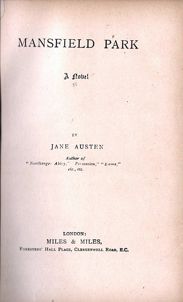
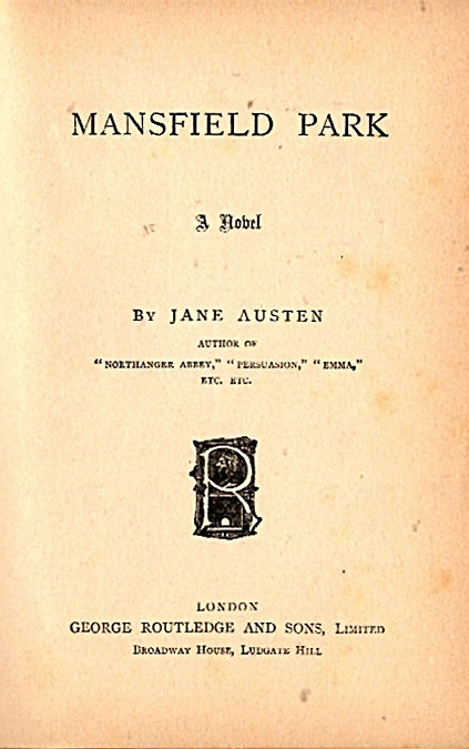
The next thing to do when examining any book is to look at the title page to see what information is present, and, all too often, what information is missing. On the three title pages, which are reproduced below (Figure 2), you can see that two of these books were published by George Routledge and Sons, while the third was published by Miles and Miles. None of the title pages cites a publication date. Here are the three title pages:
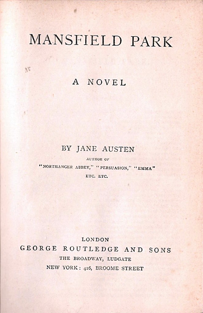
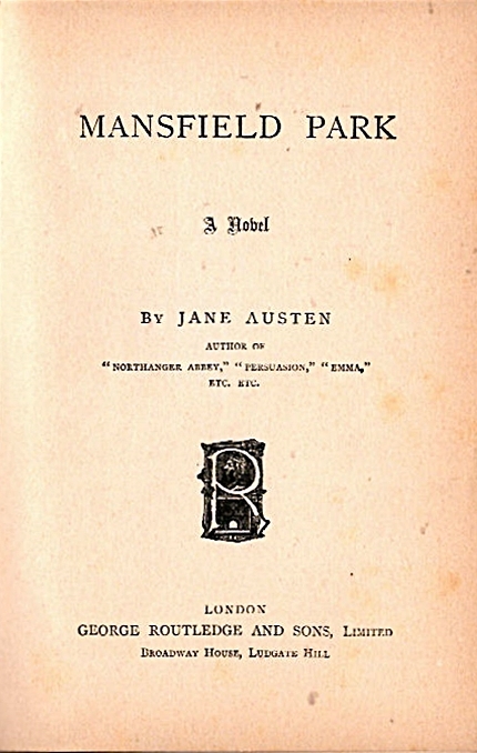
All three books are clearly editions of Mansfield Park published in London. After the title, all three pages repeat the same text ‘ BY JANE AUSTEN Author of “Northanger Abbey,” “Persuasion,” “Emma” etc, etc’, with some slight differences in fonts and cases. It is quite unusual for exactly these same three books to be cited in the same way; indeed, it is much more common for Austen to be cited as the author of Pride and Prejudice and/or Sense and Sensibility on title pages of the other Austen novels.

The left hand and central books are both published by George Routledge and Sons, with some differences in the address. In the left hand book, Routledge’s address is given as The Broadway Ludgate, followed by New York: 416 Broome Street. In the central book, the address is given as Broadway House, Ludgate Hill with no New York address. The central book also has an ornamented capital R device, obviously a colophon or logo for the publisher. The right hand book is published by Miles and Miles at Foresters’ Hall Place, Clerkenwell Road EC. The close similarity of the printed text concerning the author suggests that all three books are related.

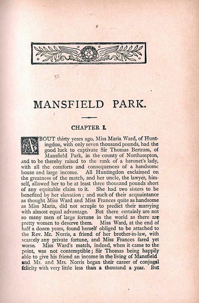
The next thing to examine is the page count of the text of the novel, normally called the “text block”, and to have a look at the appearance of the text. The left hand book has a text block of 288 pages, whereas the central and right hand books both have text blocks of 443 pages. The first page of each text block is shown in Figure 3 below.
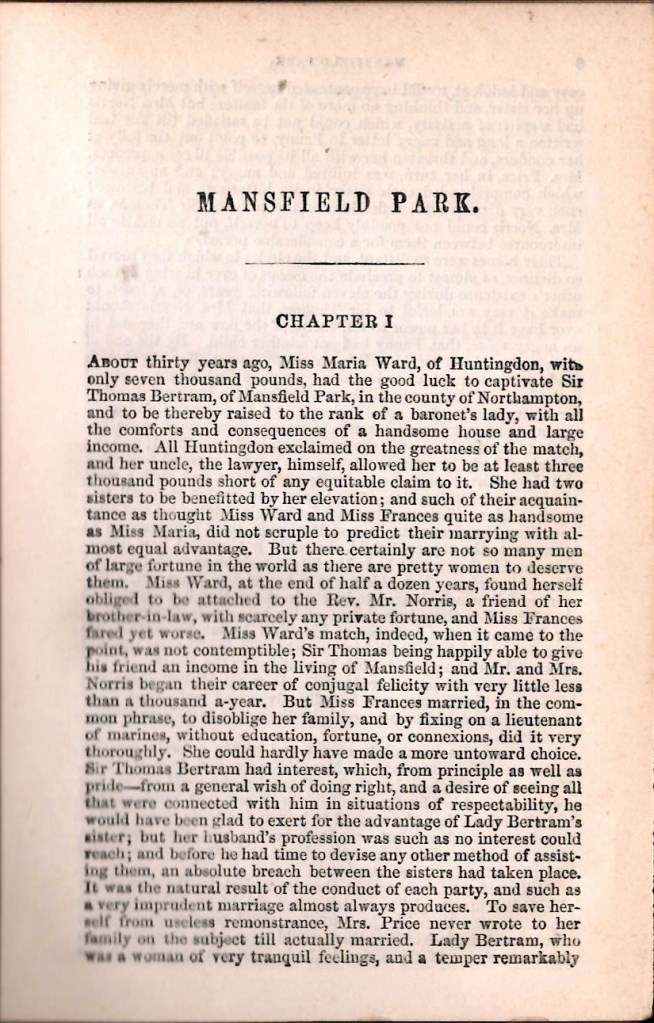
It is quite clear from Figure 3 that the two editions published by Routledge look different, but that the text block of the Miles and Miles edition seems to be exactly the same as the Routledge edition in the central panel, both in terms of page count, decoration and appearance. It is hard to get a proper impression of the quality of the pages from the images, but both the paper and print quality of the Routledge edition in the central panel is superior to both of the other two editions. How should we proceed from here?

Other relevant printed information

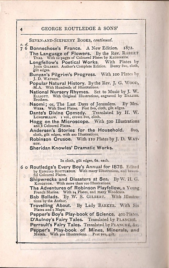
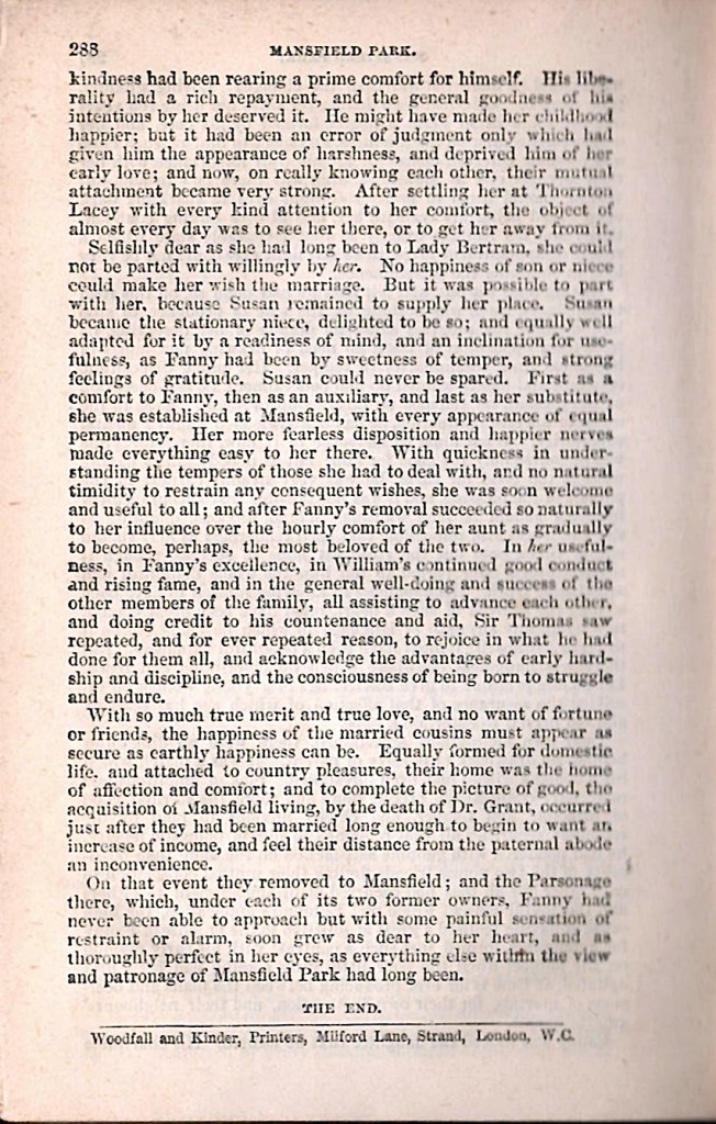
If we look at The Ruby Series edition of Mansfield Park, there are three other helpful pieces of printed information that can be found. These are a frontispiece, the printer’s details and some pages of publisher’s advertisements. These are shown in Figure 4 below.

The frontispiece is a fairly low quality wood engraving. It is disfigured by a large horizontal black ink smear, which is a printing defect that runs through the heads of the man and the woman. There are no artists’ names nor is there a date on the frontispiece image. This is disappointing, as we can often find both an engraver and and artist name in book illustrations. Dates are rarer, but can sometimes be found in illustrations. However, illustrations are not always original images made for a particular book; they can often be recycled and reused.

The last page of the text block, shown in the central panel of Figure 4 above, indicates a page count of 288 pages. Also, as is often the case, the last page of the text block bears the name of the printer. In this case, it is “Woodfall and Kinder, Printers, Milford Lane, Strand, London, W.C.” which is printed at the bottom of p.288. This information is often useful because the printer’s relationship with the publisher, the form of the name of the printing company and the address of the printer all may be associated with particular date ranges. In this case, we know from the Library of Congress records that this was the address for Woodfall and Kinder from 1865 to 1887.

Publisher’s advertisements in books can be very revealing. In this case there is some frustration, as it seems that the publisher’s advertising block of four leaves may be incomplete, as after the unnumbered first advert page, the following page numbers are present; 4,13,14,19,20,29,30. The page shown in the right hand panel of Figure 4, p.4, is the verso of the first advert page, suggesting that the publishers printed advertising pages that were extracted from a larger document. The most useful entry in the advert block is the entry two thirds of the way down the page shown in Figure 4, which reads “Routledge’s Every Boy’s Annual for 1876”. Annuals, by their nature are produced every year, so this entry strongly suggests the period 1876-1877 for the publication of The Ruby Series.

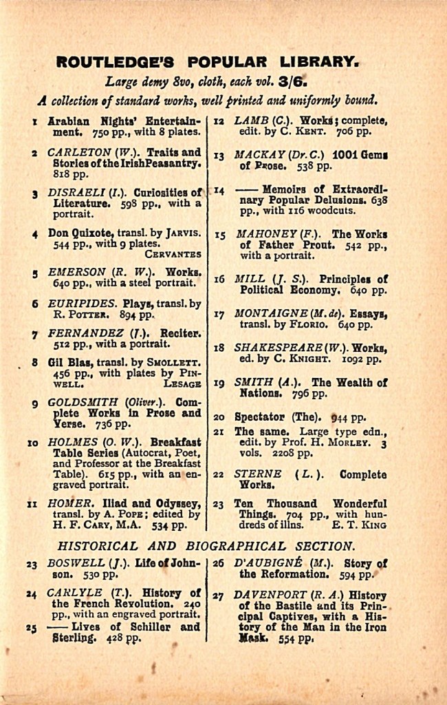
The other Routledge edition of Mansfield Park shown in the central panel of Figure 1 above also has a frontispiece and a block of advertisements, which are shown in Figure 5 below.
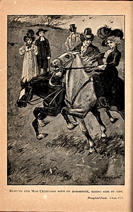
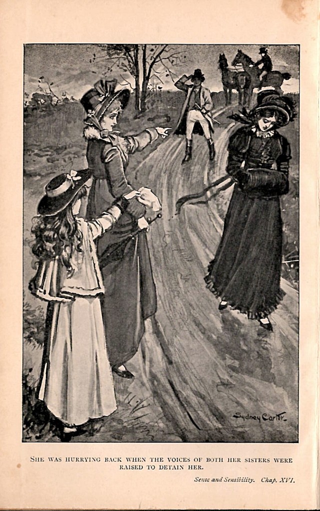
The frontispiece is a photographically produced half tone image that has an artist’s name, Sydney Carter, in the lower right hand corner. The picture shows Edward Bertram riding with Mrs Crawford, an incident from Chapter 7 of Mansfield Park. The frontispiece has no date. The decorated capital ‘R’ colophon for Routledge first appears on the title page of Routledge and Sons publications in 1903, and appears consistently on their publications until 1920. There is a four page block of publisher’s advertisements bound at the end of the text block. It consists of advertisements for books in Routledge’s Popular Library and Routledge’s Popular Poets, all of which were priced at 3/6. (three shillings and sixpence). An investigation of the book titles in the advertisements show that these items were first published by Routledge in the 1880s and 1890s.

There is also a printer’s name and address printed on the verso of the title page. It reveals the printer to be “London and County Printing Works, Bazaar Buildings, London, W.C.” This refers to the printer L. Upcott Gill, who worked at this address, which is in Drury Lane. There is evidence for the firm operating at that address at least between 1902 and 1907, including the printing of a book for Routledge in 1903.

When we consider the Miles and Miles edition of Mansfield Park, the situation is both much simpler and less helpful. There is no frontispiece present nor any other illustrations, there is no printer identified and there is no block of advertisements. So, where should we go from here?

Consult the Experts or Ask a Friend?

At this point, it is generally best to look at what is known about different editions of Jane Austen, and what is known about the two publishers, George Routledge and Sons and Miles and Miles. We now need to consult the most reliable bibliographic sources available. Another useful approach can be to consult WorldCat on line, which gives listings of holdings of books in thousands of libraries around the world. This can be a convenient way to access the Library of Congress and The British Library. For this investigation, I am going to stick to the standard bibliographies which provide far more detail. However, you do need to have access to copies of them. One of the essential elements of book collecting is to build a practical and working bibliographic library, appropriate to your collecting needs.

There are four bibliographic sources for Jane Austen. These are by Michael Sadlier (1888-1957), the authority on the publication of literature in 19th century England. His XIX Century Fiction: A Bibliographic Record, Constable, London 1951, based on his own collection, is the best general authority on 19th century publications. More specific and detailed bibliographies of Jane Austen were published by Geoffrey Keynes (1887-1982) Jane Austen: A Bibliography. Nonesuch Press, 1929 and Robert Chapman (1881-1960) Jane Austen: A Critical Bibliography Oxford University Press 1969. The current standard authority is David Gilson (1938-2014) in his massive A Bibliography of Jane Austen, 2nd edition, Oak Knoll Press, Newcastle, Delaware, USA , 1997.

The identification system used by Gilson is a combination of a letter which represents a class of publications, followed by a number which identifies the edition within that class, with the numbers assigned in chronological order. The letter and number codes are as follows in the 1997 edition:

  • A1 – A9 Original UK editions
  • B1 – B7 Original US editions
  • C1 – C249 Non-English translations
  • D1 – D13 Editions published by Bentley
  • E1 – E425 Later editions 1838 -1976
  • F1 – F24 Minor works by Austen
  • G1 – G7 Austen’s letters
  • H1 – H50 Dramatisations
  • J1 – J14 Continuations and completions
  • K1 – K20 Books owned by Jane Austen
  • L1 – L48 Miscellaneous
  • M1 – M1814 Biography and Criticism

When we consult Gilson, and similarly with Sadlier, Keynes and Chapman, the first thing to note is that there is no mention of Miles and Miles as a publisher of Jane Austen. However, there is quite a lot of detail on George Routledge in Gilson. Routledge published different inexpensive editions of Jane Austen, starting in 1849 with Sense and Sensibility recorded as Gilson E12 and Pride and Prejudice as Gilson E13. The publisher’s name and address on both of these is given as George Routledge and Co., Soho Square. These two titles reappeared in several reprinted editions throughout the 1850s.

Gilson also noted a 288 page edition of Mansfield Park published by George Routledge and Co., Farringdon Street; and 18 Beekman Street New York dated 1857 (Gilson E23). He noted that E23 was reprinted by Routledge in 1876 as a part of The Ruby Series, which Gilson recorded as E44. Gilson also noted that E44 was bound in a blue daisy-patterned cloth, with no date on the title page. The publisher’s details were given as George Routledge and Sons, The Broadway, Ludgate; New York 416 Broome Street. He also noted that the British Library copy had four leaves of publisher’s advertisements bound in. He also stated that E44 had a wood engraved frontispiece which depicted Edward Bertram and Mary Crawford on the park seat at Sotherton. From the list shown below, 416 Broome Street was the New York address for Routledge from 1866 – 1881.

I think the identity of my Ruby Series Mansfield Park is now clearly established as Gilson E44, published in 1876 in an alternative binding to that described by Gilson.

Gilson reports later editions of Austen printed by George Routledge and Sons, including all six novels in 1883, which included a 433 page edition of Mansfield Park (Gilson E61). These 1883 editions were all undated on the title page, but showed the publisher’s address as Broadway, Ludgate Hill; New York, 9 Lafayette Place. Gilson mentions that several of the 1883 editions of Jane Austen published by Routledge have been recorded by other researchers as reprinted by George Routledge and Sons in 1898 and 1899 as “The Steventon Edition”.

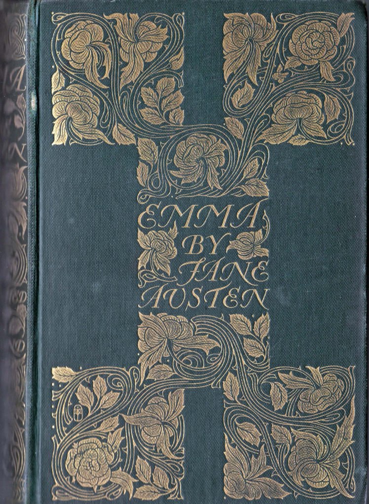
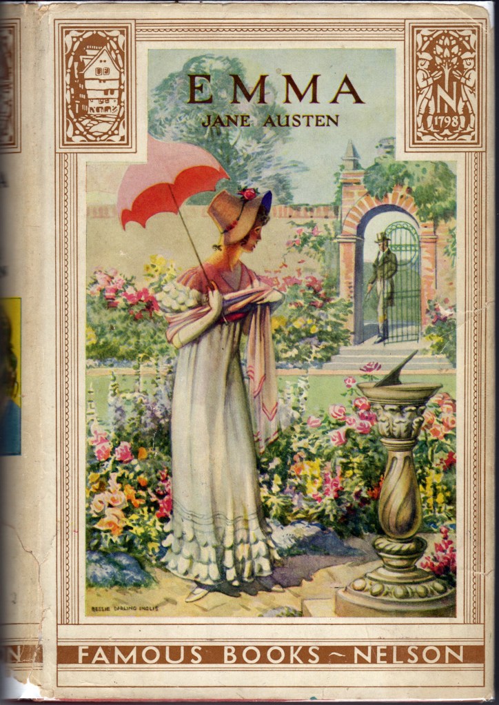
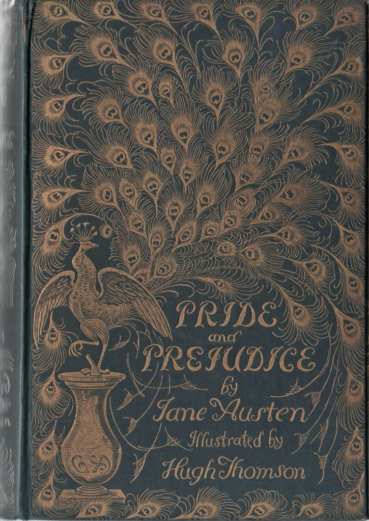
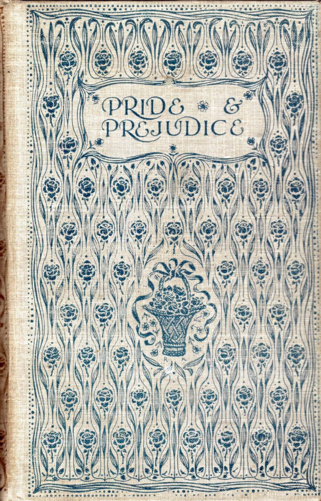
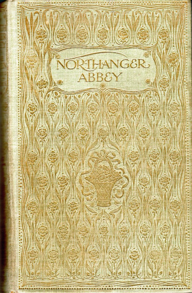
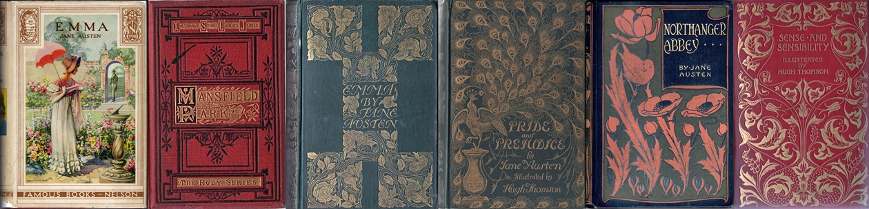
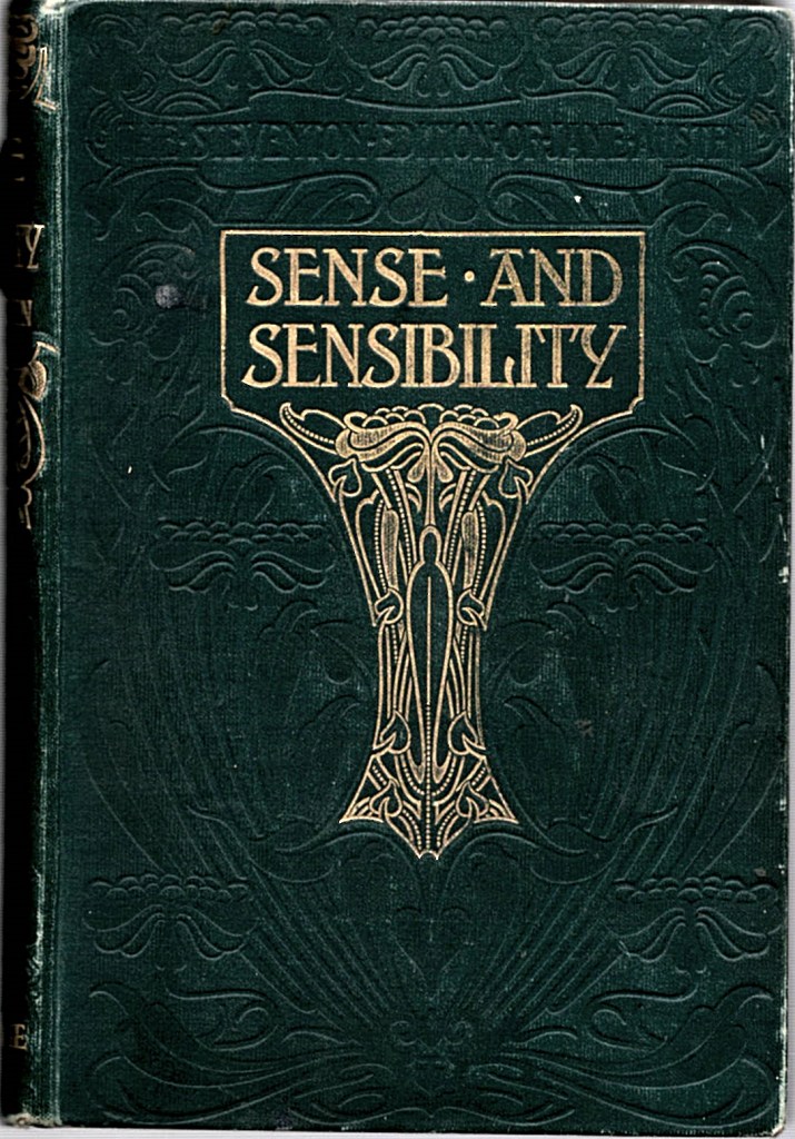
I have three of “The Steventon Edition” volumes of Jane Austen published by George Routledge and Sons in my personal library. Sadly, I don’t have a copy of “The Steventon Edition” of Mansfield Park. The bindings and title pages are shown below (Figure 6.) This are clearly Art Nouveau style bindings. The phrase “The Steventon Edition” appears blind stamped just above the gilded titles.
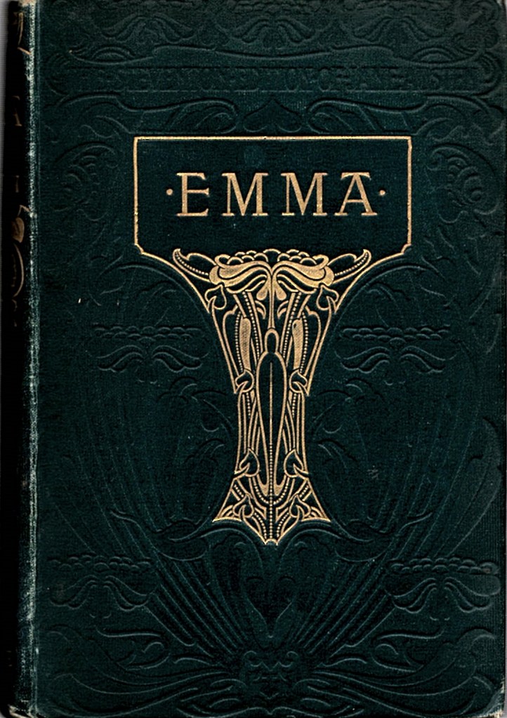
My copies of Sense and Sensibility and Emma shown in Figure 6 above both have frontispieces that are clearly stylistically very similar to that shown for the Routledge Mansfield Park in Figure 5. They are all signed Sydney Carter, all produced by the same photographic halftone process and all have the same style of caption. Sadly, the Northanger Abbey/Persuasion in Figure 6 has apparently lost its frontispiece.

The title pages in Figure 6. are all similar but have some slight differences. None of these “Steventon” editions have the decorated R colophon on the title page. The other Jane Austen titles cited following the author’s name are printed slightly differently, and the addresses on the Emma and Northanger Abbey/Persuasion are given exactly as on the Mansfield Park in Figure 5 Broadway House, Ludgate Hill, whereas the address on the Sense and Sensibility is given as Broadway, Ludgate Hill | Manchester and New York. The “Manchester and New York” printed on the Sense and Sensibility is indicative of a publication date from 1892 to 1897. The other two books were probably published in the period 1900-1902.

For more details on how to identify the publication date of books published by George Routledge, go to my George Routledge Publisher page.
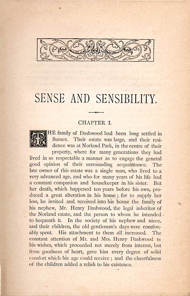
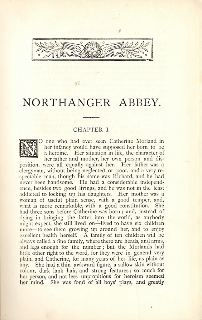
From the images of the first page (Figure 7), the style of these three books closely matches the styles of the Miles and Miles Mansfield Park and the Routledge Mansfield Park in the centre of Figure 2. If we look at the text blocks of these three Steventon editions, we find they are 379, 444 and 448 pages for Sense and Sensibility, Emma and Northanger Abbey/Persuasion respectively. This exactly matches the page counts for the 1883 Routledge editions of these titles recorded by Gilson as E60, E63 and E64. The printer for these books is identified as “Woodfall and Kinder, Printers, 70-76 Long Acre, London, W.C.” According to the Library of Congress, this is the address for this printing firm from 1888 to around 1900.

George Routledge the publisher

What do we know abut George Routledge the publisher? Fortunately, the company records for George Routledge, who lived from 1812 to 1888, have survived, and are held by University College London. Inspection of these records reveal how the description of the company and its addresses changed over 100 years. They are summarised in the following list: The numbers in brackets are the street addresses, which sometimes were printed in full, but often the number was omitted.

  • 1836-1843 George Routledge 11 Ryders Court, Leicester Square, London
  • 1843-1851 George Routledge and Co., (36) Soho Square, London
  • 1852-1858 George Routledge and Co., Farringdon Street
  • 1858-1859 Routledge, Warnes and Routledge, (2) Farringdon Street
  • 1860-1864 Routledge, Warne and Routledge, (2) Farringdon Street
  • 1865 Routledge, Warne and Routledge, Broadway Ludgate Hill
  • 1865-1866 George Routledge and Sons, Broadway Ludgate Hill
  • 1866-1878 George Routledge and Sons, The Broadway Ludgate
  • 1879-1886 George Routledge and Sons, Broadway Ludgate Hill

From 1854 to 1886, the address of the New York office was often printed below the London address. From 1887 to 1902, New York address no longer appeared on the title pages. All of the years from 1887-1890 start LONDON | George Routledge and Sons. and from 1890 onward LONDON | George Routledge and Sons Limited.

  • 1887-1888 Broadway, Ludgate Hill | Glasgow and New York
  • 1889-1892 Broadway, Ludgate Hill | Glasgow Manchester and New York
  • 1892-1897 Broadway, Ludgate Hill | Manchester and New York
  • 1895-1902 George Routledge and Sons Limited, Broadway Ludgate Hill
  • 1900-1911 George Routledge and Sons Limited, Broadway House, Ludgate Hill
  • 1903-1925 London | George Routledge and Sons, Limited |New York E.P. Dutton and Co.
  • 1912-1925 London | George Routledge and Sons, Limited | Broadway House 68-74 Carter Lane E.C.

The New York addresses are shown below.

  • 1854-1859 18 Beekman Street. New York
  • 1859-1864 56 Walker Street. New York
  • 1864-1866 129 Grand Street. New York
  • 1866-1881 416 Broome Street. New York
  • 1881-1886 9 Lafayette place New York
  • 1887-1902 New York (American only publications will still use 9 Lafayette Place)
  • 1903-1945 New York: E.P. Dutton and Co.

For more details on how to identify the publication date of books published by George Routledge, go to my George Routledge Publisher page.
From all of these considerations, it seems clear that the Routledge edition of Mansfield Park shown in the central panel of Figure 1 must be a reprint of the 1883 Routledge edition described by Gilson as E62. The Steventon editions are also reprints of the 1883 editions, probably printed between 1892 and 1900. My Mansfield Park with the woman reading on the cover is almost certainly another, later reprint of E61, printed between 1903 and 1906, because of the evidence of the title page style and the printer and publisher’s addresses. As will be seen in Part 3 of the blog, there is another piece of evidence which supports this.

How can we identify the Miles and Miles edition, which is lacking in any evidence other than the name and address of the publisher and the style of the binding and the text block. Fortunately for me, Janine Barchas in her excellent “The Lost Novels of Jane Austen” published in 2019 by Johns Hopkins University Press, Baltimore, USA , has explored the origin of the Miles and Miles editions of Jane Austen. In chapter 2, Professor Barchas relates an impressive account of how the stereotype printing plates, which were created by Routledge and Sons for their 1883 editions of Jane Austen (Gilson E60 -E64) were sold or leased to other publishers to produce cheap editions of the books. She shows how Lever Brothers, soap manufacturers at Port Sunlight in Cheshire, UK, issued at least 100 titles from stereotype plates between 1890 and 1897, which included a copy of Sense and Sensibility in her own possession, and copies of Pride and Prejudice which are all clearly printed from the Routledge stereotype plates of 1883.

Janine Barchas has also identified that several books on the Lever Brothers list were also published by Miles and Miles in at least three binding styles, one described as The Marguerite Series, another as The Sundial Series and a third unnamed series which corresponds to the Miles and Miles binding of my Mansfield Park shown in Figure 1. She also identified the use of these same stereotype plates to produce even shoddier and cheaper looking editions by other publishers including Standard Authors, The Londoner Press and John Heywood Ltd of Manchester. Clearly a range of different publishers have had access to the same stereotype plates to produce cheap editions of Jane Austen in the period 1890 to 1905, perhaps even to 1910.

Finally, Janine Barchas noted that The British Library has a copy of Mansfield Park, published by Miles and Miles, tentatively dated to 1900 by an inscription. All of the above leads me to believe that my Miles and Miles edition of Mansfield Park is another reprint from the Routledge stereotype plates of 1883, printed some time between 1900 and 1906. For more on Miles and Miles see Price and Provenance 5.

The conclusions for the dating of all three of my editions of Mansfield Park are summarised in Figure 8 below. For an account of the establishment of provenance and prior ownership of these and other related books, please refer to the following section of the blog Price and Provenance 3.


Revised and updated 21 April 2020.


Price and Provenance 1

An Approach to the Investigation of Books

Introduction

This is the starting point for a series of posts about how to find out information about any particular copy and any particular edition and printing of an old book. As a book collector, these have been topics of great interest to me, so I thought that it might be useful to share and document some of my approaches, methods and findings. I call this series “Price and Provenance” as it is often quite difficult to find out how much an older book initially cost and also who has owned it previously. Both are issues of some interest to a serious book collector. I am taking different editions of the novels of Jane Austen as my starting point for this series of posts, partly as it reflects one of my main collecting interests, and partly as I have quite a few interesting editions to discus.

New books

Let’s start with the situation of new books. It is obviously so much easier to document the price, nature and provenance of a new book. You go to your local bookshop, or if you must, look at online vendors. Whichever way you choose, you browse around the available stock, choose your book, pay your money and take your purchase home so it can join the family of your previous purchases.

Virtually all new books today carry excellent documentation of what they are. Externally, books generally will have a removable price sticker that humans can read and also often a machine readable price bar-code. For most of the 20th century, the price was recorded on the front inner, lower corner of the dust jacket, often below a diagonal line which invited the discerning gift giver to remove the price with a pair of scissors. Dust jackets that have been mutilated in this way are generally referred to as “price-clipped”.

Books will have a title page, which will tell you the book title, author and publisher, generally in that order as you read down the page. It used to be that, through most the past 500 years, the date of publication appeared at the foot of the title page. Today, more often than not, the title page will not have the date of publication printed at the bottom. You will now have to turn the page to find it.

Now for some nomenclature which I will try to introduce gradually through these posts. We call the front of a leaf in a book or right hand page as we view an opened book the “recto” and the rear of that page, normally appearing on the left hand side of an opened book, the “verso.” So, if you look on the other side, the verso, of the title page of a new modern book, you will see a whole lot of detail which gives you a full description of the book. There will be a dated copyright statement, the date of publication, and the full name and address of the publisher, often with addresses of that publisher in multiple countries. Books published in the USA will have a statement about registration with the Library of Congress. In the UK, the equivalent is a statement about a CIP catalogue number registered with the British Library, and in Australia, where I live, there will be an equivalent statement with regard to the National Library of Australia. Towards the bottom of the page the details and address of the printer are usually given.

The details of the edition of the book also generally appear on the verso of the title page. Some times the statement will be simply “First Edition” ; other times it might say “Third impression” or it might read something like “First published in 1963, reprinted 1964 (twice), 1965, 1966”. More recently, this has been codified into a line of numbers. It generally looks like this:

1 3 5 7 9 10 8 6 4 2

or this: 1 3 5 7 9 8 6 4 2

But is may also look like this: 9 8 7 6 5 4 3 2 1

All of these tell you that the book is the first impression (printing) of the first edition. If however the line of numbers should look like this:

9 8 7 6 5 4 3 2

you are dealing with the second impression of the first edition, and you will find with each new impression, a further digit is removed. For some blockbusters, the publishers just print a number by itself to indicate the impression.

International Standard Book Number (ISBN)

In modern books, you will also find the ISBN number. ISBN stands for International Standard Book Number. These started in 1965 as a nine-digit Standard Book Number which in 1967 became the International Standard Book Number. The format was officially established as an international standard in 1970 when a ten-digit ISBN was adopted; the earlier nine-digit numbers were updated by the addition of a leading zero. New books displayed the ten-digit ISBN, as a printed number or as a bar-code from 1970 until 2007 when the ISBN standard was redefined as a 13 digit number. While most countries adopted the ten-digit ISBN in 1970, the UK persisted with the nine-digit format until 1974. Most book readers will be familiar with the appearance of the 13 digit ISBN bar-code format shown below:

200px-EAN-13-ISBN-13.svg

Without going into the full complexities of the ISBN system, the principle is that each book should be uniquely identified, just as a URL uniquely identifies a Web page. The structure of the ISBN is built from several elements: a three-digit prefix, currently 978 or 979 known as the EAN (European Article Number), the language and or country of publication, publisher and book details. The final single digit is a technical check-sum. The elements are separated by blank spaces or by hyphens. Different formats of books (hardback, paperback, e-book) each get their own individual ISBN.

Identification and provenance of older books

For any book published before 1970, there is no ISBN, so as collectors, we have traditionally concentrated on the identification of the precise edition, printing or binding of any given book, either from inspection of the book itself, or by recourse to catalogues and bibliographies. Much less effort has been expended on understanding provenance, with the exception of the identification and collection of desirable “Association” copies of books. By Association copy, we mean a book which has been previously owned or inscribed by someone of importance, either to the book itself, or its subject matter or sometimes just by the personal fame of the associated person.

In her recent excellent book “The Lost Novels of Jane Austen”, (Johns Hopkins University Press, Baltimore, 2019, ISBN 978-1-4214-3159-8)  Professor Janine Barchas explores the topic of the provenance of hitherto unregarded, cheaper editions of the novels of Jane Austen as valuable evidence in the understanding of how the popularity of this major author was spread by the publication of editions that were accessible to the broad general reading public. Many of the books that she examined had escaped inclusion in the standard bibliographies.

Professor Barchas also uses the information of prior ownership, in combination with family history research techniques, to rediscover some of the countless unrecognised readers of Jane Austen from the past. This approach has been a facet of my book collecting practice for the past decade or so. In a series of follow-up posts, I will share some of the findings of my exploration of provenance and the previous history of the books in my collection. My first examples, like Janine Barchas’ work, will involve Jane Austen. Here are three copies of Mansfield Park which I will be exploring first.

Read the next posting to learn more about these three books.


Christmas Books

Books about Christmas that are of interest to collectors.

There have been many books written and published about and for Christmas. Here are a few of my personal favourites, with a brief commentary on them and some background on Charles Dickens and Christmas.

Charles Dickens is often credited with the invention of  “The Traditional Christmas”, but most who have looked at this issue would agree that Dickens is mainly responsible for the general popularity of the notion of the “Traditional English Christmas”. The combination of the family-centered celebration of Christmas, together with fun, feasting, drinking and above all a sense of Goodwill Towards All Men has come to epitomise the Dickensian Christmas. But where did all this come from, and how did Dickens know about it?
One interesting fact is that a book was published in London in 1836 called The Book of Christmas by Thomas K Hervey. The book, which was a collection of English Christmas customs, was illustrated by Robert Seymour. 

The Book of Christmas 1836

We know that Charles Dickens knew Robert Seymour, as in 1836, that same year, Dickens had been hired by the publishers Chapman and Hall to provide the text for a series of sporting illustrations to be drawn by Seymour. This project eventually became The Posthumous Papers of the Pickwick Club, which propelled Dickens from obscurity to instant fame. Sadly, Seymour only provided the first few illustrations for the book, as he committed suicide soon after the start of Pickwick. Some, rather unkindly, have suggested that it might have been working with Dickens that drove him to his sad fate! 

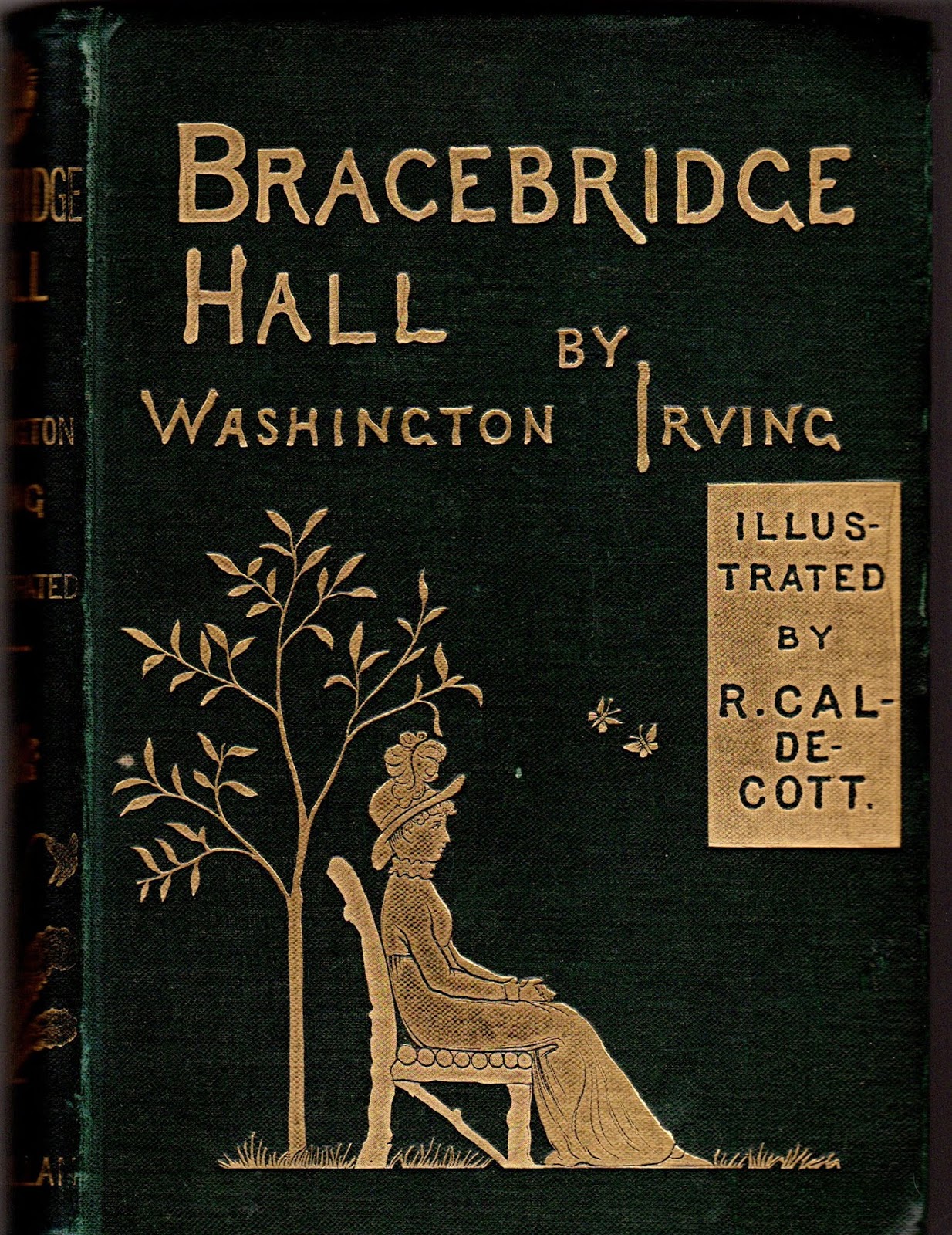
Charles Dickens was by no means the first author to look back nostalgically at the traditional English Christmas. The American author Washington Irving wrote several short pieces describing various scenes from Christmas in England. These were based on his personal experience of spending Christmas in a fine old country house close to Birmingham in Warwickshire. These writings first appeared in Washington Irving’s The Sketchbook of Geoffrey Crayon, Gent., which was first published in installments during 1819 and 1820. The most pleasing edition of these sketches about Christmas in England is Old Christmas, which was published by Macmillan in 1876, and is gloriously illustrated by Randolph Caldecott. This book was intended to be a Christmas present, and it still makes a fine seasonal gift. In 1877, Bracebridge Hall, a companion volume of Irving’s sketches in the same setting was published by Macmillan, also featuring wonderful illustrations by Randolph Caldecott. These two books are shown below in their original bindings.
Old Christmas, Macmillan 1876Bracebridge Hall, Macmillan 1877

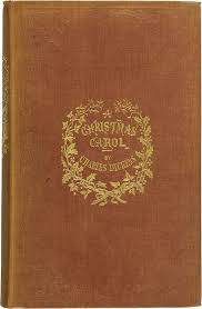
Although there are two memorable Christmas “episodes” in Pickwick, the great Dickens Christmas book was certainly A Christmas Carol, published by Chapman and Hall in December 1843. The genesis of the book was the rather poor sales of the serial parts of Martin Chuzzlewit, in the middle of 1843, which was causing some distress to Dickens and his publisher. After threats to reduce Dickens’ income in light of the poor sales, he was encouraged to produce a successful book for the Christmas market of 1843. After much walking and worrying, it was probably a visit in early October to Dickens’ older sister Fanny in Manchester, where she lived in fairly straitened circumstances with her husband and crippled son Fred, that gave Dickens the inspiration for A Christmas Carol. He started writing the book in mid October and presented the finished manuscript to his publisher on December 2nd. The first edition of  6000 copies was published on 19th December and was sold out in four days at 5 shillings each. The manuscript of A Christmas Carol has survived and is in the Pierpoint Morgan Library in New York. The library published a fine facsimile of the manuscript in 1993, which allows you to read the text in Dickens’ handwriting, with all of his erasures, amendments and edits, side by side with the printed text.
††

A Christmas Carol 1843Facsimile of the first page of the
manuscript of A Christmas Carol 1943

A first edition of A Christmas Carol costs $10,000 – $25,000 today. Ironically, Dickens was disappointed in the financial return that he got from A Christmas Carol. His publishers had forced him to take the financial risk with the publication, but because Dickens had insisted on high-quality end-papers, a high-quality binding, and above all, four hand coloured lithographs as illustrations, and a coloured title page, the production costs of the book consumed most of the earnings so that Dickens only made a few hundred pounds from the project, rather than the thousands that he had expected. This was in spite of the fact that A Christmas Carol sold out twelve editions before Christmas 1844. Never again in his lifetime did Dickens publish a book which contained coloured illustrations. 
Fortunately for the book collector with a modest budget, a nice facsimile edition of the first edition of A Christmas Carol was published by Chapman and Hall in 1926. This can still be found for purchase for a reasonably low sum, often below $100.
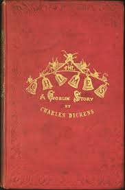
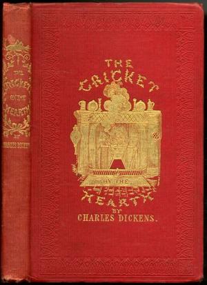
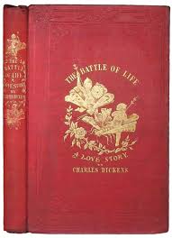
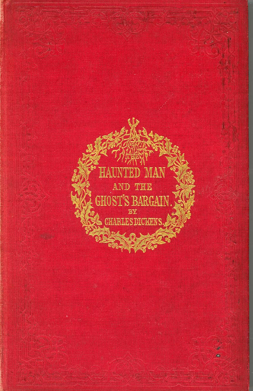
Dickens published four more Christmas books, but none of them are thought to be comparable to A Christmas Carol in quality, and they certainly have not been as popular with the general reader. Here they are in the original bindings.
The Chimes
1844
The Cricket on the
Hearth 1845
The Battle of Life
1846
The Haunted Man
1848

The five Christmas Books of Charles Dickens have been published together many times as a collection in a single volume, starting with the first collected edition published in 1852 by Chapman and Hall in a rather undistinguished pale green blind-stamped cloth binding. A much more attractive edition is the one published by Chapman and Hall in 1869 shown below, which was the last edition of the collected Christmas Books that was published in Dickens’ lifetime. As in most of the combined editions of the Christmas Books, the illustrations are all printed without colour, presumably to contain the high costs of production which beset the early editions of A Christmas Carol.

Christmas Books Charles Dickens
Chapman and Hall 1869

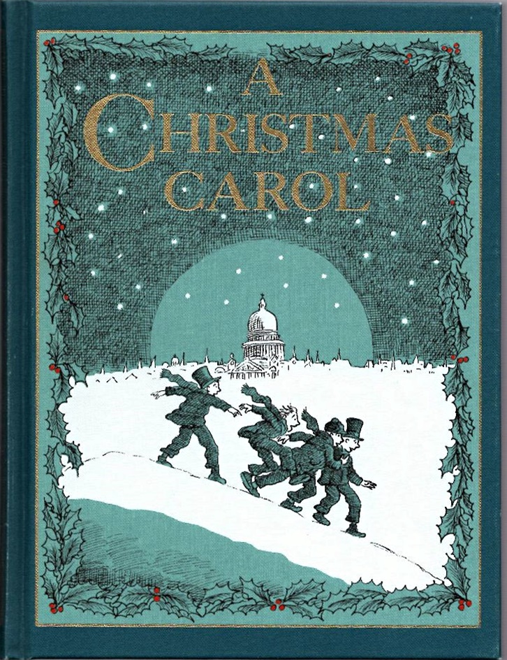
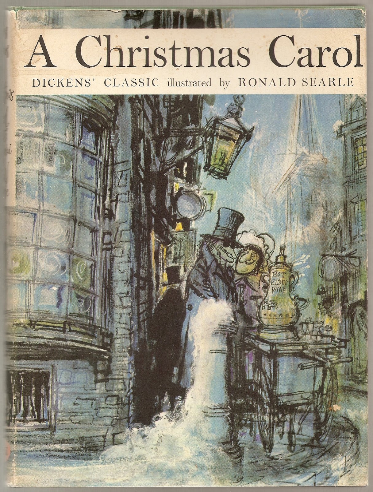
 Many other fine editions of A Christmas Carol have been published with new illustrations by many of the greatest book illustrators. Among my favourites are those illustrated by Arthur Rackham, arguably the doyen of English book illustrators; the edition illustrated by Harold Copping for the Religious Tract Society, the quirky edition illustrated by Ronald Searle in 1961 and the fine edition illustrated by Michael Forman for the Folio Society in 2003.

Arthur Rackham
1915
Michael Foreman
2003
Harold Copping
1920
Ronald Searle
1961

More recently, Cedric Dickens, Charles Dickens grandson, published Christmas with Dickens in 1993 to celebrate the 150th anniversary of A Christmas Carol. Cedric tells the reader exactly how to organise a Dickensian Christmas celebration. He tells the reader how to serve a traditional Christmas dinner, with traditional Christmas drinks, interspersed with five selected readings from A Christmas Carol. My copy formerly belonged to the wife of an Australian High Commissioner to London, and is signed by Cedric who praises the successful Dickensian Christmas Dinner that she held, based on the book!


Christmas with Dickens, 1993

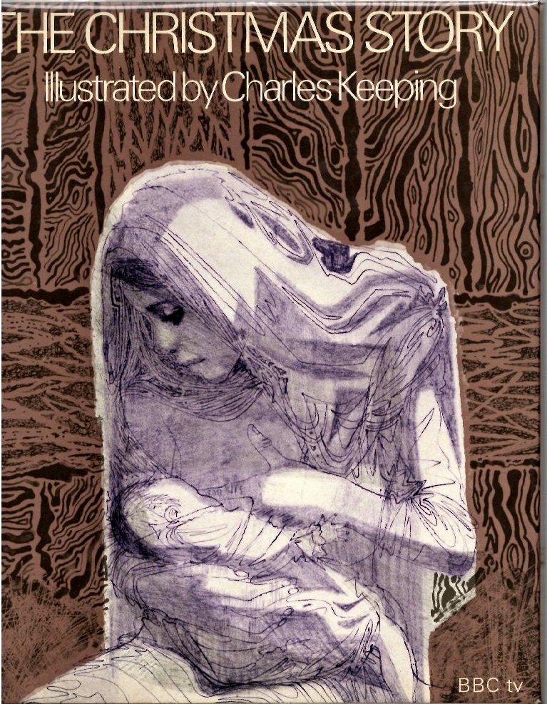
Christmas is, of course, a major religious festival, and unsurprisingly, many books have appeared telling the story of the birth of Christ. My favourite of these is The Christmas Story, which was published by the BBC in 1968. The text of the book has been taken directly from the New Testament in a form simplified for children. However, the real appeal of the book is in the great illustrations by Charles Keeping. Keeping’s illustrations were commissioned by the BBC to accompany the text for a filmed version of the book that was shown on the popular children’s program, Blue Peter.

A Christmas Story, 1968

For those of us who live in Australia, the greatest conundrum about Christmas is how to celebrate it in what is often the sweltering heat of the southern hemisphere summer. Not very much snow to be seen at all! The best book that I know which tackles this is Bush Christmas, a book that was published in 1983 to accompany the remaking of a film, Bush Christmas, that had first been released in 1947. The original film had starred the immortal Australian character actor Chips Rafferty, and concerned the theft of a champion horse from a family, and told how the horse was recovered and the thieves captured by the courage and ingenuity of a group of children. The 1983 remake tells the same story and features a child actor in her first film, the fourteen-year-old Nicole Kidman! 

Bush Christmas, 1983

The title of the film is drawn from the poem, A Bush Christmas, by C J Dennis, first published in the Melbourne Herald newspaper in December 1931. The book prints the text of Dennis’ poem and also has collected together many early accounts of Christmas in the heat and hardship of 19th century Australia, as well as presenting bush ballads about Christmas, as sung by The Bushwackers, a popular band of the 1970s and 1980s in Australia.


Travel writing is often published in the form of a compendium of traveller’s tales. My favourite Christmas version of this genre is A Traveller’s Christmas, a fine collection of short pieces about Christmas and travel selected by Sue Bradbury and published in 2006 by The Folio Society in a typically high-quality production that features illustrations by Paul Slater. There are many examples from writers of many languages and different cultures, largely around the theme of Christmas spent far from home. My favourite accounts are those of Kipling in India and Robert Falcon Scott in Antarctica, along with accounts from mariners rounding Cape Horn and several from battlefields and war-ravaged lands. 

A Traveller’s Christmas, 2006

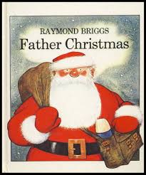
The English book illustrator, Raymond Briggs has produced many fine books over the last fifty years. Four of them have a particular relevance to Christmas. These are The Christmas Book by James Reeves (1968), Father Christmas (1973), Father Christmas Goes on Holiday (1975) and The Snowman (1978). These latter three titles are all authored and illustrated by Briggs, although it should be noted that The Snowman is wordless. Briggs’ Father Christmas is a rather grumpy old man but as the story unfolds, his grumpiness becomes increasingly appealing. The original story of The Snowman in the book does not feature Father Christmas, but the filmed version of 1982 does include an encounter with Father Christmas. Both Father Christmas and The Snowman have won multiple awards.

Father Christmas
First edition 1973
The Snowman
Puffin edition 2013

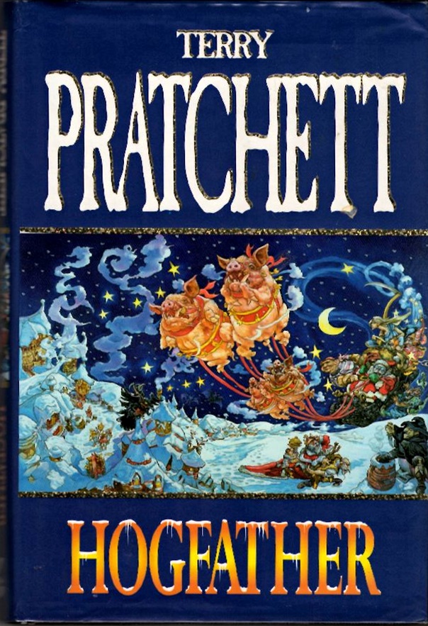
I thought I would finish with two satires on Christmas. The first is Hogfather by the late and very lamented Sir Terry Pratchett. This is his 20th novel in the Discworld series, published in 1996, and tells a tale of the disappearance of The Hogfather (Father Christmas) at Hogswatch (Christmas), due to the plotting of an assassin, and how the Hogfather’s duties are taken up by Death, before the situation is resolved by Death’s granddaughter. I know that this is a great oversimplification of the plot… so go and read the book. If you prefer films, the BBC version of 2006 features the late Ian Richardson as the VOICE OF DEATH (Pratchett fans will understand the capitalisation.)

Hogfather, 1996

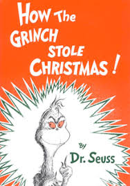
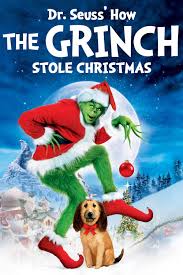
My final choice is a children’s book, but is it? How the Grinch Stole Christmas by Dr Seuss, the pseudonym of Theodor Geisel, was published in New York by Random House in 1957 and like Dickens’ A Christmas Carol, has never been out of print. The story is presented as a simple picture book, in which the tale is told of a bad character, the Grinch, who tries to stop Christmas by stealing things related to Christmas. On another level, the book is really Geisel’s protest about the over-exploitation of Christmas by commercial interests. Geisel liked the Grinch so much that his car number plate was GRINCH.

Many editions of this book have been published during the last sixty years. Here are three editions, with the original of 1957 on the left, a Jim Carrey film tie-in version from 2000 in the centre, and a more recent edition on the right.

195720002008

Ironically, many people today will know the story due to the various commercial film, TV and recorded sound versions that have been made. 

A nice trivia question for you all could be “What do Boris Karloff, Jim Carrey, Zero Mostel, Walter Matthau and Benedict Cumberbatch have in common?” 

Answer… they have all performed the voice of the Grinch.
Happy Christmas reading!  ++++++++++++++++++++++++++++++++++++++++++++++++++++++++++++


Here is a list of the books mentioned in this blog post.
The Book of Christmas by Thomas K Hervey, William Spooner, London, 1836

A Christmas Carol by Charles Dickens  First edition, Chapman and Hall 1843 Facsimile, Chapman and Hall 1926

Manuscript Facsimile, Pierpoint Morgan Library 1993


Editions of A Christmas Carol with illustrations by:

Arthur Rackham, Heinemann, 1915,

Harold Copping, Religious Tract Society, 1920

Ronald Searle, Perpetua, 1961

Michael Forman, Folio Society, 2003


Christmas with Dickens by Cedric Dickens, The Belvedere Press, 1993

The Chimes by Charles Dickens, Chapman and Hall, 1844

The Cricket on the Hearth by Charles Dickens, Bradbury and Evans, 1845

The Battle of Life by Charles Dickens, Bradbury and Evans, 1846

The Haunted Man and The Ghost’s Bargain by Charles Dickens, Bradbury and Evans, 1848

Christmas Books by Charles Dickens, Chapman and Hall, 1869

Old Christmas by Washington Irving, Macmillan 1876

Bracebridge Hall by Washington Irving, Macmillan 1877

The Christmas Story illustrated by Charles Keeping, BBC, 1968

Bush Christmas edited by Dobe Newton, Tombola publishing, 1983

 A Traveller’s Christmas, compiled by Sue Bradbury, Folio Society, 2006

Father Christmas by Raymond Briggs, Hamish Hamilton, 1973

The Snowman by Raymond Briggs, Puffin 35th anniversary edition, 2013
Hogfather by (Sir) Terry Pratchett, Gollancz, 1996

How the Grinch Stole Christmas by Dr Seuss (Theodor Geisel), Random House 1957              ++++++++++++++++++++++++++++++++++++++++++++++++++++++++++++

1938 Rebecca: Daphne Du Maurier

1938 REBECCA: Daphne du Maurier

Dame Daphne du Maurier (1907-1989) was a best-selling author of romantic and macabre stories, novels and plays. Many of her best works, particularly those with a Gothic inspiration, have been the subject of successful films, such as Jamaica Inn, The Birds, Don’t Look Now and most famously Rebecca.

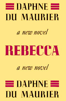
Rebecca was du Maurier’s most successful book, being reprinted multiple times and selling 3 million copies by 1970. It starts with one of the most famous first lines in literature. “Last night I dreamt I went to Manderley again.” The line is spoken by the “second Mrs de Winter, the narrator of the story, whose given name is never revealed. The book contains the classic gothic character, Mrs. Danvers the housekeeper of Manderley, and has many close parallels to Charlotte Bronte’s Jane Eyre. The Alfred Hitchcock film version (1940) went a long way to establishing the enduring fame of Rebecca.

There are thousands of copies of the many impressions of the early English editions of Rebecca published by Gollancz in the standard house yellow dust wrapper. The true first impression of the first edition was 20,000 copies. It is shown below and is the one that collectors want.

Return to the Gothic Novel list

1959 Psycho: Robert Bloch

1959 PSYCHO: Robert Bloch

Psycho now tends to mean the famous film by Alfred Hitchcock made in 1960 with Anthony Perkins and Janet Leigh. The famous “murder in the shower” scene with the electrifying music of Bernard Herrmann remains an iconic series of images in popular culture.

The film is based on the book Psycho by Robert Bloch (1917-1994), which was published in New York by Simon and Schuster in 1959 and in London by Robert Hale in 1960. Block had a long history of writing tales with supernatural content and was part of the circle of H.P. Lovecraft and a regular contributor to Weird Tales. He wrote hundreds of stories and more than 30 novels during a long career which started in 1935. Late in his life he wrote The Jekyll Legacy, a sequel to Stephenson’s famous novel.

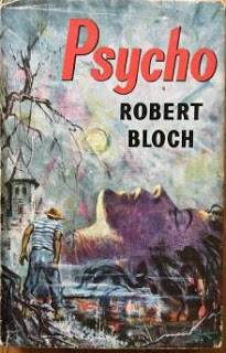
First editions of Psycho are becoming increasingly hard to find. Collectors would be happy with either the American or English first edition. The New York edition in very good condition in dust wrapper will cost around $1000; the London edition about half that price. Both of these books are shown here.

London edition, 1960
New York edition, 1959

Return to the Gothic Novel list

†

Beginners Guide to Collecting Books

What makes a book collectible?

I am often asked by non-book collecting friends what makes a book collectible and how can you tell if a book is valuable. Here are some thoughts on these matters.

Firstly, for a book to be collectible, there needs to be someone out there in the world who desires to own it! That may seem obvious, but really is the sine qua non of any collecting. Similarly, one may ask what is a particular book worth, and one rather obvious answer is “Whatever someone in the marketplace for books is prepared to pay for it!”
For instance, a book dealer may have a rare volume displayed in his or her shop with a price tag of say $500 on it, but if the book has been unsold in the shop at that price for 5 years, then who is to say that it is worth the price on the tag?

If we dig a little deeper into these issues, the four major determinants of “worth”, which may not be the same thing as “value” or “price” are form, content, rarity and condition. Lets consider these four issues in turn.

Form

By form, I mean the physical presentation of the book. Is it a hardback or paperback? Is it a first edition or a reprint? Is it printed or published by a desirable firm? Is it in an attractive or elegant binding? Is it illustrated? Is it signed by anyone special, such as the author, illustrator or a significant previous owner? Does it have an interesting, well designed or famous bookplate? Some of these issues is worthy of some consideration.

Hardback or Paperback

Generally speaking, hardback, or more properly, ‘cased’ books are more collectible than paperbacks. There are many reasons for this. Most books are first published in a fully bound and cased format, at a relatively higher price, before they are then reprinted as a less expensive paperback in card covers, often with the gatherings of the pages glued to a back-strip, in what is misleadingly called ‘perfect bound’. Most paperbacks that one sees are perfect bound. In recent years, in an attempt to contain costs, large format first edition ‘trade paperbacks’ have been published at the same time as an equivalent fully cased hardback first edition. Here in Australia, for instance, in the 21st century, most first edition novels are only available as trade paperbacks, when in the UK and USA they are often published as both hardbacks and trade paperbacks. Often it is then only the trade paperback that is exported from the UK to Australia for retail sale.
Cased books for the last almost 200 years have been bound within board covers that are covered with a substance that can be labelled or decorated. The coverings were traditionally types of animal skins, leathers of various types, or vellum. In the early 19th century, book cloth was popularised as a cheaper and durable alternative to animal products.

Since the later part of the 19th century, cased books have also been covered by paper wrappers called a dust wrapper or dust jacket. These were initially disposable, plain paper covers to protect the printed pages before they were cased by a book binder, or to protect them on the journey between the publisher and the retail bookseller. As the years went by, the dust jackets were seen as a useful, if perhaps ephemeral part of the book, which could also be decorated and so be useful in the marketing of books. For the collector of Modern First Editions (however defined), the dust jacket is a highly desirable if not essential component of the book for it to be deemed complete and collectible.
Some paperbacks are highly prized and collectible, particularly certain books which were only published in paperback format, or books from certain paperback publishers, such as Penguin, Albatross, Tauchnitz and Pan.

First editions

Everyone knows that first editions are very collectible and are often highly desired. But if you give this a little thought, it does require some explanation. One thing that you can be sure of is that every book that has ever been published has existed as a first edition. Indeed, the vast majority of books, once published in their first edition, have probably failed to sell sufficiently well, and so have never been  reprinted or re-issued! So why the importance of first editions?  Collectors will generally say that the first edition is the first appearance of the book and as the initial form of the book that the world ever sees, it has a particular power and importance beyond the raw text. They will also say that the first edition also represents the author’s freshest and new ideas and inventions. However, the first appearance of a book, which is strictly the first state of the first impression of the first edition ( I will explore these terms more in a following blog) in the original publisher’s binding and dust jacket will often contain errors (known in the book collecting world as points) that are most commonly introduced by the printer, but sometimes by the editor or the binder. Thus the earliest form of the book may not represent the author’s true intentions, and it may be later states that correctly reflect the text as presented in the author’s manuscript.

Bindings

Generally, the original publisher’s binding of  a book is the most desired form. However, from the earliest times, it has been quite common for books to be given different bindings after their purchase, that are often more ornate and attractive than the publisher’s binding. Sometimes, particular book buyers or collectors had a preferred or personalised form of binding that they always applied to their books. Some private, public and school libraries also adopted this practice. From  early Victorian times, it was quite common to replace the publisher’s cloth binding with a half or quarter bound casing that used different leathers and boards, often with marbled end papers. On occasions, the publishers themselves produce a limited number of copies of a book that are bound in higher quality, more expensive bindings. 


In mid to late Victorian times, many publishers adopted more highly decorated cloth styles, with the use of impressed or embossed gilt designs or coloured cloth decorations, sometimes on beveled or more elaborately incised boards. All of these superior Victorian cloth bindings are very collectible in their own right. In addition the cheap ‘yellowback’ bindings of crime and sensational novels of the late Victorian and Edwardian age are also now highly collected.

From the early years of the twentieth century, books were mostly bound in cloth which had become very plain and undecorated, particularly after World War One. As the cloth became plainer, so the dust jackets gradually became more highly decorated. In the Art Deco period, from the early-1920s until the end of the thirties, an expectation of elegantly decorated dust jackets began to become the norm for high quality books. For some crime fiction and thrillers, some of the dust jacket decorations became quite lurid and sensational. There are collectors out there for all of these. A few authors even designed their own dust jackets, Evelyn Waugh with ‘Vile Bodies‘ and Ian Fleming with ‘Moonraker‘ are two famous examples, and Len Deighton designed a few decorated Penguin covers in the 1960s.

Signed books

Names or signatures in books can add to their desirability. However, it does matter whose name and signature it is. ” To little Freddy  from Auntie Nell, Xmas 1984, XXX “, scrawled across the title page of any book with purple broad tip Texta pen will almost certain detract from the books desirability. 

However, a copy of the James Bond book ‘Dr No‘, neatly signed “Ian Fleming” on the end-paper would be desirable. If it were inscribed “Peter, here is my latest book; your brother Ian” it would probably be more desirable. If it were to be signed “to Sean Connery from Ian Fleming, loved your performance”, it would be very highly desirable. I’m sure that you get the idea.  Certainly a plain signature, probably written en masse for a bookstore appearance, is probably less desirable that a dedication to an unknown person, and certainly less desirable than a dedication to a famous person or a person who has some significant relationship to the book. 
Ownership signatures from famous, previous owners of the book, neatly written on an end-paper are also highly desirable. In this regard, a copy of Hitler’s “Mein Kampf”, with Sir Winston Churchill’s ownership signature would be desired by all collectors of war books or Churchilliana.

Bookplates

Bookplates are the often decorative labels pasted onto the end-papers of books to assert ownership. Many people had personalised bookplates designed for them and the presence of a discreet and tasteful book plate does not generally lessen the desirability of a book; if the bookplate is particularly well designed, or sufficiently grotesque  and unusual, or if it belonged to a famous or significant person, then it probably adds to the desirability of the book.

Content

Content is a fairly straight forward matter to consider in book collecting. By content, I mean the text and the illustrations (if any). 

Text

If the book is a classic or prize winning or ground-breaking work, then it will be intrinsically more desirable. For most authors, there are one or a few stand-out titles which are the most collected. For George Orwell for instance, I think that everyone would identify “Animal Farm” and “1984” as his most desirable books. On the other hand, almost anything by Charles Dickens, Jane Austen or the Brontes would be very desirable.
The nature of the text is also important. Most collectors prefer the detective fiction of Dorothy Sayers to her religious works; similarly, the Narnia books and the three space fiction novels of CS Lewis are more collected than his academic or religious books. Most collectors would rather have Rider Haggard’s “King Solomon’s Mines” or “She”, rather than his scarce first book, “Cetewayo and his White Neighbours”, or his later books on farming. 
Charles Darwin’s “On The Origin of Species” probably is a unique book in its profound impact on human ideas and life. Any copy of this text has some interest to collectors, from the first edition of 1859 down to the many modern reprints that have appeared since.

Illustration

Illustrated books also have a content collectibility over and above the written text. Many books have been published in un-illustrated first editions, which, after the book’s success as text has been established, are re-issued in lavishly illustrated and finely bound editions that many collectors crave. For collectors of English books, the golden age of book illustration is generally held to be the period 1875 to 1914.
I personally have collected editions of the Alice books of Lewis Carroll illustrated by many illustrators over the last hundred years or so. Although the original illustrations in the first editions of 1865 and 1871 were famously and iconically created by Sir John Tenniel, many famous illustrators have produced wonderful illustrations since then. In a future blog, I will discuss these books and illustrations.

Rarity

Rarity is determined by a number of factors. Age is certainly one, and although old books are not necessarily highly collectible, there is no doubt that age will have an effect on survival of any book, and so will affect rarity.
The size of an edition is also a key factor. The first edition of the first book by an unknown author is usually published in very small numbers, as the publishers want to limit their risk of losses. If the book is successful, then the publisher can print more copies and issue new editions, according to the book’s popularity. Nowadays, if a film is made of the book, new editions are published to take advantage of the marketing of the film.
An interesting recent example of the first book phenomenon is offered by the Harry Potter books of J K Rowling. The first book in the series, “Harry Potter and the Philosopher’s stone” (1997), as the first book by an unknown author, was published in a standard small first UK hardback edition of 500 copies in laminated boards, along with a paperback edition of a few thousand books. 300 of the 500 hardbacks were sold to the English School Library system, where they will have been read to destruction, leaving only 200 copies for book collectors. These now attract massive prices, around $50,000, in specialist book auctions. Copies signed by Rowling will cost even more.
The second book “Harry Potter and the Chamber of Secrets” (1998) and third book “Harry Potter and the Prisoner of Azkaban” (1999) were both published in UK hardback first editions of about 10,000 copies each. These are also highly collected and quite expensive, generally costing around $1000 , depending on condition and issue, rising to $7500 if they are signed by the author.
By the fourth book “Harry Potter and the Goblet of Fire“, (2000), the Harry Potter phenomenon had well and truly taken off. The first UK hardback edition numbered one million books! Although these are still collectible, they are easy to find, and not very expensive. The same is true for the last three books, published in massive first editions and therefore relatively common and easy to find. Interestingly, the first UK hardback edition of the first James bond book “Casino Royale” (1953) is also very rare and highly desirable, due to a small edition being printed (about 4500 books), of which half went to the UK Public Library Service and were read to destruction… a similar story to the first Harry Potter book.

In a parallel story,  the first edition of Charles Darwin’s “On the Origin of Species“, was published by John Murray on 24th November 1859 in a first edition of only 1250 copies of which 1170 copies were available for sale. 500 of these were purchased by Mudie’s Library and all of the rest were pre-sold before publication, mainly due to the intense interest in the subject at the time. Many ended up in institutional libraries, so that the number of copies in private hands, which are those that tend to become available to the rare book trade, was very limited. A first edition can still sometimes be offered for sale in 2015, but it will cost around $250,000. A copy famously sold for around this price on the 150th anniversary of its publication in 2009.

Condition

Condition is the final factor that I will consider here. Book collectors want the best possible condition of any book that they want to collect. The book should ideally be complete, in the original binding and dust jacket, with no marks, tears, scribblings, sticky tape scars, water or light damage, library detritus or stains. It should ideally look like a brand new copy of the book on the day of issue, before it has been read.
This Ideal is not always attainable, and so the more scarce and desirable a book is, the more collectors will compromise on condition. Small stains and small repaired tears and creases in the dust jacket are often acceptable. All illustrations must be present in an illustrated book, but looseness of tipped-in illustrations can be acceptable and can be easily repaired. The title page must be present and all of the text must be present, but some people will accept the loss or disfigurement of the free front end paper (the blank page often found at the front of a book, before the title page). Looseness or defects in the binding, usually found in the “gutters”, the region where the pages are attached to the boards, are grudgingly acceptable to most, and the absence of tissue guards, the protective tissues for illustrations, particularly frontispieces are common and also generally acceptable.
Foxing, the appearance of brown stains due to a mould within the paper is common and also acceptable if not too severe. (A well known comical book on book collecting, illustrated by Ronald Searle, is famously titled “Slightly Foxed, but Still Desirable”, echoing the description often given in book dealer’s catalogues.)
Not surprisingly, the older a book is, the more damaged and worse for wear it is likely to be. Most collectors will accept this and take a pragmatic view of this issue. Thus I expect a much higher standard for my Terry Pratchett first editions, all of which were published after 1983, than my Charles Dickens first editions, all of which were published between 1834 and 1870.

Chris’s Book Blog Site

This is my attempt to create a web presence about Old and Rare Books and Book Collecting. It is an entirely personal viewpoint and represents my own views and tastes, and so will reflect my own collection and collecting interests. I will try to link to useful resources and devise original posts that may be of interest to some book collectors out there.

My collecting tastes are very catholic but are generally in the area of English and children’s literature from the 19th and 20th centuries. Wow, (I hear you say), that’s a huge scope. Yes it is, but I narrow it by collecting authors who I enjoy and like, books that I admire for their form as well as their content, and some particular areas of English writing, including some travel writing by favourite authors, and detective and crime fiction by authors who use this genre to explore particular times, places and cultures.

I am also an avid collector of Penguins, now going for 85 years. I will try to gather together here some useful information, ideas and sources for Penguin collectors.

Charlotte Jay

Charlotte Jay aka Geraldine Mary Halls

Charlotte Jay was the pseudonym of an Australian mystery writer and crime novelist born Geraldine Mary Jay in Adelaide on 17th December 1919. She attended Girton School and the University of Adelaide. Jay worked as a shorthand typist in Australia and England, and as a court stenographer in Port Moresby in Papua New Guinea. She wrote nine crime books under the Charlotte Jay pseudonym. Their originality earned her a place in mystery novel history.

 These included:
 • The Knife Is Feminine (1951) Her first novel set in Sydney. This has never been published in Australia.

 • Beat Not the Bones (1952) This book won the first Edgar Allan Poe Award of the Mystery Writers’ Association of America for Best Novel of the Year in 1954.

 • The Fugitive Eye (1953)
 • The Yellow Turban (1955)
 • The Man Who Walked Away (US Title: The Stepfather) (1958)
 • Arms for Adonis (1960)
 • A Hank of Hair (1964)

 After a single novel published in the UK using the name Geraldine Mary Jay, The Feast of the Dead (US Title: The Brink of Silence) in 1956, she also wrote novels under her married name, Geraldine Halls, through the later part of her writing life. In the USA, all these books were published using the name Charlotte Jay.

These included:
 • The Cats of Benares (1967)
 • Cobra Kite (1971)
 • The Voice of the Crab (1974)
 • The Last Summer of the Men Shortage (1977)
 • The Felling of Thawle: a novel (1979)
 • Talking to strangers: a novel (1982)
 • This is My Friend’s Chair (1995)

 Geraldine married Albert Halls, an Oriental specialist, who worked with the United Nations Educational, Scientific and Cultural Organization (UNESCO). Geraldine and Albert Halls traveled to many exotic locations which Geraldine used in her books. Only The Knife is Feminine is set in Australia. The other books are set in Pakistan, Japan, Thailand, England, Lebanon, India, Papua New Guinea and the Trobriand Islands. Geraldine and Albert returned to Australia in 1971 and spent the latter years of their lives in Adelaide where Albert was an antique dealer.

Charlotte Jay died as Geraldine Halls in Adelaide on 27th October 1996.

Come to the Library at the Dock at Harbourside Boulevard in Melbourne’s Dockland precinct to hear a discussion and readings all about Charlotte Jay called The Knife is Feminine at 6.30-7.30 pm on Wednesday 10th June 2019.

Sketch drawing by Alissa Duke

The three sisters who became literary giants

The Three Sisters who became Literary Giants 

This is a talk that I gave on the three Bronte sisters, Charlotte, Emily and Anne. 

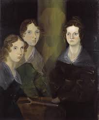
Left to Right: Anne, Emily and Charlotte Bronte


It was broadcast on the Overnights program on RN on the ABC on Tuesday 26th February 2019.

 To listen to the recording of the talk, you can go to:

https://www.abc.net.au/radio/programs/overnights/the-bronte-sisters/10850774

 or look for “The three sisters who became literary giants” via the ABC Listen App. 

Here is the poem by Emily Bronte which I used to close the talk by reading the last verse.


Riches I hold in light esteem
And Love I laugh to scorn
And lust of Fame was but a dream
That vanished with the morn–

And if I pray, the only prayer
That moves my lips for me
Is–”Leave the heart that now I bear
And give me liberty.”

Yes, as my swift days near their goal
‘Tis all that I implore
Through life and death, a chainless soul
With courage to endure!

Emily Bronte March 1, 1841


 Enjoy!

Philip Kerr 1956 – 2018

Philip Kerr: Creator of Bernie Gunther

Philip Kerr 1956-2018

Very sad news this weekend, with the announcement of the death of Philip Kerr on Friday 23rd March 2018. Starting from a career in advertising, Philip Kerr will be long remembered for his wonderful series of books featuring Bernie Gunther, a hard-bitten, essentially moral, German policeman; Gunther is not without his own weaknesses and demons, but when faced with moral choices, always seems to make the right choice, albeit often with a very hard edge.

The twelve book series started in 1989 with “March Violets”, which is written in a very punchy, hard-boiled style, owing much to Hammett and Chandler, but set in a Germany of 1936, where the Nazi regime is consolidating its power and preparing for war. Bernie investigates the murders of family members of a rich German mandarin of industry, and leads us through the dark and dangerous world of pre-war Berlin, ending up in the Dachau concentration camp.

The next two books, “The Pale Criminal”, published in 1990, and “A German Requiem”, 1991, continue in a similar vein and style, with stories set in Berlin in 1938 and Vienna in 1947 respectively. These first three novellas were re-published together by Penguin in 1993 under the title “Berlin Noir”.

The fourth book in the series, “The One from the Other”, did not appear until 2006. It is set in Munich in 1949, and is set in the world of post war former Nazis and all the recriminations found in a defeated nation. Gunther is now a private detective looking for a former Nazi war criminal on behalf of his wife. 15 years on, Kerr’s style has become more mature and he has found his own authentic voice, not having to rely on the hard-boiled tricks of the first three stories.

The remaining eight books, which appeared between 2008 , “A Quiet Flame”, and 2017 “Prussian Blue” explore Gunther’s career between 1934 and 1956, with several involving a flash-back flash-forward structure, which is managed very smoothly, are all written in the mature late style and are an absolute joy to read.

I have read all of the Bernie Gunther books twice, both in the order in which they were published, and in the chronological order, which runs from book 6 “If the Dead Rise Not”, set in 1934 to book 11, “The Other Side of Silence”, which is set in 1956. My enjoyment was not dependent on the order of reading, but I do suggest that the first three early titles should perhaps be read first, as the stylistic change may jar somewhat.

The only bright news about Bernie Gunther is there is one more book, Greeks Bearing Gifts which is due out on April 3rd 2018. I have already ordered my copy and will read it with a mixture of pleasure and sadness.

2019 update

The final Bernie Gunther book was published posthumously in March 2019. Called Metropolis, it takes us back to the very beginning to see Bernie as a new member of the Berlin detective squad in 1928.

The Bernie Gunther Series

 1. March Violets 1989

 2. The Pale Criminal 1990

 3. A German Requiem 1991

 4. The One From the Other 2006

 5. A Quiet Flame 2008

 6. If the Dead Rise Not  2009

 7. Field Grey 2010

 8. Prague Fatale 2011

 9. A Man Without Breath 2013

10. The Lady From Zagreb 2015

11. The Other Side of Silence 2016

12. Prussian Blue 2017

13. Greeks Bearing Gifts 2018

14. Metropolis 2019

Vale Philip Kerr. You will be sorely missed.